Bobby Berk Teams up with Corian® Design to Create Kitchens for the Fab Five
Design and home decor expert Bobby Berk is everywhere – from Queer Eye to Taylor Swift’s latest video and about a dozen places in between. But we guarantee that there’s nothing a designer loves more than their skills being put to the test. And what design challenge could be better than Bobby teaming up with Corian® Design to dive into their new product releases and create kitchen designs from the same space footprint for each of his Fab Five castmates? Our answer: none.
The aesthetics of the Corian® Design products represent the telling of a story, because you’re not just designing a kitchen, you’re making it your space and showing off your personality. The materials, textures, and finishes chosen say so much about someone’s style, how they use the area, and what aspects matter most to them. Corian® Design provides a diverse palette of patterns and colors in both solid surface and quartz material to help your space become uniquely you.
Each of the Fab Five has such a strong, distinctive personality that we knew Bobby would easily be able to find and select features and finishes for each of them from the Corian® Design portfolio of wide-ranging choices.
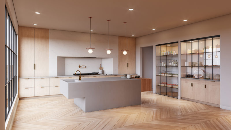
Known on Queer Eye as the wine and food expert, Bobby honed in on designing Antoni Porowski’s kitchen to be functional above all else. “From the built in range, to the cantilevered chopping block, to the walk in fridge, what isn’t there and allows him to make healthy meals? I really wanted to create a ‘cooks’ kitchen for this one with all the bells and whistles but done in a subtle way that is still modern and clean like his aesthetic.”
“Antoni’s kitchen is all about cooking, and everything else was secondary. I wanted to create interest through angular lines and shapes versus employing a lot of different materials. I was also able to use some very modern concepts, like the cantilevered sink and the integrated range area that draws the eye visually in to those ‘cooking areas’,” Bobby shared.
Bobby went on to explain, “In Antoni’s kitchen we went with Corian® Solid Surface in Ash Concrete on the island. The solid surface material is one that can be made completely seamless once it is installed which means we could truly create a large monolithic island like we wanted for the space. For the island, we wanted it to serve as a central gathering place for everyone while he cooks and prepares his meals and the solid surface is perfect for that – the non-porous surface resists stains so he can prepare just about anything he wants on that countertop without worry that it will leave any residue or mark behind.”
“For the hood area and countertops we used Corian® Quartz in Ashen Grey, it has just enough variance to give some movement to the large wall that we installed it on without distracting from the minimal aesthetic happening in the kitchen. Beyond that it is scratch and heat resistant which makes it the perfect option for the cooking area, where pots and pans will be on and off the burners,” he shared.
With so many beautiful options from Corian® Design, how did Bobby manage to translate each castmate’s kitchen design to their individual personalities and personal aesthetics?
“You’ll notice little things in all of the kitchens that speak to each individual. In Antoni’s, I wanted to keep the focus on cooking, with everything else being more simple and subtle, so I went for a modern and clean space that is central around the food prep elements.
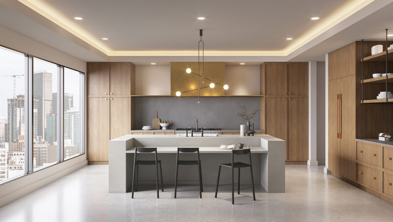
For Karamo’s, it was about creating a space that employed mixed materials all coming together to create one cohesive story, and a place people could gather in.
For Tan’s, I wanted to give a nod to his more traditional roots while bringing in some modern materials and elements.
And for Jonathan’s, I went more playful and whimsical. I wanted to create a space for him to entertain, be with friends, and have everyone be able to gather around a large table in the center.”
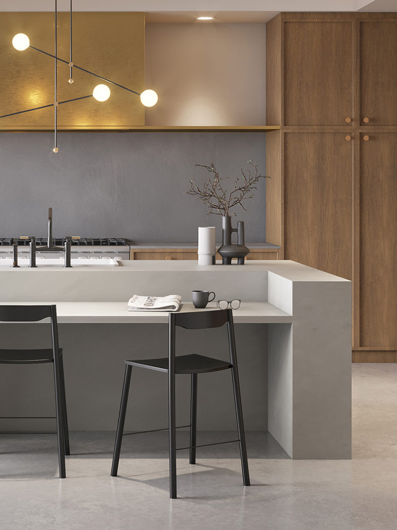
If you’re a fan of the show, you already know that Karamo Brown oozes culture and worldliness, giving Bobby quite a bit to work with in his personalized kitchen design. “In Karamo’s kitchen, I wanted to employ a use of multiple materials in one space. There is brass, terrazzo, wood, cement, aggregate, and iron. It’s a reflection of some of the work that he does not only in the show but in his life – bringing people of different cultural beliefs and backgrounds together into one harmonious space. The materials work together to build a stronger concept than they would if they were used on their own,” Bobby added.
Bobby said, “In Karamo’s kitchen, we wanted to play with mixed materials and a play on tonal textures. So for the countertops and the island we used two different color tones of Corian® Solid Surface. On the island, we went with the Neutral Aggregate and then on the countertops and backsplash we went with a darker toned Carbon Aggregate. Stylistically the two tones work perfectly together in the space and the Solid Surface material also means that it can be made totally seamless and will resist stains which is great for the eat-in area on the island.” In this moody space, Bobby also utilized a Corian® Design Precision 9412 Sink in custom Carbon Concrete.
“This kitchen brings a lot of different elements all into one space but in a harmonious way, which is something that I love to do in design. Rather than bringing in a lot of color or pattern, I like to bring in different materials and texture to create visual interest.”
Each space is different, interesting, and special – just like the guys.
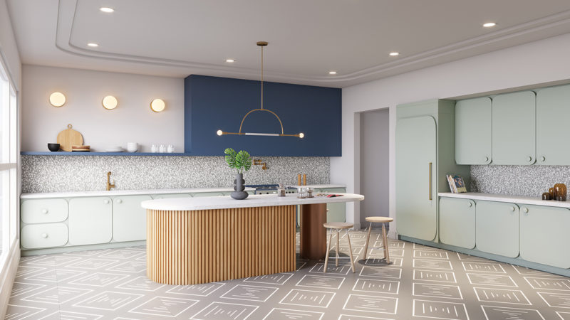
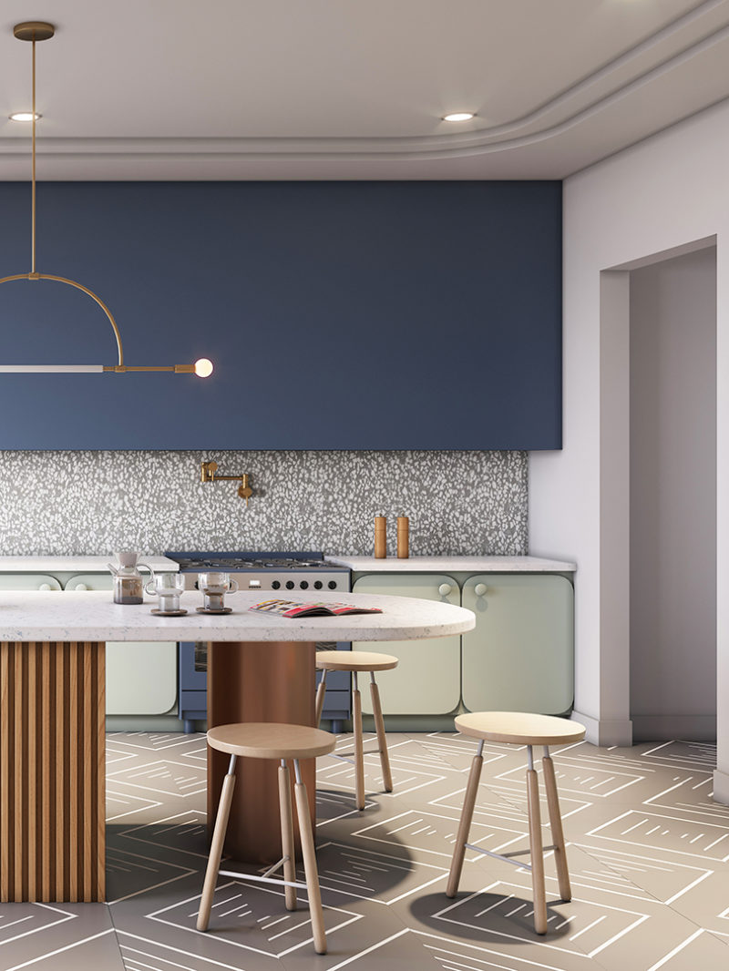
Jonathan Van Ness, Queer Eye’s resident grooming expert, is known for his daring style just as much for the personality that comes along with it. “In Jonathan’s kitchen, we wanted to create a happy and inviting space by mixing multiple materials, finishes, and colors.”
“We started with Corian® Solid Surface Laguna, which we used on the hood area and floating shelf. The blue was the perfect tone for his space and was the jumping off point for the rest of the room. To balance out the blue and brighten it up we used Corian® Quartz Blue Carrara on the countertops. It has the faintest blue veining throughout the material which worked perfectly with the Laguna. On the backsplash we brought in a third material that’s a new color and we love it. The Corian® Solid Surface Pebble Terrazzo has a grey base with chips of white throughout to create the terrazzo effect, and it’s playful and fun just like we wanted this kitchen to feel,” Bobby said. A Corian® Precision 9412 sink in Glacier Ice is also part of the design.
He went on to say, “Jonathan’s space is all about gathering. Rather than using an island in the middle of the space, I opted for a large table with chairs around it. It lends itself to a more inviting, informal, and fun atmosphere in the kitchen.”
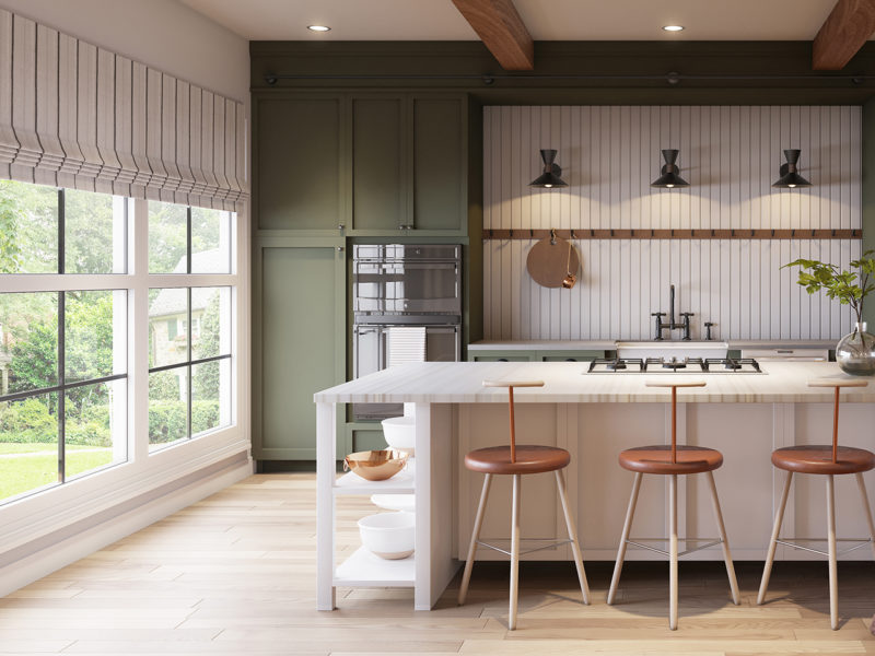
Bobby shared of the show’s fashion expert, “Tan’s kitchen was all about mixing traditional details with modern materials. For the countertops, we went with Corian® Solid Surface Weathered Concrete, which has the perfect taupey tone to it that evokes the look of an old English countertop. The pattern in the surface gives it a beautiful patina and brings in the warmth that we wanted for his space along with the green cabinets.”
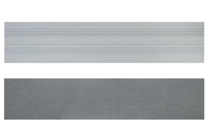
“For the island we wanted to do something bold and make it feel like a freestanding piece of furniture – much like you would find in an old English pub or manor. The island is built up from the floor to give it a freestanding look, then painted a traditional English grey and topped with Corian® Solid Surface Silver Linear on the countertops. The Silver Linear is a variated pattern of stripes done in an organic way that mimics the same menswear-inspired stripe that we used on the roman shades. The solid surface material is perfect for his island, which also houses his cooktop, as it doesn’t let stains penetrate the surface so he won’t have to be worried when cooking.” The Corian® BOLD 690 farm sink used in Glacier Ice is part of the elements collection.
The real question is, to put Bobby on the spot, if he had to choose one of these kitchens as his own which would it be?
He mused, “Asking a designer to pick his favorite room is like asking a mother to pick their favorite child. It just isn’t possible. There are so many elements that I love from all of these kitchens that I would love to have in my own space. The same goes for the materials that I used in the spaces. I love so many of the new colorways and textures that Corian® Design introduced this year.”
See the entire 2019 collection from Corian Design® at CorianDesign.com.
from Design MilkInterior Design – Design Milk https://ift.tt/2S0smuN
via Design Milk





No comments