Barde + vanVoltt Designs New Digs for Ace & Tate to Stimulate Creativity
Amsterdam-based Ace & Tate reached out to local design studio Barde + vanVoltt to create a new workspace that focuses on driving ambition, stimulating creativity, and disruptive thinking, while also feeling like a comfortable place to hang out. Working with Ace & Tate’s in-house retail design team, they set out to realize the perfect workspace that was not only functional, but it enhances the quality of the employees’ work life.
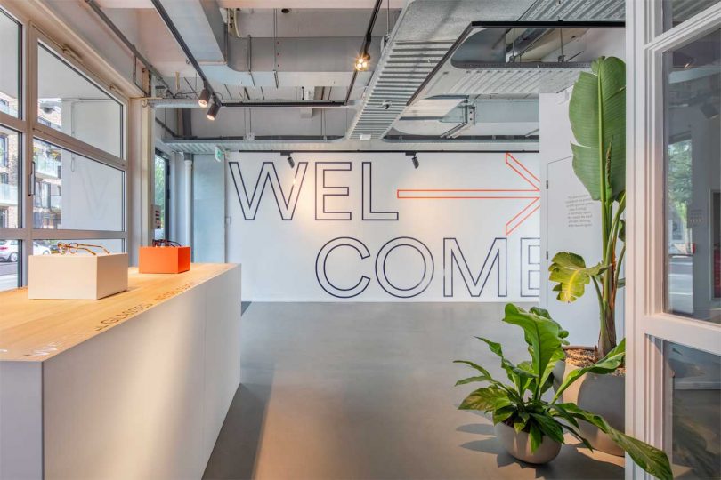
The eastern Amsterdam headquarters took over a space that used to be a dimly lit garage. The design team added massive patio doors on the darker side of the building and restored original light shafts to bring additional natural light to the interior spaces. A mural greets visitors with a big welcome when entering the space, as well as a spot to display product.
The design plan involved creating inspiring spaces where everyone can interact and put their heads together, or hunker down in a private space to get more work done. The company’s basement, dubbed The Playroom, is decked out with ping pong tables, a yoga space, and lounge areas to watch TV when a break is needed.
The ground floor features four meeting rooms that each have their own personality and style. The grouping resides in the middle helping to split the open floor plan up.
Ace & Tate have their very own in-house store allowing employees to be trained and for product to be displayed.
Throughout the office, plenty of informal seating areas are setup to encourage socializing and a change in scenery.
Bold cobalt blue, an orange-y red, oak, concrete, and powder-coated steel merge together to form a vibrant and enticing workspace for the company.
Photos by Wouter van der Sar.
from Design MilkInterior Design – Design Milk https://ift.tt/2Vwcwd8
via Design Milk


No comments