Can’t Decide on Color? Fermob’s Moodboards To the Rescue!
COLOR! It touches nearly every aspect of our outward facing lives – our wardrobe, our walls, even our cars! Most people have a strong opinion on the subject, they know their individual favorites and maybe even an entire palette of preferred hues. But at some point, all of the colors and all of the options can become overwhelming, and a little help narrowing down our favorites is much appreciated. Outdoor furniture brand Fermob is now using their color expertise to create moodboards and lend a hand.
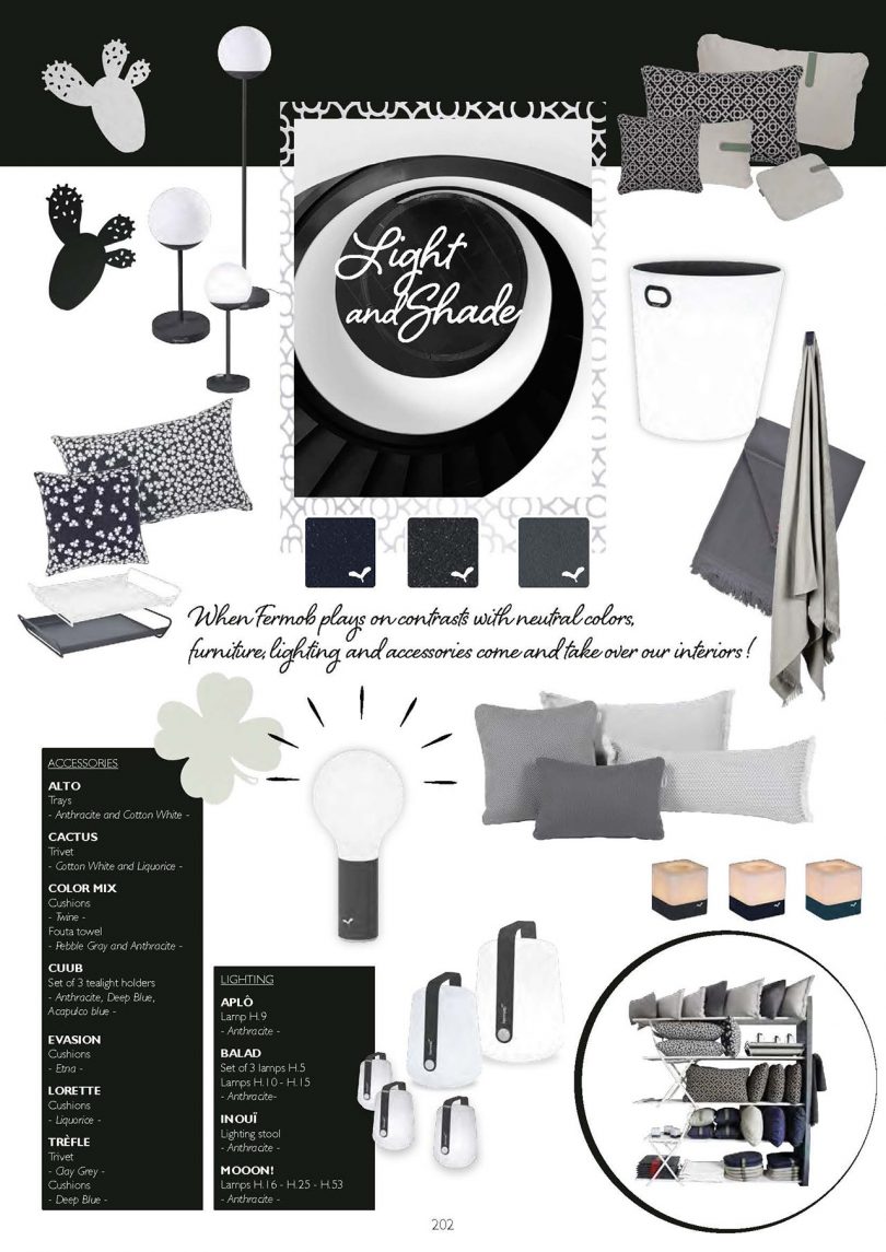
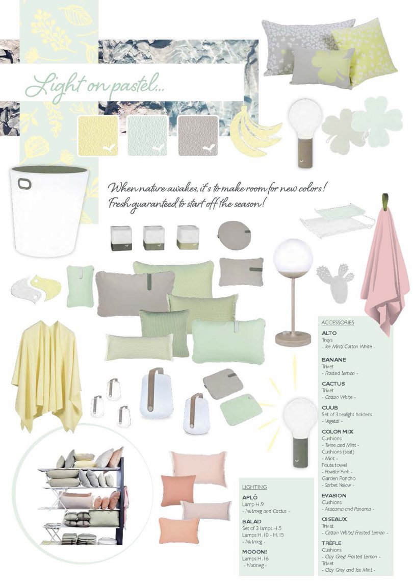
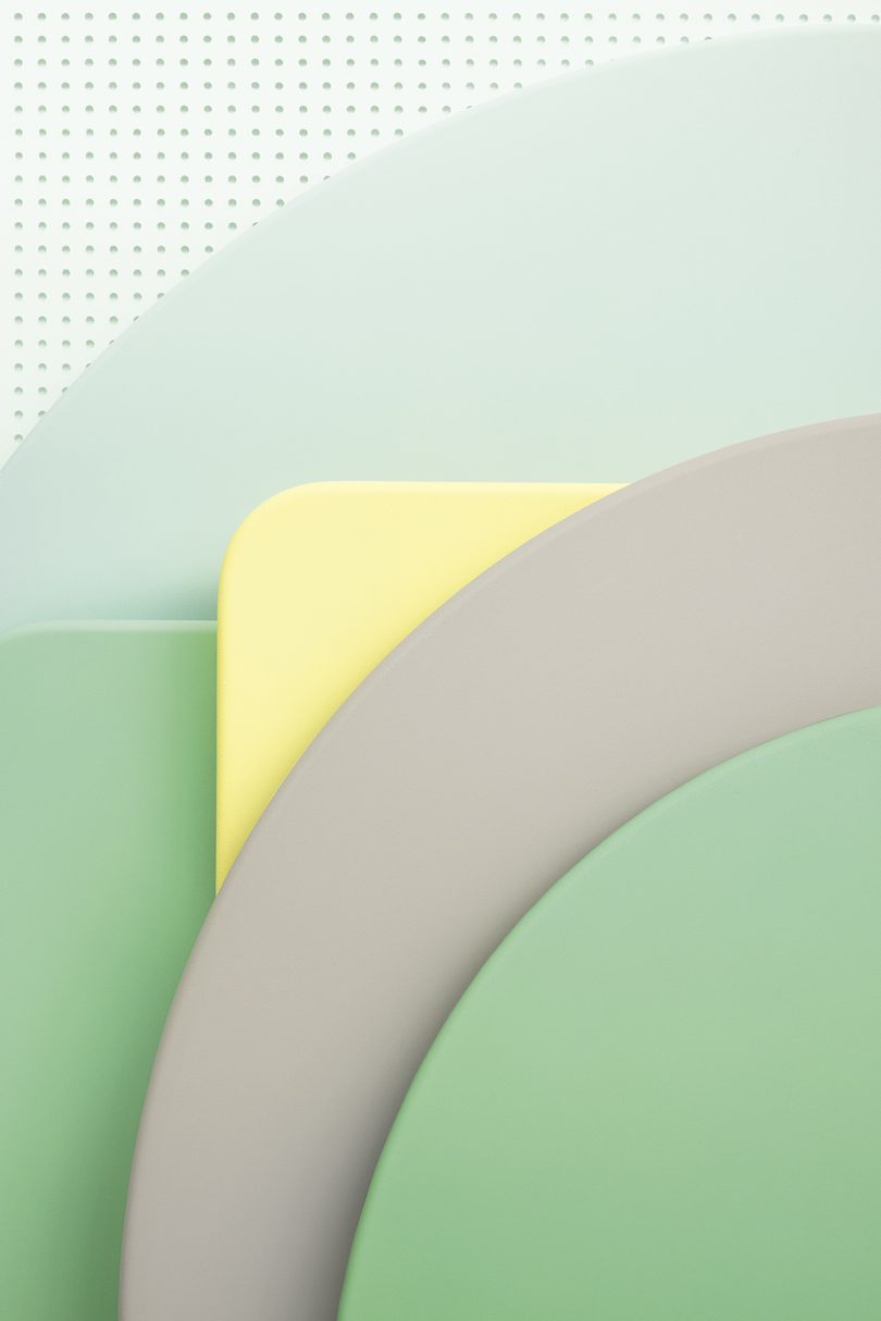
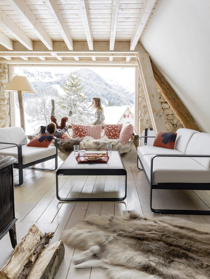
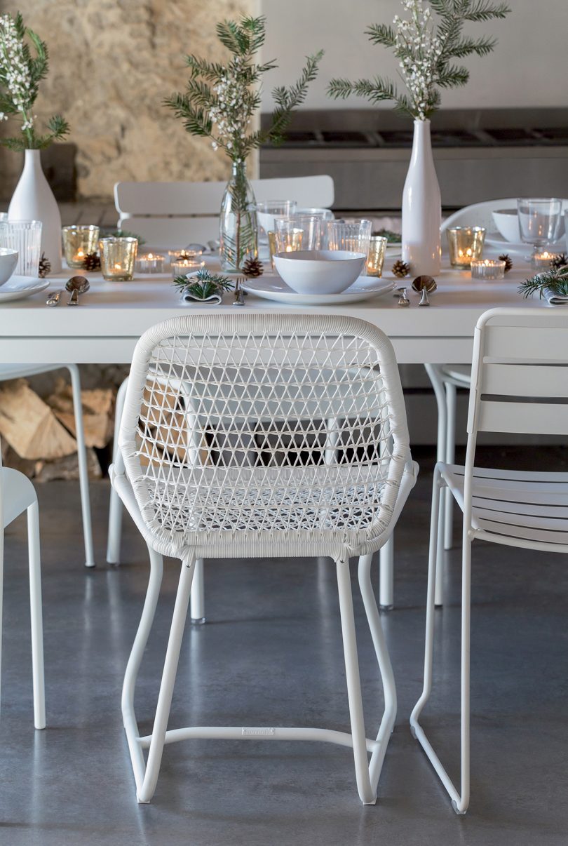
Fermob is creating four moodboards, one for each season of 2021. Winter consists of extremes, Light and Shade, while Spring leans towards soft Pastels. “Color has been the starting point of our trends and moodboards, they’ve been created to form a link between all of our products – furniture, lighting and accessories,” shares Marion Bouvet, Visual Identity and Merchandising Project Manager at Fermob. You’ll notice each board suggests only a select few colors to help keep the customer’s aesthetic cohesive.
A trend can have an ephemeral resonance. Our trends aim to stay relevant over the seasons. We associate neutral base colors with more unexpected ones, continuing to inspire each person that encounters Fermob.
– Marion Bouvet, Visual Identity and Merchandising Project Manager at Fermob
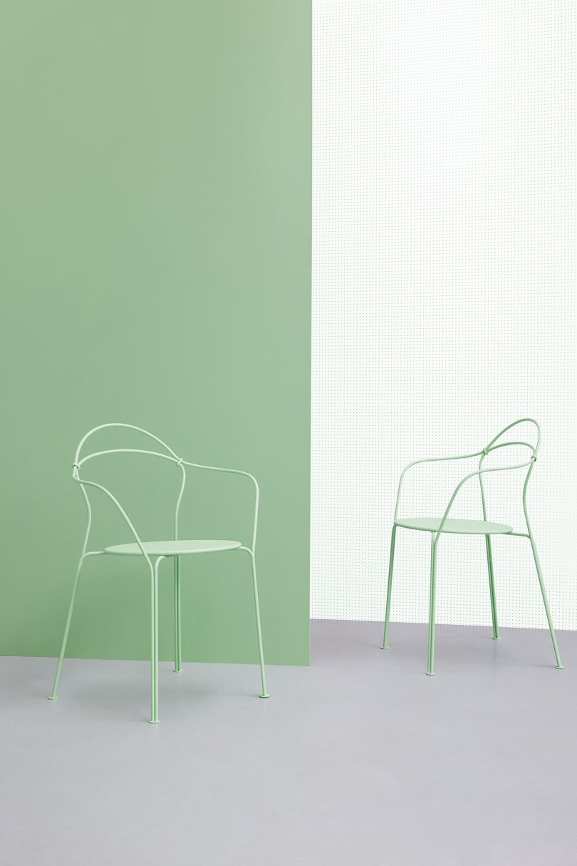
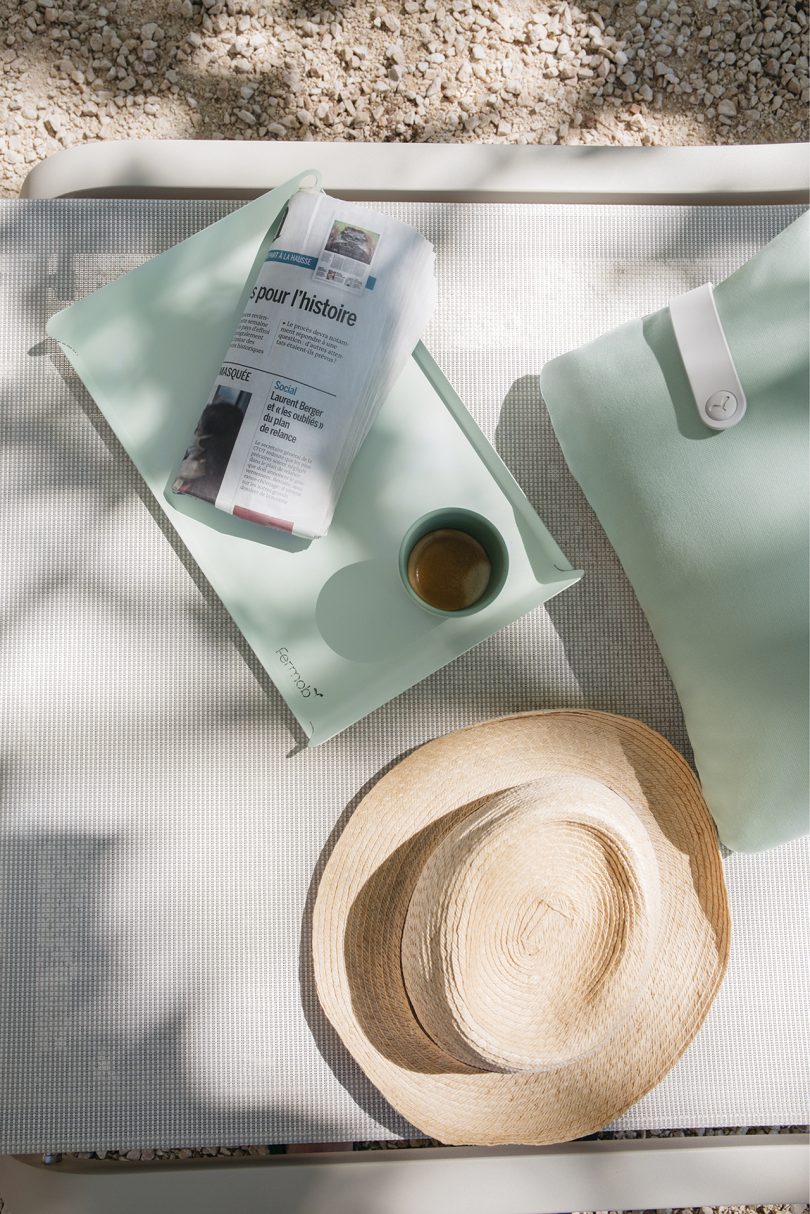
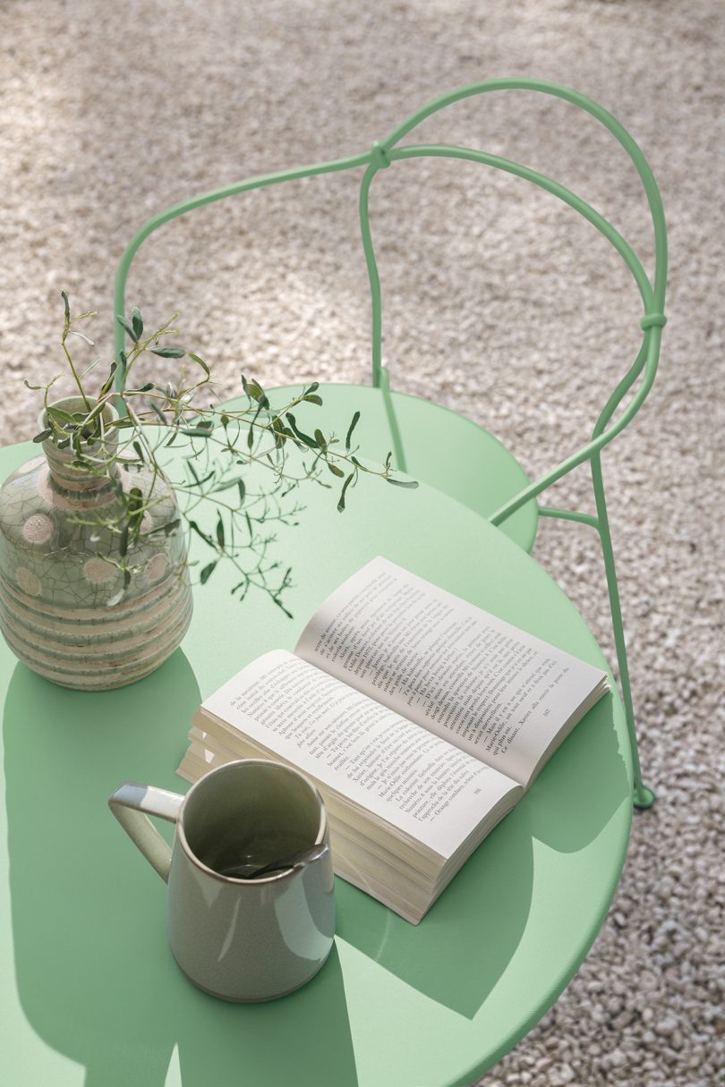
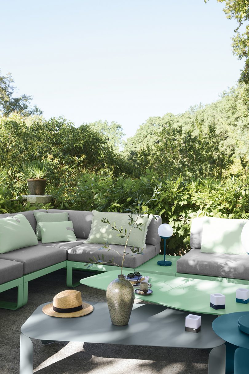
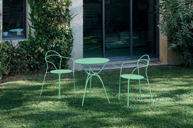
This spring, you’ll be introduced to Opaline Green, a new player in Fermob’s pastel color story. Soft in tone, but also fresh and outdoorsy, this green has added a new light and luminous element to your design options. Bright and soothing, Opaline Green has a subtle feel that’s oh so inviting. Fermob refers to it as a chameleon in their color chart because it can be mixed and matched well with so many of their colors.
Both moodboards released so far by Fermob, Winter and Spring, give you the ability to grow and expand an outdoor area in the future through yet-to-be-introduced pieces and colors. Half of the fun Fermob provides as a brand is a game of mixing and matching to see what works for a space, and what doesn’t. The moodboards extend a helping hand towards getting started, whether that’s with a particular color or piece of furniture, lighting or accessories.
Fermob is well-known for their mastery of color, in fact their zero-waste powder painting line is celebrating 25 years of success in 2021. The brand’s 24 metal chart colors are defined to encapsulate not only individual colors, but different ranges of intensity within those colors. Each year fresh colors are introduced, while other colors are discontinued. However, Fermob always gives customers a wide range of choices with their offering of 24 colors.
“When a color is developed by Fermob, it can work on its own but also has to be able to live with the other colors of our color chart. New colors have to find their place, ensuring a balance between modernity and timelessness that suits our brand. We’ve gone so far as to postpone a color launch to ensure that its place will be durable and essential for some time to come,” Bouvet reports.
With no in-person trade shows happening yet, Fermob instead invites you to take part in an online guided tour. They’ve built an actual booth to showcase new products that you can “walk through” as though you were there in person. The platform is well-designed, offering dynamic content such as video, images and more. You’ll leave feeling inspired and ready to create, whether it’s with an assist from Fermob’s moodboards and Opaline Green or otherwise!
To learn more about Fermob, visit fermobusa.com and their shop, where you can track new trends and moodboards as they’re released.
from Design MilkInterior Design – Design Milk https://ift.tt/2NmDtjK
via Design Milk

No comments