Kelly Wearstler Creates a California-Inspired Paint Palette for Farrow & Ball
Marking the first time collaborating with an outside designer and its 75th year of business, British paint brand Farrow & Ball enlisted global American designer Kelly Wearstler to create a paint palette all her own. The result is The California Collection featuring eight fresh colors inspired by the Los Angeles-based designer’s home state, from the notorious fog brought inland from the Pacific Ocean to the palm trees lining California streets to terracotta pots and tiles baked daily in the sun. Having used Farrow & Ball paint in her interiors projects for more than twenty years and with her self-professed love of color, the partnership makes total sense: “I always say living without color is like living without love, so it’s been a dream to partner with Farrow & Ball on a collection of paint that celebrates the emotions color can evoke,” says Wearstler. If the dreamy color palette isn’t enough to draw you in, it needs to be noted that Farrow & Ball makes sustainability a priority, as each shade is eco-friendly, low-VOC, water-based and packaged in a recyclable can. Read on to see how the collaboration evolved and the eight colors that make up The California Collection, in this month’s Deconstruction.
Kelly Wearstler and Charlotte Cosby, Head of Creative at Farrow & Ball, at work in the factory conceptualizing the collection. This partnership is the first palette created by an outside designer since the paint company’s founding in 1946, and is launching during the brand’s 75th year of business.
Kelly Wearstler flipping through inspiration decks as she and Charlotte Cosby, Head of Creative, are on the Farrow & Ball factory floor during Wearstler’s trip to Dorset.
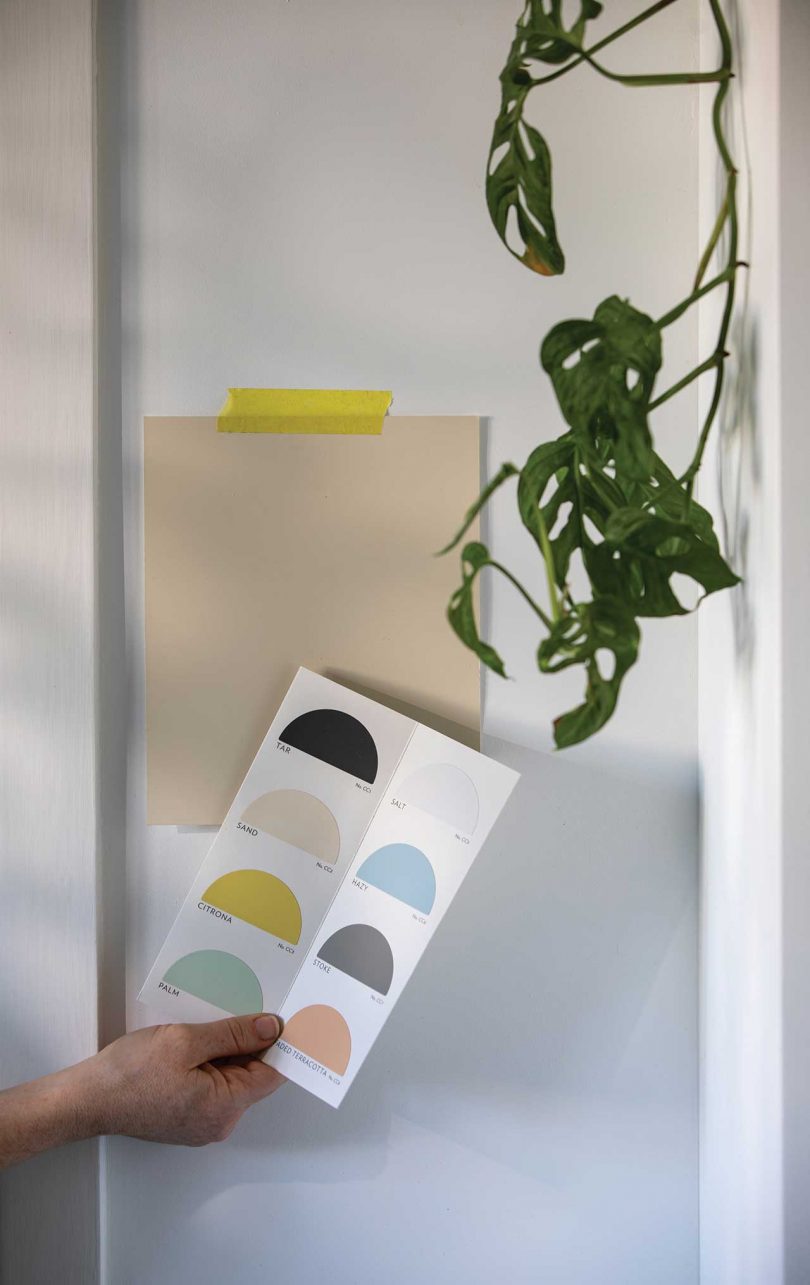
Samples and swatches of the working colors as The California Collection was coming to life.
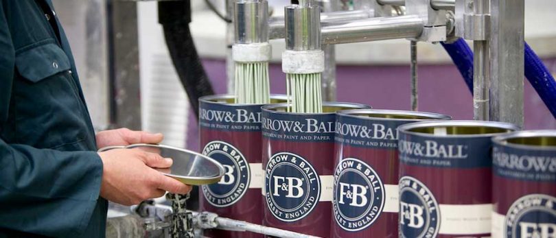
Here is one of the containers used to mix paint colors in the Dorset factory.
A color is being mixed. Each shade is eco-friendly, low-VOC, water-based and beautifully packaged in a recyclable tin.
A brush out board is created once a batch of paint is complete to test color quality, durability and other qualities.
The color Palm being dispensed into Farrow & Ball tins, which are entirely recyclable.
Another color, Terracotta being dispensed into Farrow & Ball tins.
Kelly Wearstler created vibe trays, pulling together various textures and materials that complement each of the colors. This vibe tray is for the color Hazy.
A second vibe tray Kelly Wearstler curated that reflects the new paint color Sand.
A third vibe tray from Wearstler that was referenced for the color Tar.
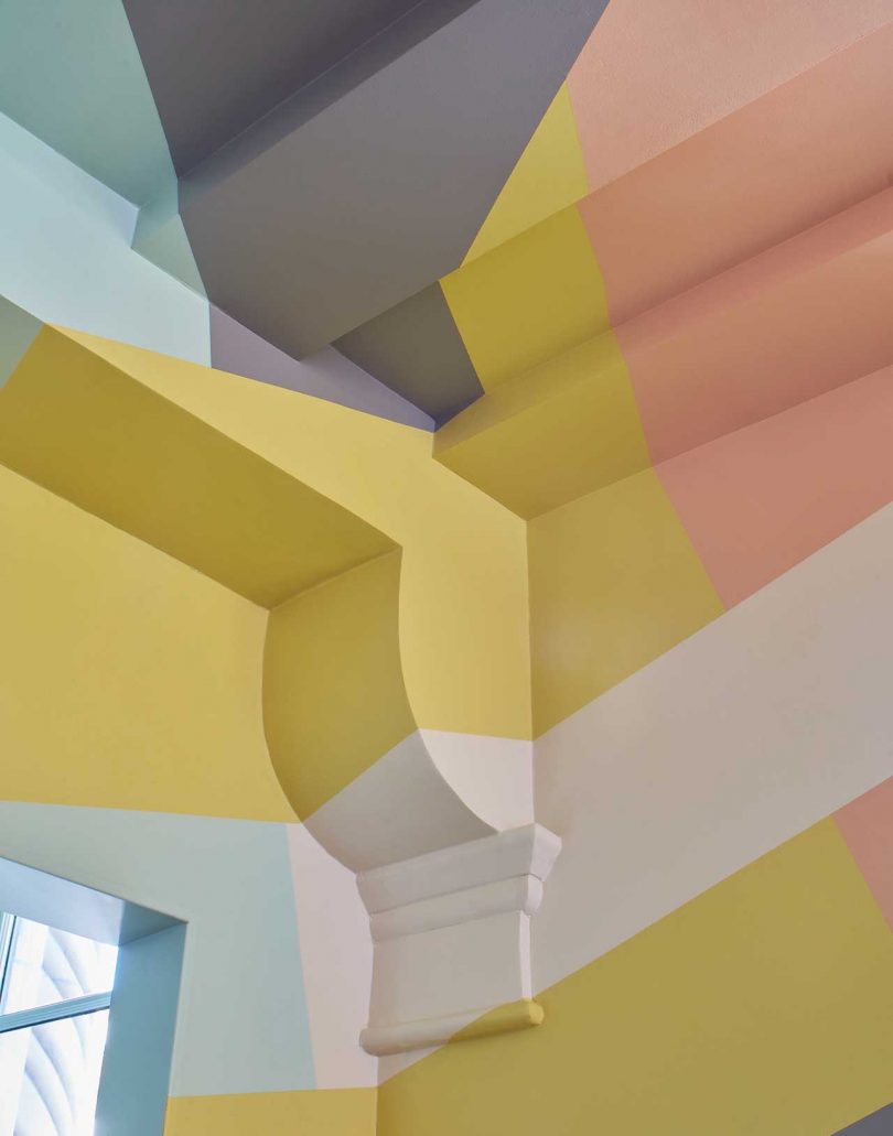
The California Collection paint colors used to create a graphic pattern on an architectural wall.

Faded Terracotta – An easygoing shade that references terracotta pots and tiles baked in the warm California sun.

Hazy – A muted blue-grey inspired by the morning marine layer that carries fog inland from the ocean.

Salt – A crisp white evoking the salt-filled air brought in by the Pacific Ocean and the crystalline layer left behind.

Sand – A natural white that feels like sandy beaches and coastal homes in Malibu outfitted with natural wood and textured linens.

Stoke – The perfect, effortless grey that grounds any space the color is used within while paying homage to city streets and cloudy days.
from Design MilkInterior Design – Design Milk https://ift.tt/3sgPPID
via Design Milk


No comments