After: “Coastal Grandma Meets Graphic Designer” Is the Vibe of My New Living Room
Earlier this week I shared the beginnings of a living room refresh project – layouts, schemes, mood board, cringey before photos, and all – and today I’m excited to reveal the final results and dive into all the details with you!
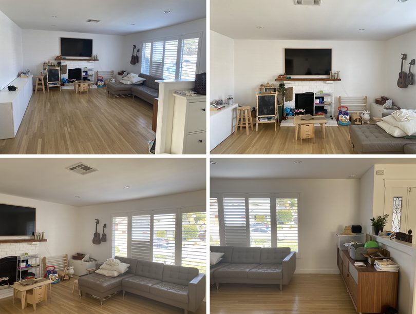
Let’s remember where we started:
Before, I thought I was making fool-proof choices in furnishings by going with neutral everything. I chose white storage cabinets, a leather (re: easy to clean) chaise sofa in a neutral color, no rug (to avoid messy toddler hands and feet), and a modern media console in a beautiful walnut wood. Despite what I thought was logical thinking, it completely backfired because there was no cohesion in design. Plus, safe and neutral actually translated to sterile, boring, and unbalanced – who knew!?
All the while, all the books and toys started to take over the room. It was clear who was king and queen of the household. The lack of division between the two different functional spaces we needed (a space for the adults to unwind and an area for the kids to be kids) made the room feel cluttered and disjointed.
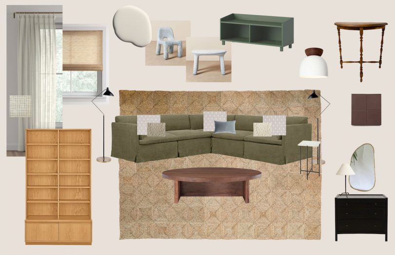
I voiced these pain points to our interior designer, Alex Yeske who drafted up three main layouts. We discussed each of them in depth and I shared what I liked, parts of a scheme that couldn’t work with our current season of life (i.e., sharp marble corners and a toddler still learning to walk), and details my husband was drawn to. After a few iterations, we landed on this final scheme:
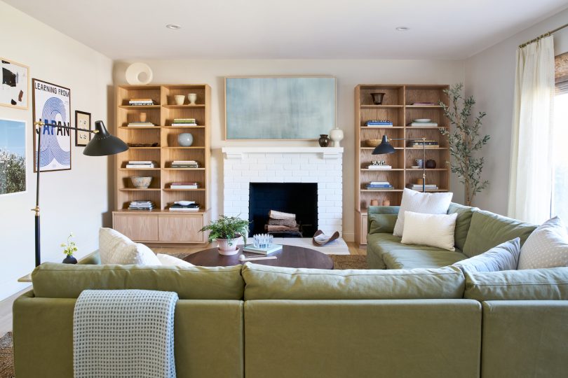
And here are the glorious after photos:
One of the first things we did was give the space a fresh coat of paint. Because the room is north-facing, the current white paint made the room feel dingy, cold, and sterile due to the lack of warm, natural light. We chose Moon Ritual by Backdrop, who describes the color as a “light gray-beige with warm undertones.” The new subtle color instantly injected cozy vibes into the room, even without final furnishings in the space. We also cut the mantle edges down to be flush with the fireplace and painted both the mantle and bricks with Backdrop’s Supermoon, a pure white that freshened up the area.
When it came to finding the right furnishings, I relied on Shopify’s Shop app to give me new ideas and possible contenders after I found myself dissatisfied with the selections from big box stores. Because the app pulls in the millions of brands and businesses that use the Shopify platform for their e-commerce business, I was able to find a majority of my home furnishings from this one app. In my opinion, it’s an underrated app that I think interior designers (or anyone furnishing their home) should have in their back pocket. Add in the conveniences of adding my favorite brands to a list, discovering all their new arrivals, and tracking all my orders – it’s just a no brainer. Let’s take a closer look at what I ordered!

Actual screenshot of my Shop app with my favorite brands, both newly discovered and longtime faves
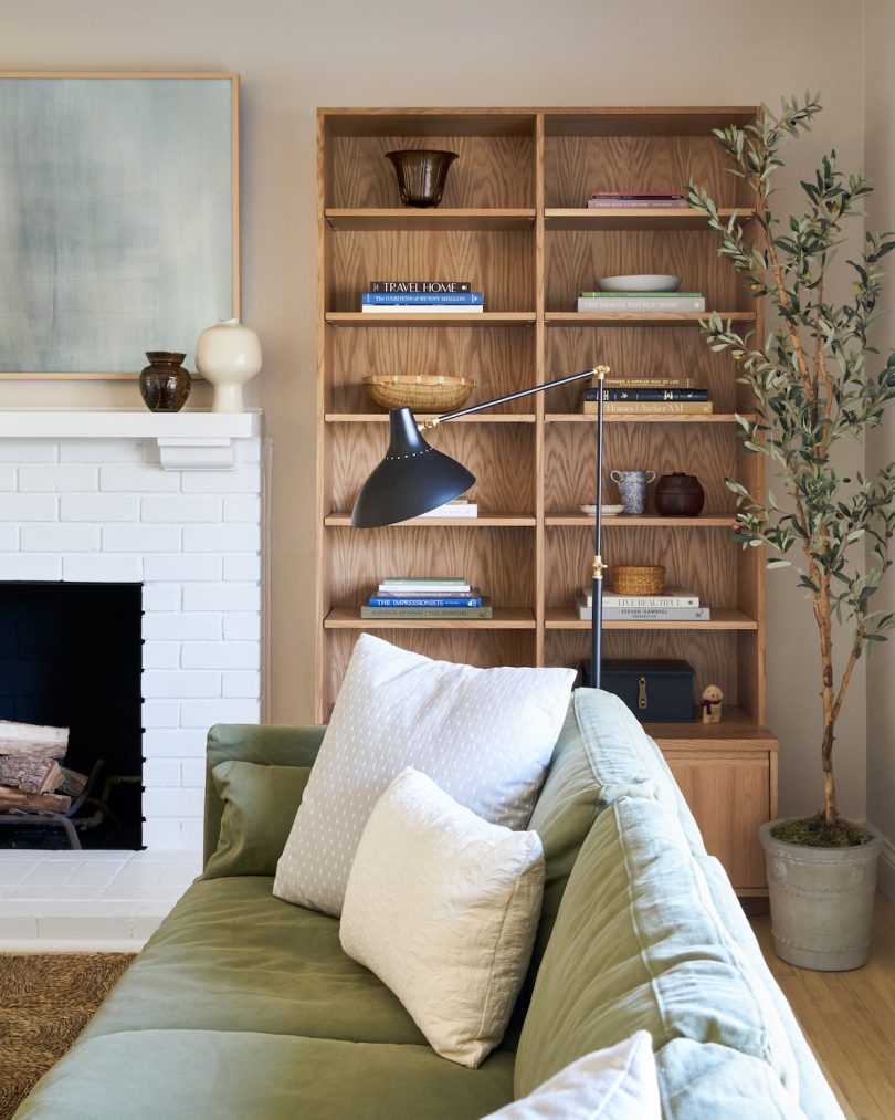
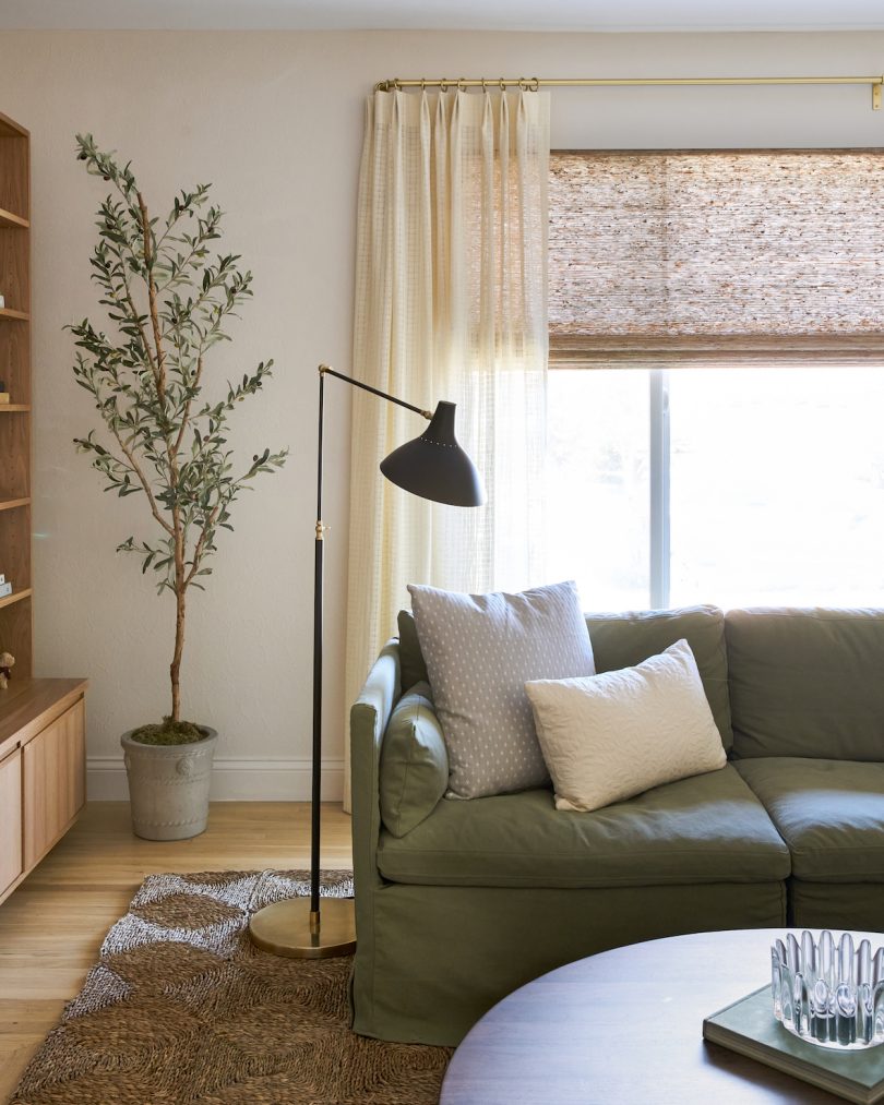
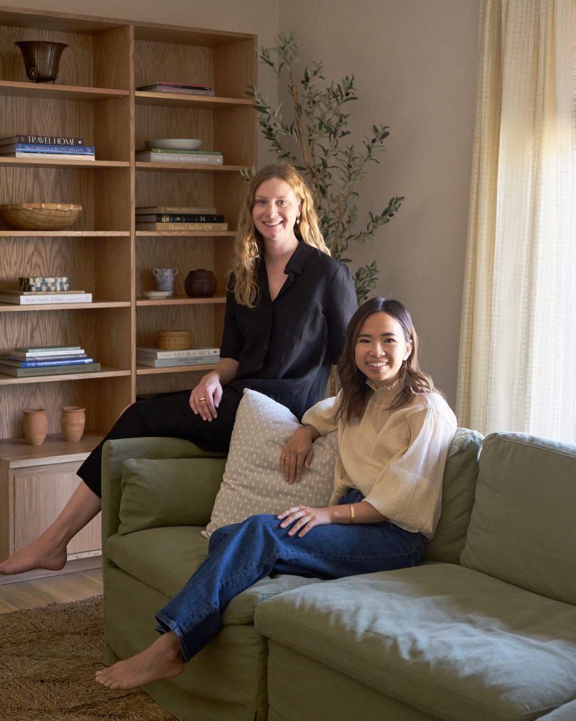
The Sixpenny Gabriel corner sectional is the headliner of the show and probably the one we put the most thought into. We host family over a lot and my husband loves his shows and live streamed concerts, so we wanted a high-quality, comfortable sectional that didn’t feel too precious for everyone to relax on. I didn’t love the feel of our previous leather sofa and while a white sofa is very chic and future-proof for changing tastes and styles, we went with this beautiful French flax linen in Quiet Sage that adds a pop of sophisticated color. I also felt good about going with a feather down fill because the distributor that Sixpenny carefully vetted only uses non-live-plucked down feathers which are obtained as natural byproducts of the food industry. This vendor is also audited and inspected every year for certification renewal by the Feather and Down Association. It was a hard decision between feather down and Sixpenny’s poly fill, which consists entirely of vegan poly fiber, but I’m happy with our choice.
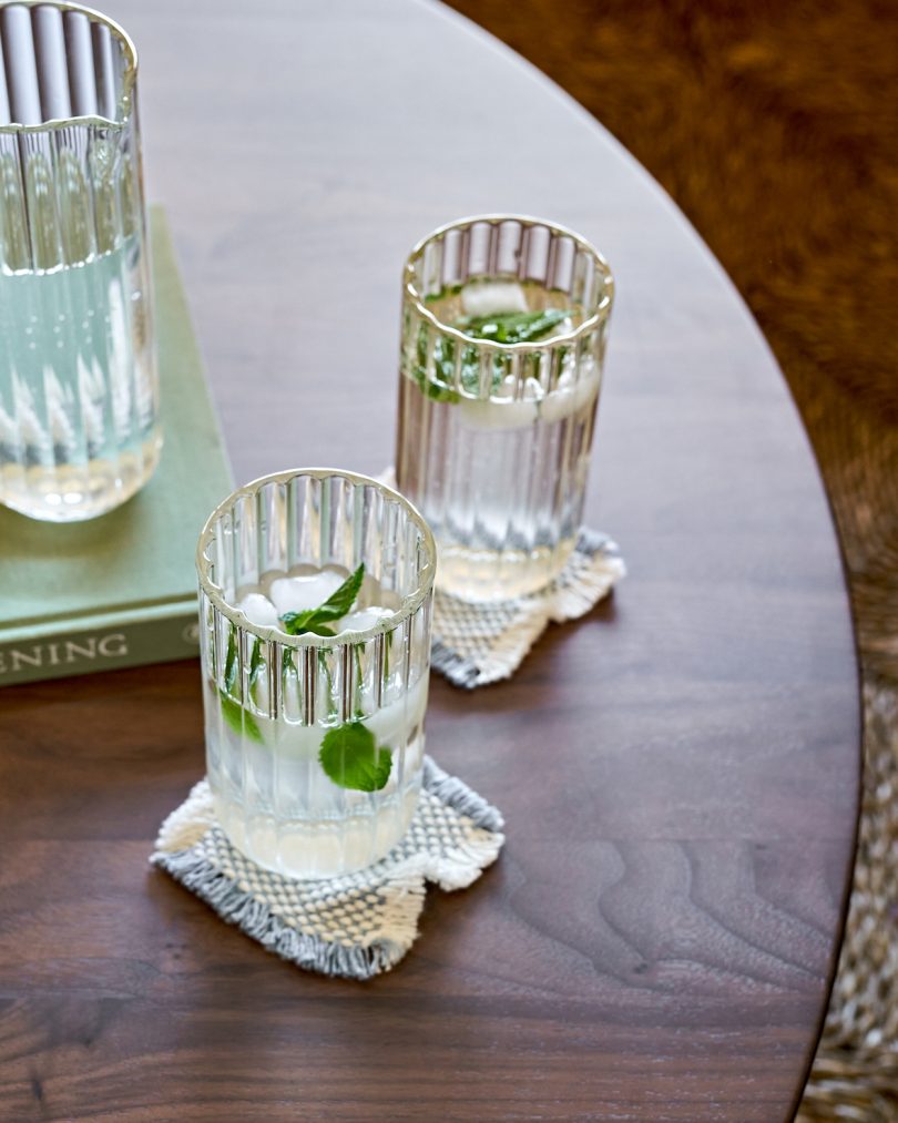
With the amount of square and rectangular pieces in the space, Alex advised on going with a round coffee table, so I sourced this newer Field Round Coffee Table from Canada-based Sundays Furniture after already owning the Field Side Table that we use in my son’s bedroom. I thought the walnut wood and brown rush rug would be too tonal but it makes the space feel bigger. A white marble table would have highlighted how much of the space it actually takes up in the modest-sized room. The Field table’s low, rounded profile also makes it less of a hazard for our kids, which makes me feel even more relaxed in the space. We already broke our “no food in the new living room” rule, so I added two straw cushions for my toddlers to sit at a proper height in an attempt to at least keep food off the sofa. We’ll see how long that lasts…
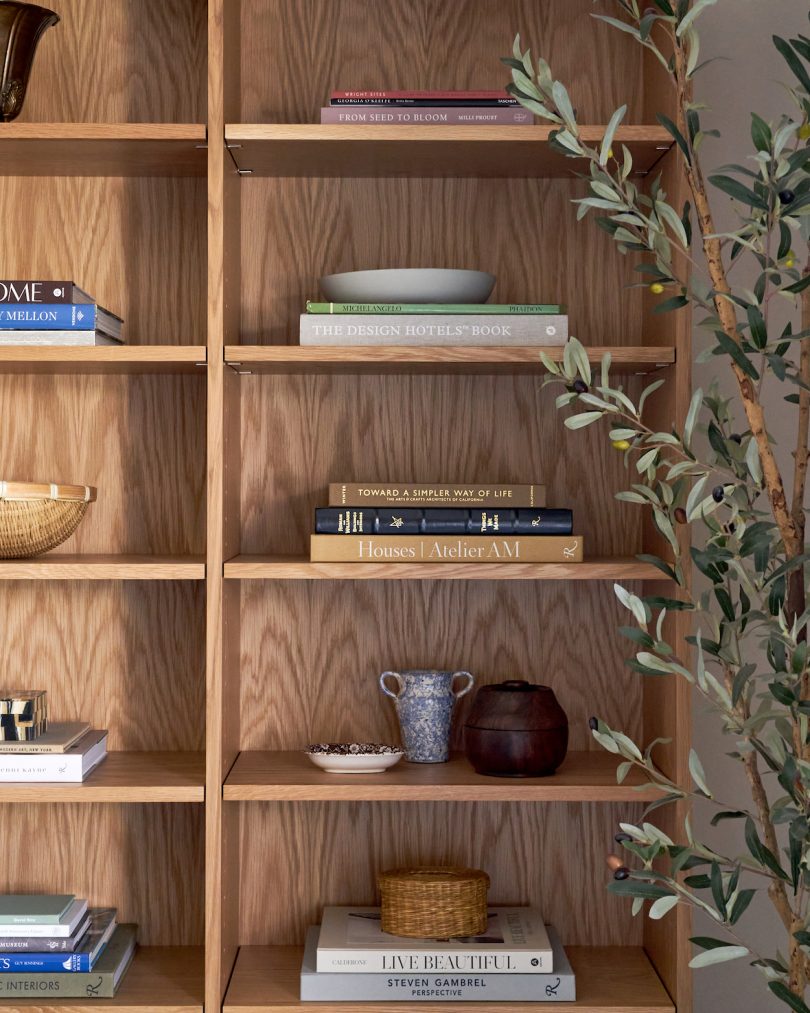
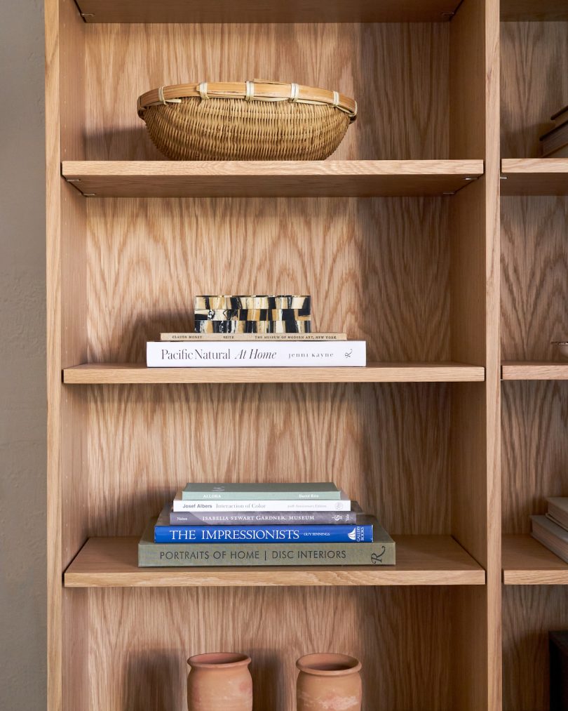
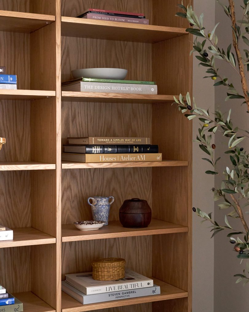
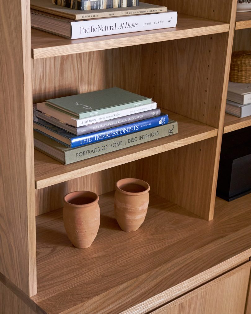
Eagle-eyed readers might notice that we ended up going with different cabinets from Alex’s original scheme. I really wanted to go custom for the cabinets that were going to flank the fireplace and had a budget for them, too. However, it just wasn’t in the cards with us with quotes ranging from $8400 (reasonable) to $16,000 (*sobs*). There were also longer-than-usual lead times and the rising costs of wood to consider. To get the custom look without the custom look price, we turned to a favorite, tried-and-true brand, Room & Board. I didn’t expect ready-to-ship cabinets to look as good as custom cabinetry, but the white oak Keaton Bookcases completely exceeded our expectations. They look like they were custom ordered and because the shelves are adjustable, they can adapt to our future needs. I’m so glad we went this route because I can bring these beauties to our next home (if that’s ever in our future), something I can’t do if they were custom fitted and installed in our home.
Upholstery wasn’t something I thought I would shell out extra money for (big box options always seemed fine to me!), but after working with Alex, I am a complete convert. For our drapery, we went with local, Los Angeles-based company Everhem, who Alex worked with to create our custom drapes to pair with Everhem’s Woven Wood shades. Because our living room is north-facing and doesn’t ever get direct light, we initially wanted a light-colored shade that wouldn’t darken the already dim room. Alex convinced me that the Khaki would give the room some texture and cohesiveness to our rush straw rug from Shop Rush House. Alex worked so hard to find me yardage of a discontinued Pindler fabric I fell in love with for its perfectly airy, checkered texture and Everhem turned it into perfectly pleated drapes. The satin brass hardware gave just enough contrast to the fabric and shades.
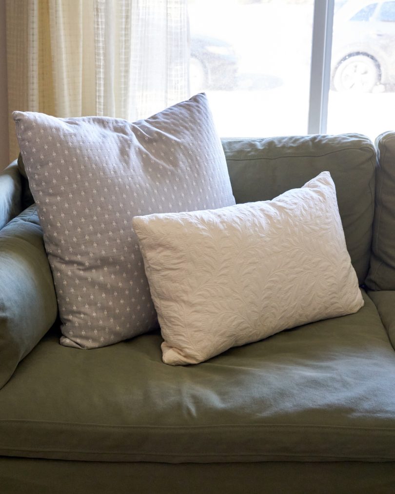
I also went custom with all our accents pillows minus the one dusty blue lumbar pillow I was able source on sale from Rejuvenation. While they weren’t cheap, I felt that this was an area I could add a personalized touch and because they’re washable (and dyeable, if worst comes to worst), I figured they had a long life span. After a cryptic email from me (“Do you have anything flower textured? Not necessarily a floral print. Maybe something cream?”), Alex sourced a beautiful raised floral fabric from Fabricut to pair with the grey patterned fabric she chose, and I loved, from Schumacher. For the custom drapes and pillows, I spent roughly $1850 (including a $250 rush fee). The joy of having bespoke pieces in our home though? Priceless.
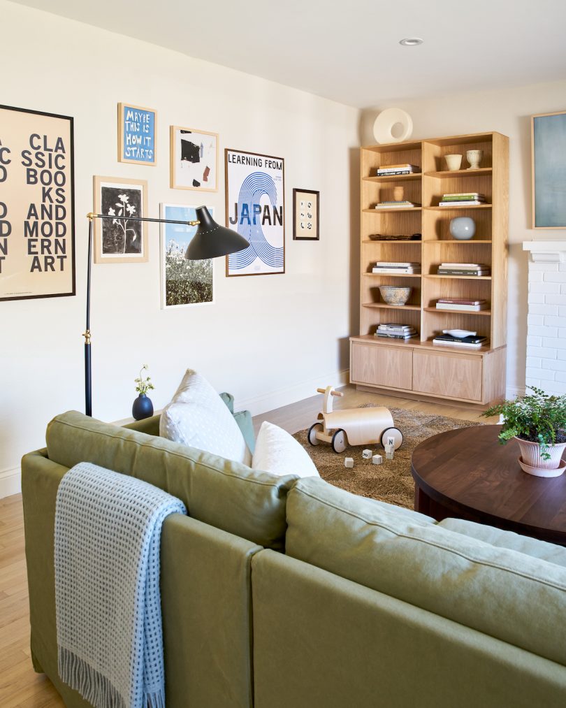
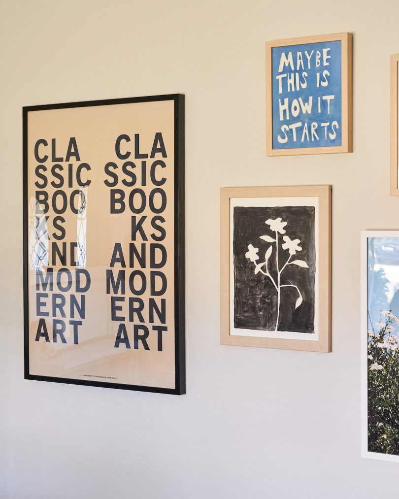
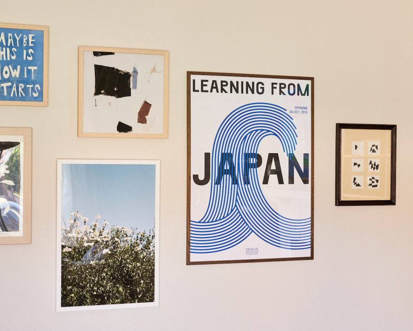
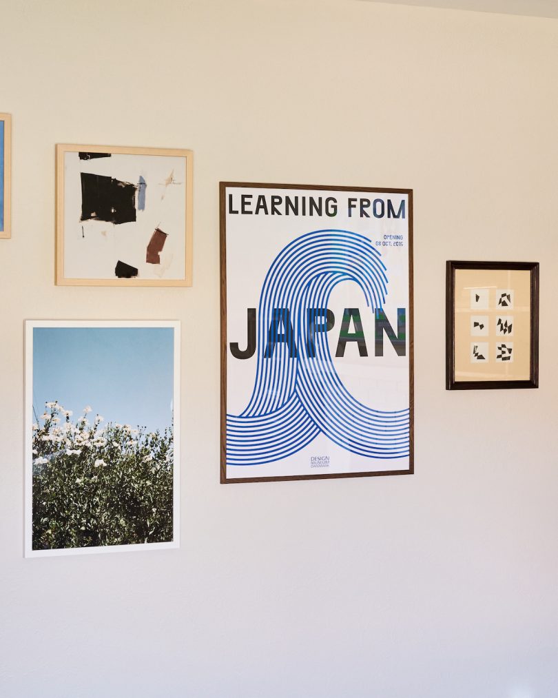
A gallery wall is also a great place to express a home’s individuality. Alex sourced three pieces from Artfully Walls, which has so many unique, affordable prints and is so convenient because you can order frames from them at the same time. She also found a geometric vintage print and frame from a local flea market, the latter of which I sanded and stained to take on a walnut tone instead of cherry wood. I bought the Learning From Japan print and frame from the Design Museum in Copenhagen after visiting the museum’s reopening this year. The graphic design ties in nicely with the Bookshop print. The floral ink print is my favorite of all, an original from my friend Molly Fitzpatrick of DittoHouse. Alex worked with a tasker from Task Rabbit to create the perfect arrangement that will still allow for new additions.
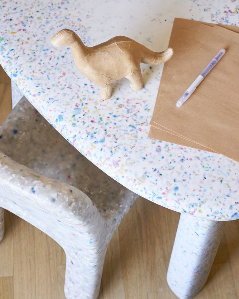
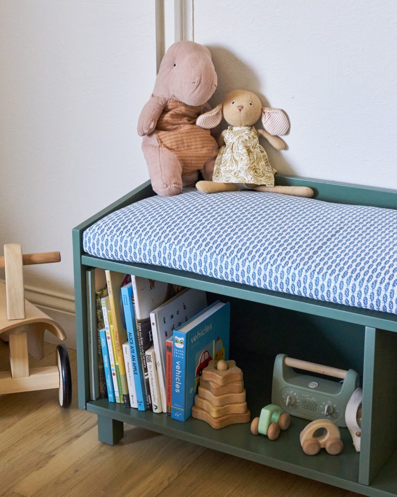
One of my favorite features about our new space is that there is a designated area for my two toddlers to play kitchen, read books, and draw all day long. Do some of those materials sometimes spill over to the grown up area? Yes, of course, but carving out this area for them has already given them the autonomy to own their own space, so much so that very little toys actually end making it over. The Ecobirdy table and chairs is perfect for my toddler who’s still a bit wobbly, because there are zero sharp corners with this slightly bulbous design. The table is also made of recycled plastic toys, hence the confetti effect, which makes me smile having a piece of circular design in our home. The Duc Duc Indi bench not only gives us some extra storage for toys and books, but it’s become a soft surface for make-believe, thanks to Alex’s surprise gift of a custom cushion (the newest way to my heart).
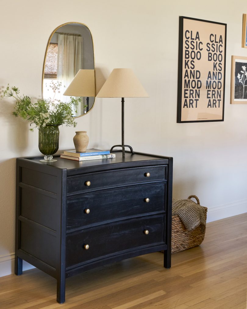
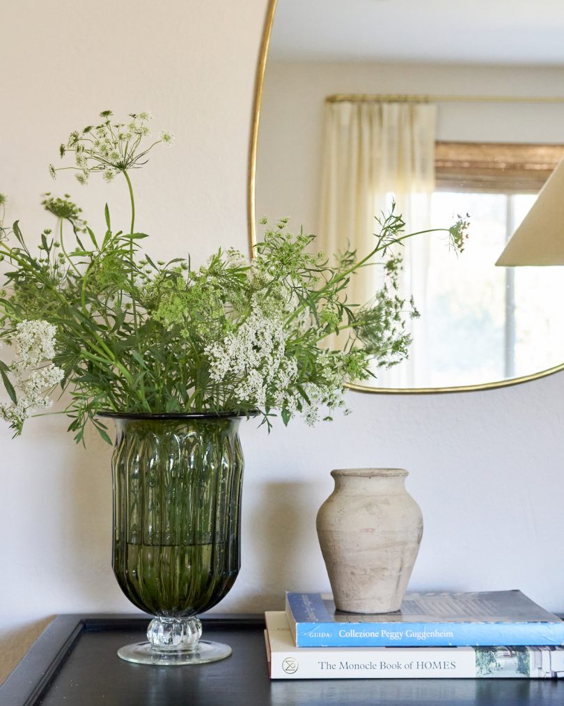
Because of the way our home is laid out, we needed a drop-off area for keys, sunglasses, and wallets, so Alex created a designated space designed around this stunning Carnegie Chest of Drawers from Jayson Home. The black ties in with other dark details within the overall space, like our picture frames and our two angular brass floor lamps from Foundry Lighting. The curved front edge is also a very unique detail that I love. We use this station daily as it holds (and hides) items we need regularly, like diapers, wipes, extra coasters, and other entertaining necessities.
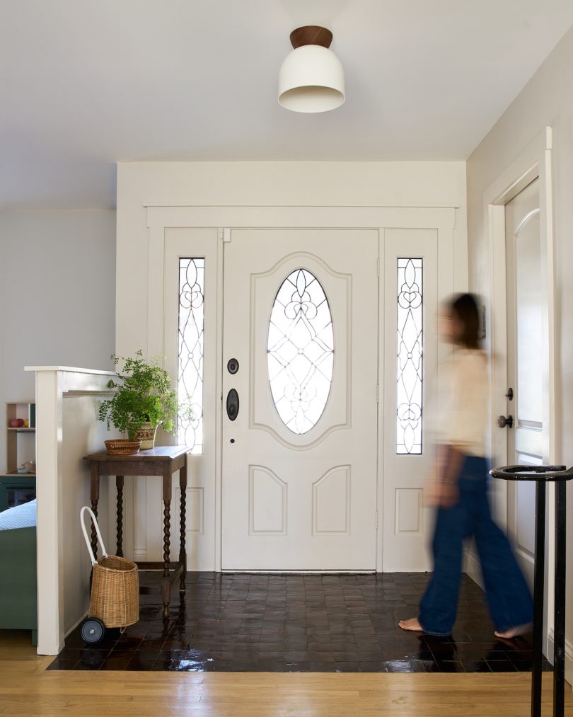
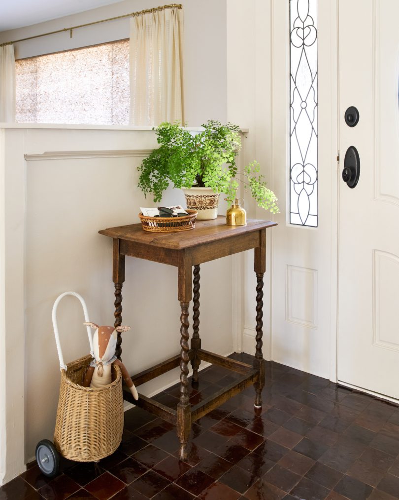
Our entryway is one of our favorite moments in the space because it has a slight old-world feel to it with the vintage table (a $30 Facebook Marketplace find) and the hand-made, chocolate brown Moroccan zellige tiles from Zia Tile. The irregularities of both elements gives the space so much charm. The walnut canopy from our Amélie light fixture from Cedar & Moss ties back into the brown theme of the room and brings back that balance of vintage and modern. In an ideal world, I would replace our door and sidings but I’ll save that project for another day, much to the delight of my budget-conscious husband.
I knew Alex nailed it with the design when friends and family would review the schemes and layouts and declare with their vote, “This one feels most like you.” I love how comfortable and lived in the space feels while still looking current with touches of contemporary design. It gives me “coastal grandma meets graphic designer” vibes, with the contemporary furnishings and wall art paired with the classic and vintage items. I love and am so excited about this space (especially come the holidays!) that I can’t foresee changing one single thing about it any time soon.
If you love any of the pieces in today’s post, here is a full source list of furnishings and decor:
1. Sixpenny Gabriel Corner Sectional in Quiet Sage and Feather Down Fill | 2. Sundays Field Round Coffee Table in Walnut | 3. Everhem Khaki Woven Woods Shades with Satin Brass Hardware Custom Drapery | 4. Aerin Charlton Floor Lamps via Foundry Lighting | 5. Rush House 9×12′ Original Rug | 6. Amélie Surface 10″ Flush Mount Light in White and Walnut | 7. Ecobirdy All Bright Set via Goodee | 8. Jayson Home Carnegie Chest of Drawers | 9. The Inside Marble Side Table | 10. Duc Duc Studio Indi Bench in Fern | 11. Zia Tile 4×4 Zellige Tiles in Burnt Sugar | 12. Artfully Walls “Maybe This Is How It Starts” Print, “Matilija Poppies” Print, “Tule Study 2” Print | 13. Bookshop “Classic Books and Modern Art” Print | 14. Design Museum “Learning From Japan” Print | 15. Ciseal Aspen Magazine Rack | 16. Komolab Elysian Incense Holder | 17. The Foggy Dog Bed | 18. Pablo Designs Candél Lamp | 19. Backdrop Paint in Moon Ritual and Supermoon | | 20. Samsung 65″ The Frame TV | 21. Etsy Brass Mirror by Libitii | 22. Etsy TV Art by Harris Lane Prints | 23. One Forty Three Guitar Hooks in Walnut and Black Leather | 24. Ollie Ella Luggy Basket | 25. Room & Board Keaton Bookcases in the 45″ Width in White Oak | 26. Room & Board Homage Throw Blanket in Sky | 27. Room & Board Althea Vase in Ivory | 28. Hawkins Brass Plant | 29. Ferrone Deerborn Carafe and Large Water Glasses | 30. Zara Table Lamp | 31. Zara Blue Glass Vase
All photos by Jennifer Chong Studio.
This post contains affiliate links, so if you make a purchase from an affiliate link, we earn a commission. Thanks for supporting Design Milk!
from Design MilkInterior Design Ideas for Your Modern Home | Design Milk https://ift.tt/5FiDYch
via Design Milk



No comments