Camille Walala’s Vibrant Studio Where Happiness + Joy Are Created
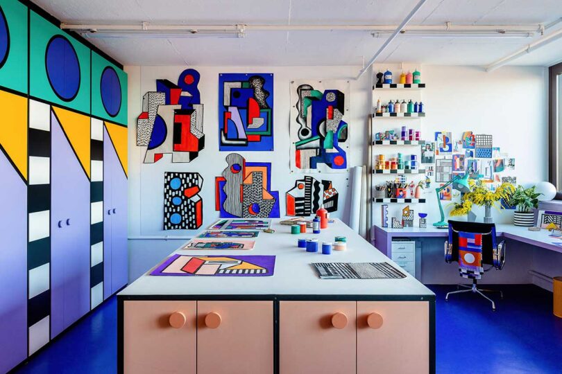
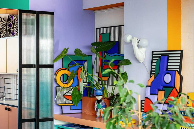
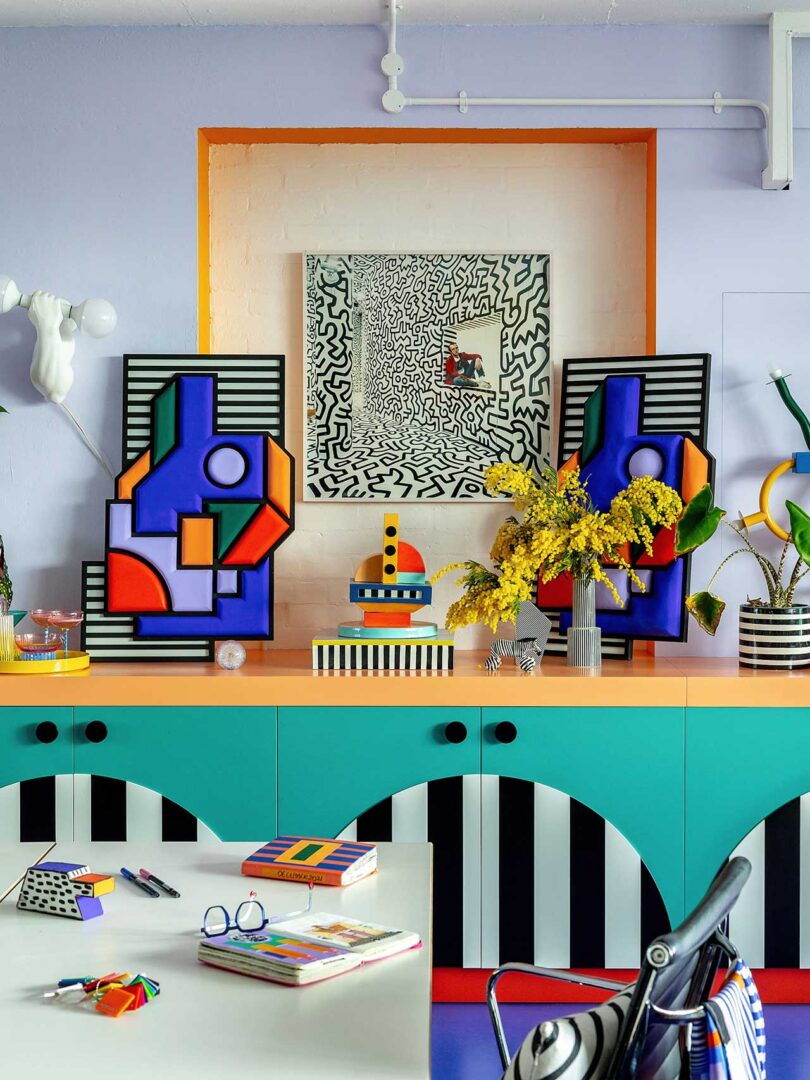
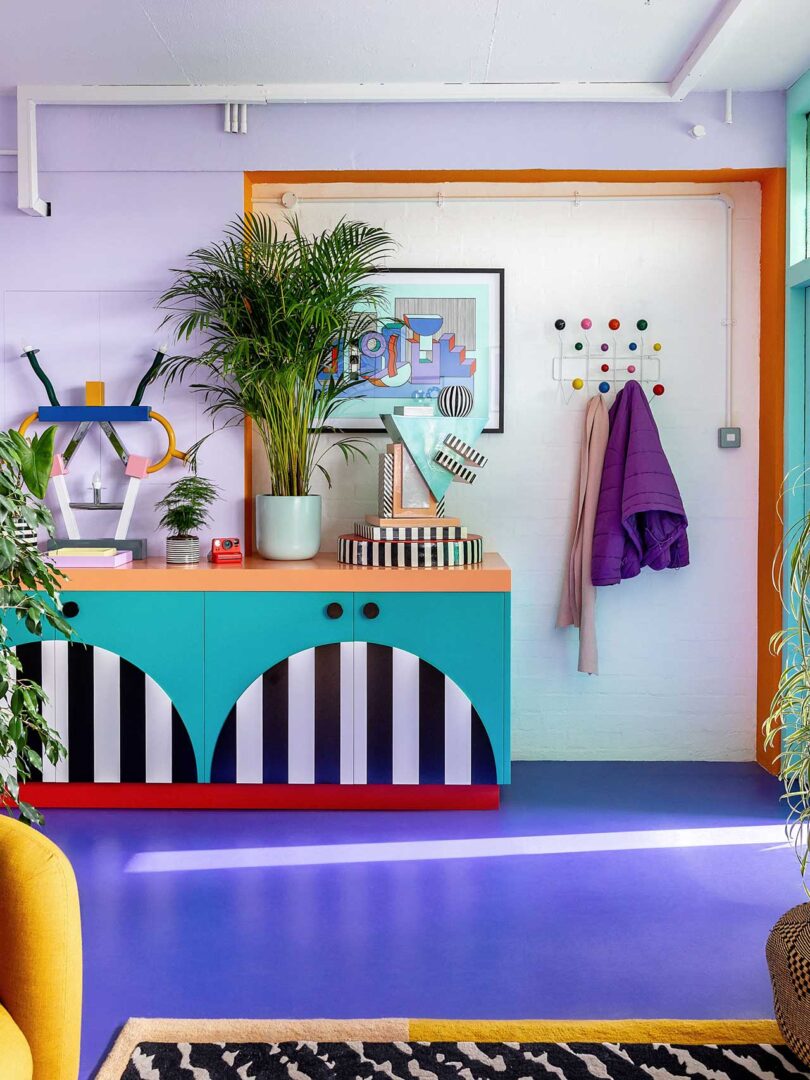
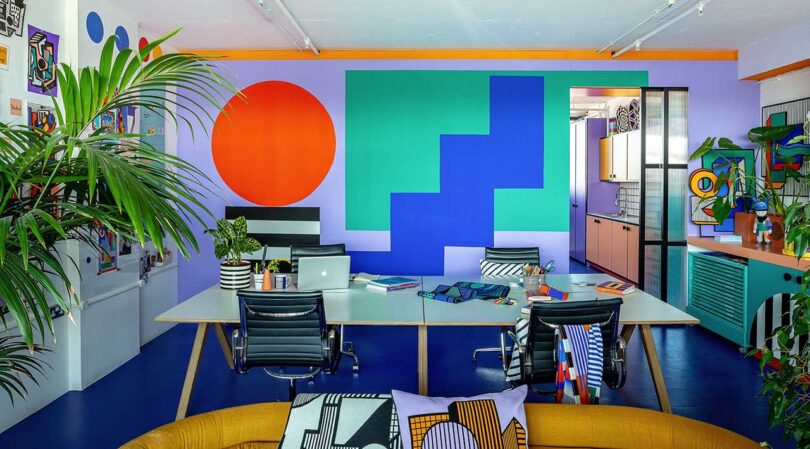
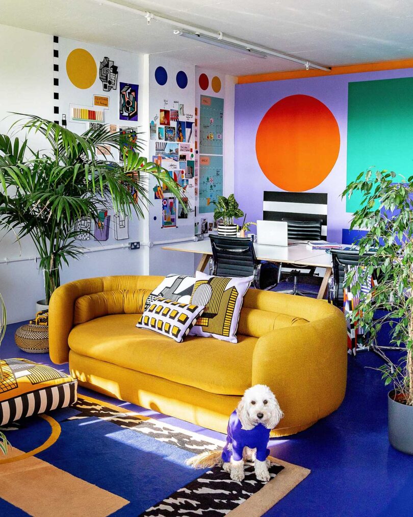
If ever there was an artist that could instantaneously spread utter happiness and pure joy, it would be the London-based Camille Walala. Known for her use of geometric patterns and bold colors, the French artist partnered with Our Department to translate her aesthetic into a vibrant new studio that is 100% inspiring. The new space at Regent Studios is equal parts Memphis, Pop art, and post-modernism – instantly recognizable with Walala’s signature stamp. There is zero doubt that nothing but magic happens here.
Having landed in London over 25 years ago, Walala has worked out of many offices along with her creative + life partner, Julia Jomaa. The duo brought in another pair – Simon Sawyer and Gustave Andre, aka Our Department – to help transform their abstract ideas into a functional space where they can bring their imaginative visions to life. Together, they realized a bright and dynamic space that’s bound to spark endless creativity.
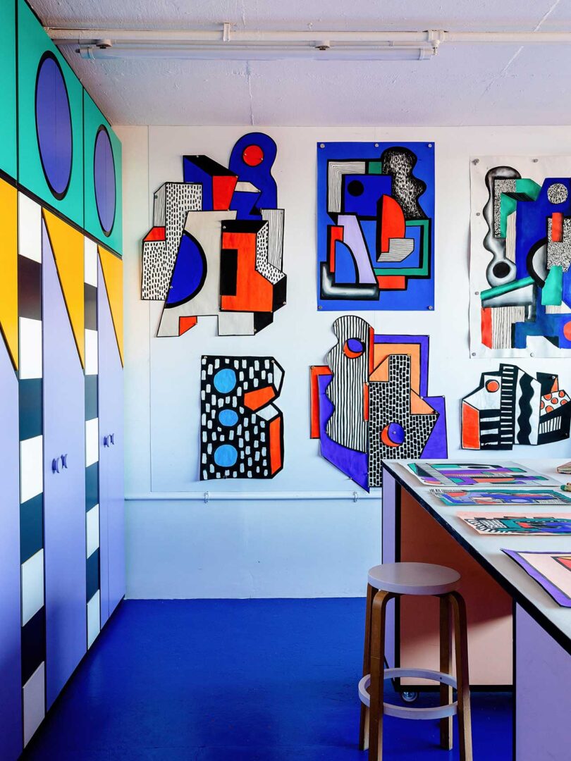
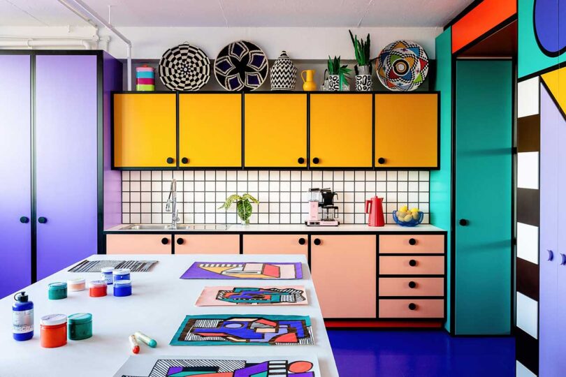
The studio is separated into two rooms: one where they can get messy with paint and model building, and the other for the “clean” work on computers. While fairly modest in size, the two spaces produce a plethora of work, including large-scale public project collaborations, and then smaller scale art, from paintings to sculptures to ceramics, that Walala creates herself.
At first, Walala was concerned about bringing in too much pattern and color, not wanting it to overtake the ongoing work rotating through the studio. “I enjoy the ambiance of the studio when I’m working. I want to inhabit the aesthetic fully, and push it in a new direction,” she said. “But I don’t want any Walala style at home, Julia and I just have artworks by other people we like.”
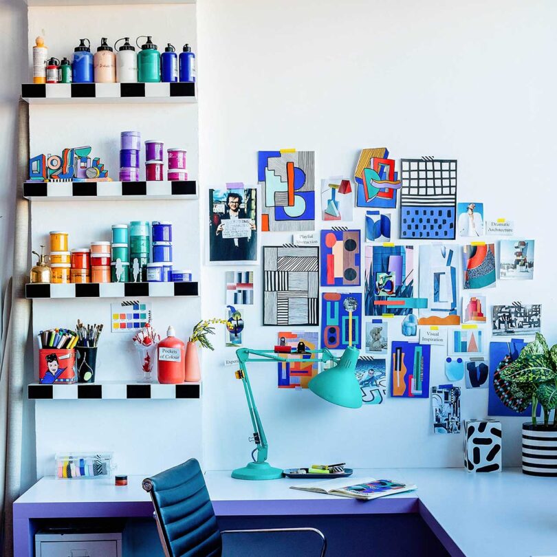
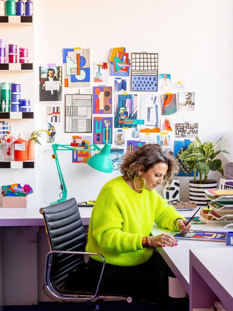
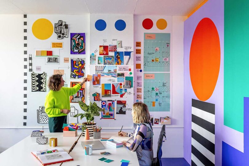
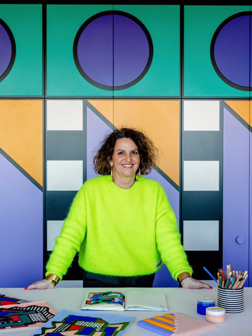
Each project starts with a sketch or drawing to get the inspiration going.
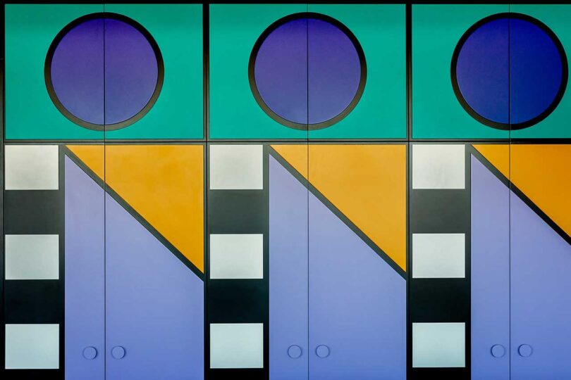
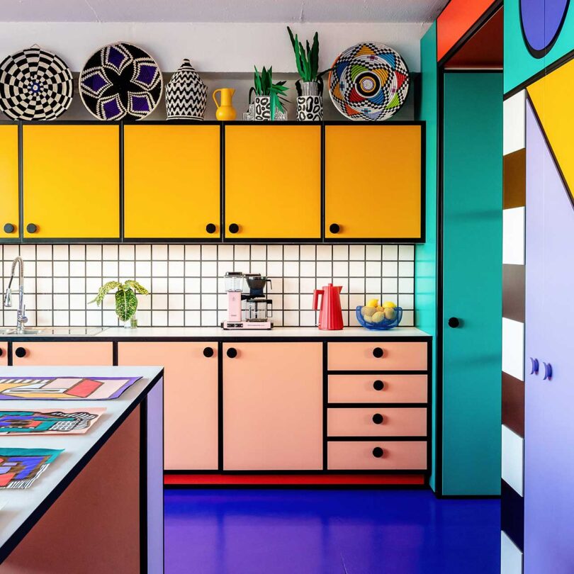
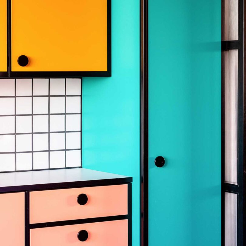
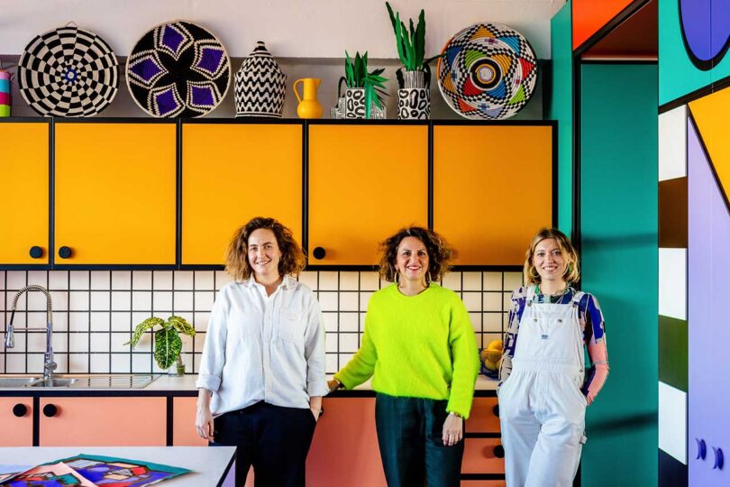
In the kitchen, the door and drawer fronts are painted in four bright colors, all unified with black outlines, a feature often seen throughout Walala’s work.
To ensure an overall cohesive space, Walala and Jomaa made a model of the design in SketchUp. Durable materials are used in order make the spaces as functional as possible, while guaranteeing they would last and maintain the aesthetic as long as they plan to stay there.
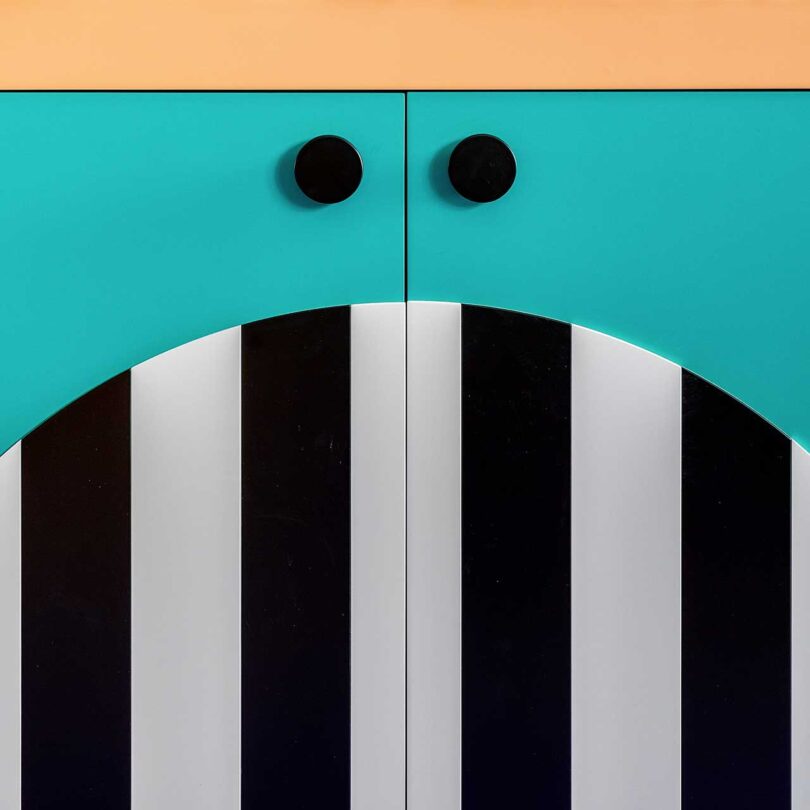
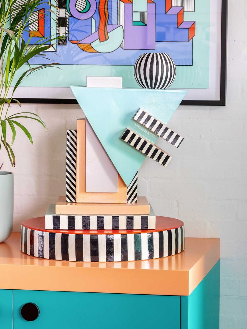
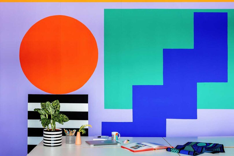
Her vivid color palette is grounded with the use of black, and in particular, black and white stripes.
Most everything is custom designed and built by Our Department out of smaller components that made it easier to put together on site. When they chose to leave the studio, the furniture and structures can easily be disassembled and moved.
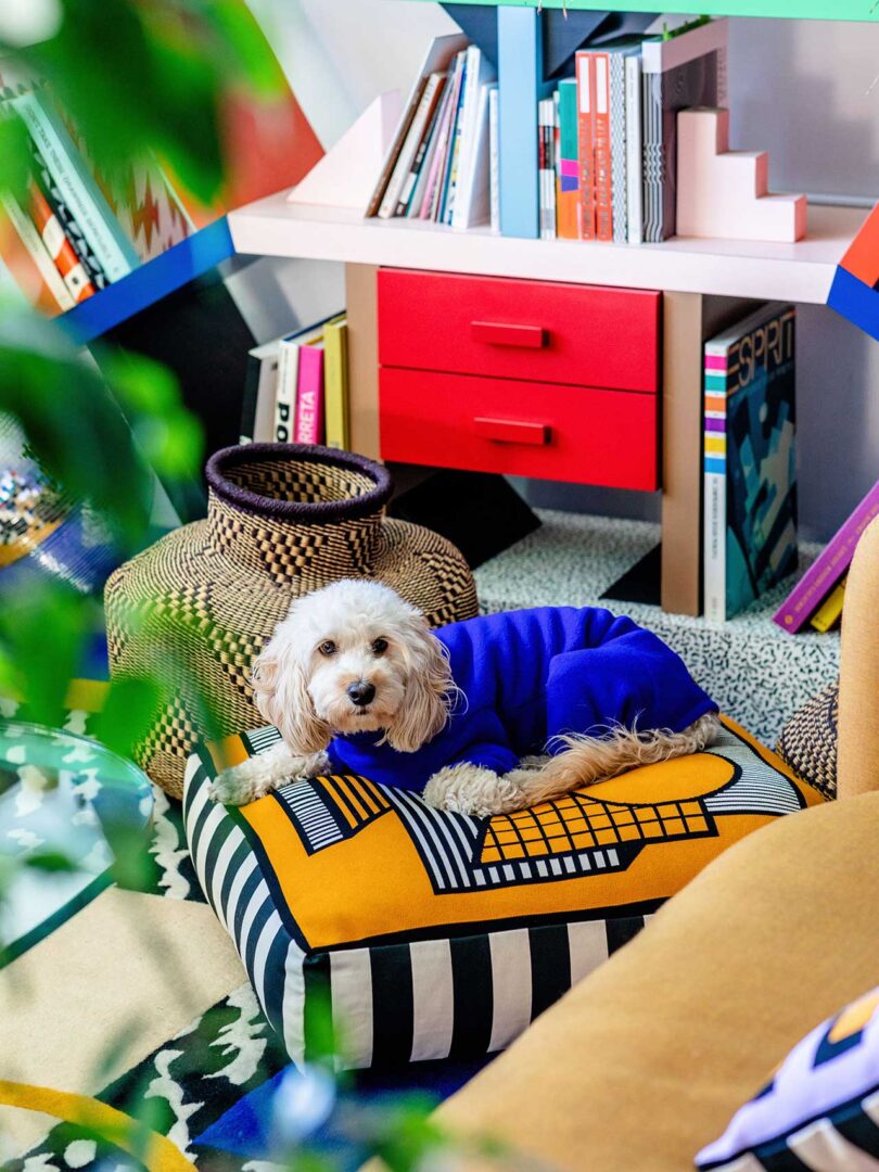
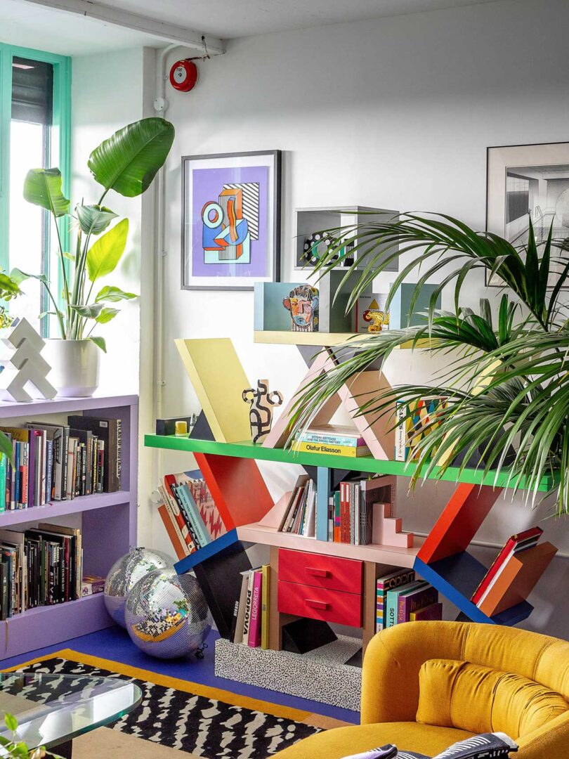
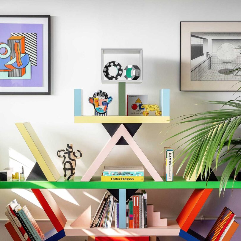
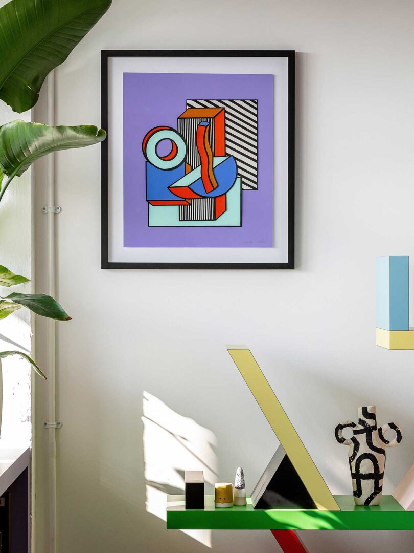
One of the most iconic pieces from the Memphis era, the Bookcase by Ettore Sottsass from 1981, stands out yet blends in perfectly.
Photos by Taran Wilkhu.
from Design MilkInterior Design Ideas for Your Modern Home | Design Milk https://ift.tt/ti3IDo6
via Design Milk




No comments