A Belgrade Office That Combines Playfulness and the Tranquility of Japanese Design
Studio ANTIPOD created a new, vibrant world for the Tenderly Office, where tranquility and playfulness merge for an engaging workspace. Located in Belgrade’s newly opened GTC building, this inspiring interior spans three floors, covering over 3,000 square meters. Overall, Studio ANTIPOD designed a captivating office that seamlessly integrates Japanese aesthetics and the fun of building blocks.
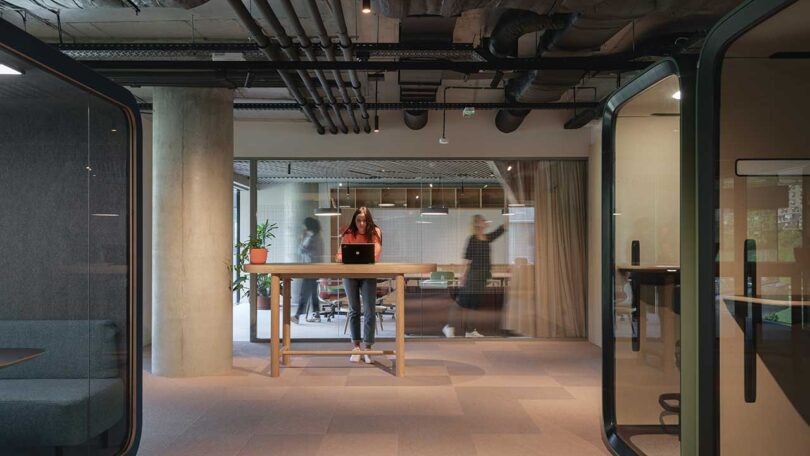
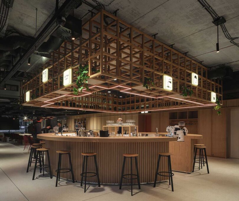
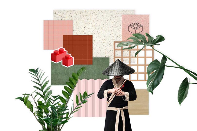
Drawing inspiration from the art of simplicity and harmony, the space reflects the calm essence of Japanese culture. From the use of grids to the mix of calming tones, natural materials, and abundant greenery, every detail has been thoughtfully crafted to create a layout that guides visitors through the space. The infusion of Japanese design philosophy not only enhances functionality but also fosters a sense of tranquility and security.
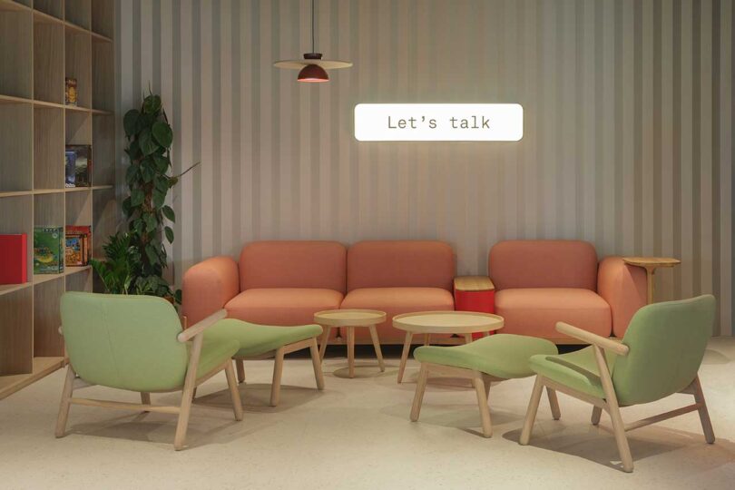
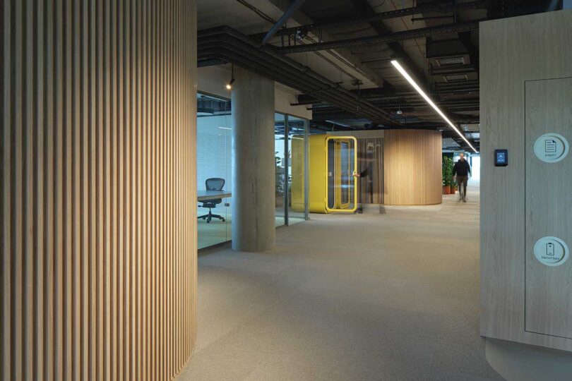
In contrast of the Japanese zen, the Tenderly Office embraces the playful nature of building blocks. Drawing inspiration from the childhood toy, the interior is energized with vibrant colors, playful shapes, and dynamic spatial configurations. The infusion of these striking tones breathes life into each element, creating a captivating atmosphere that sparks creativity and cultivates a lively work environment. In total, the Tenderly Office is designed to feel like home, where security, comfort, and imagination thrive.
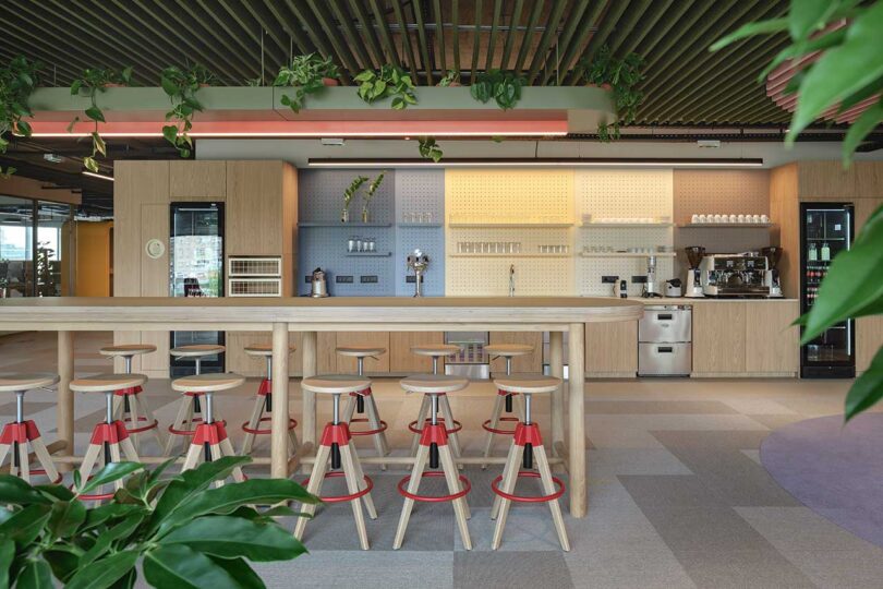
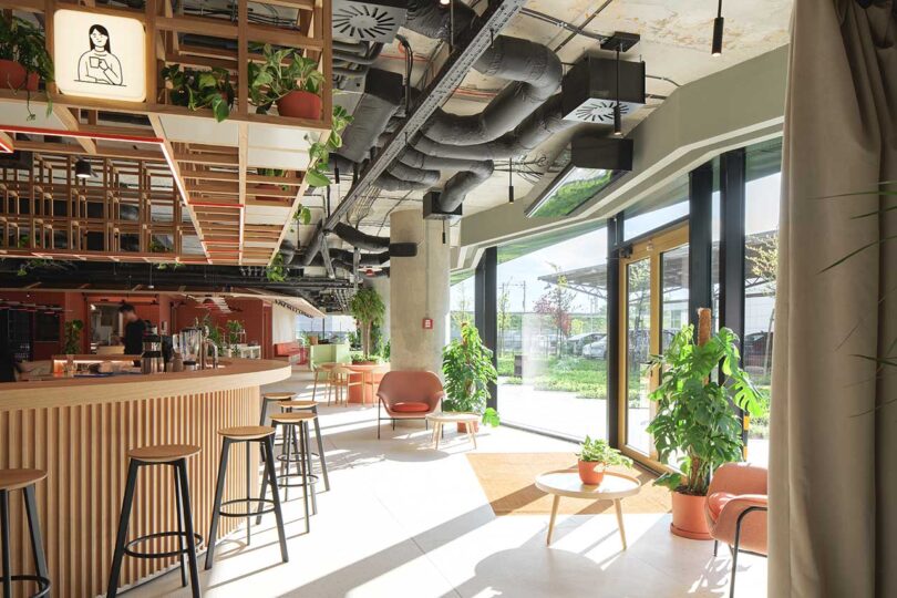
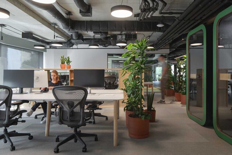
Lush green plants throughout add a biophilic touch, while helping to reduce sound, improve air quality, and boost productivity.
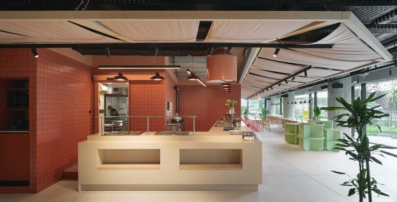
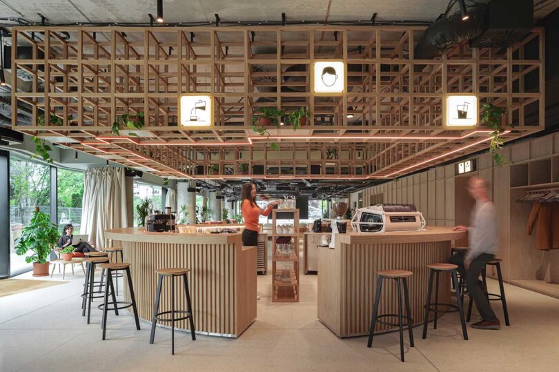
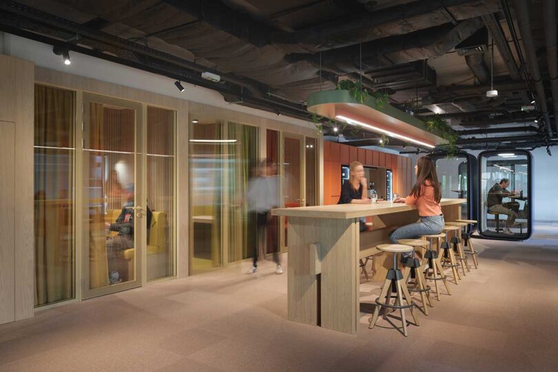
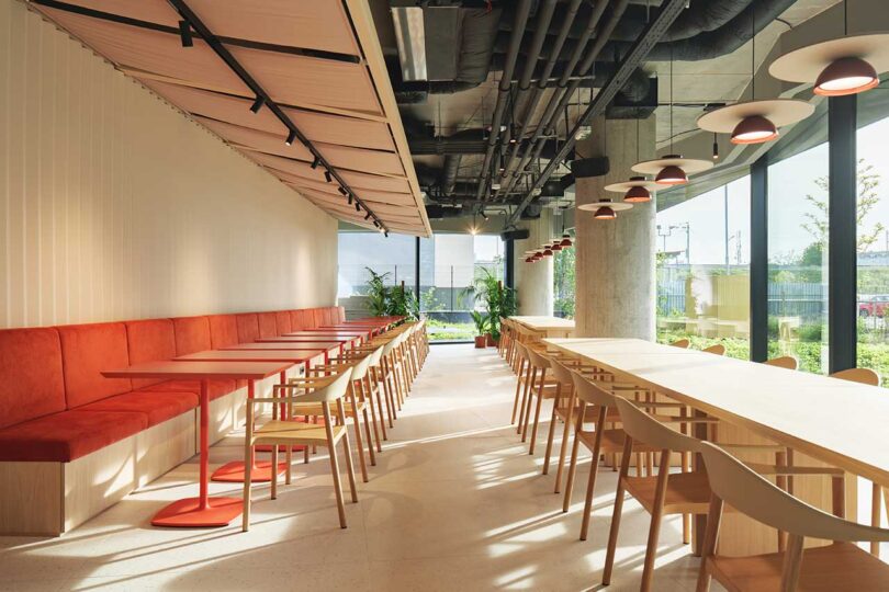
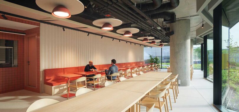
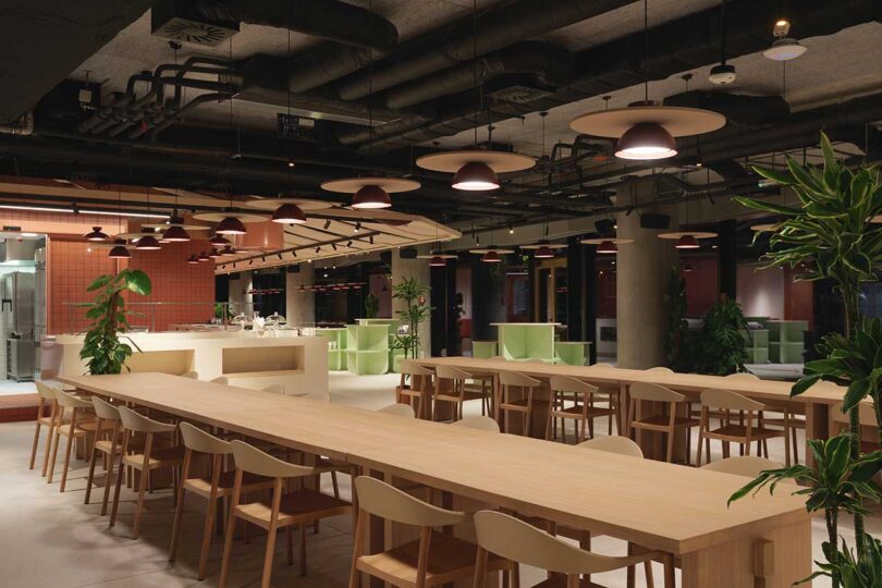
The ground floor serves as the central hub of the company, featuring a bar, canteen, and an auditorium. This multifunctional space acts as a focal point for socialization, idea exchange, and inspirational discussions. Its non-corporate aesthetics helps form a separation between the social zone and other areas dedicated to work.
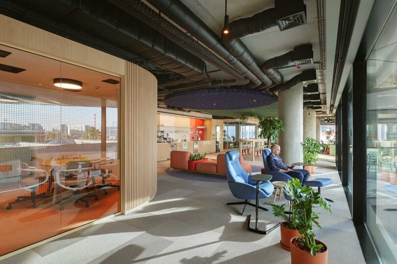
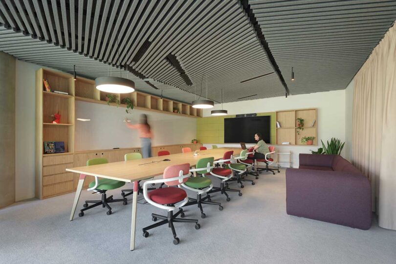
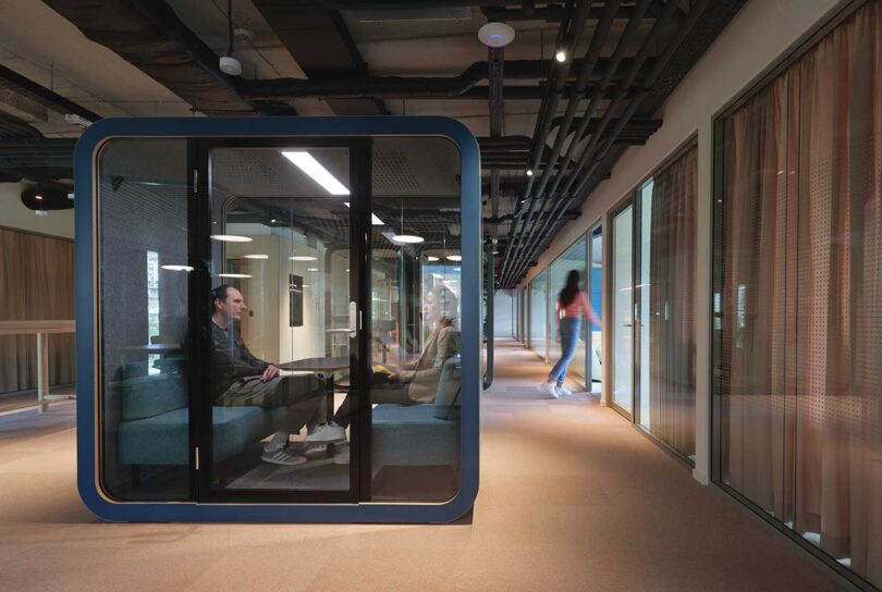
The second floor is designed as a peaceful escape for solo work and group meetings. Both dedicated spaces for focused work and meeting rooms offer serene surroundings that support team work and individual needs. Thoughtful soundproofing ensures interactions remain undisturbed, allowing individuals to immerse themselves in work or engage in group discussions.
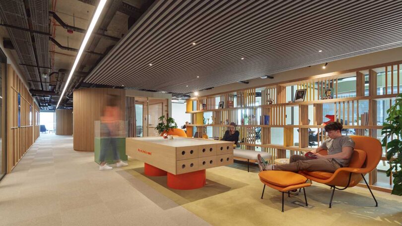
The third floor showcases a mix of open and closed offices, which support both teamwork and individual needs. This arrangement marks Tenderly’s approach to promoting collaborative work while also providing opportunities for personal growth. Spotted throughout the floor are quiet islands and pods for quick, spontaneous meetings for up to four people.
Photography by Relja Ivanić.
from Design MilkInterior Design Ideas for Your Modern Home | Design Milk https://ift.tt/2DlJu97
via Design Milk

No comments