MK&G Hamburg Unveils its Vibrant + Inspiring New Foyer Transformation
The Museum für Kunst und Gewerbe Hamburg (MK&G) has just undergone an awe-inspiring transformation of its foyer, courtesy of the creative minds at Studio Besau-Marguerre. After an arduous four and a half months of renovation work, the MK&G now opens its doors to visitors with a harmonious fusion of design, functionality, and hospitality.
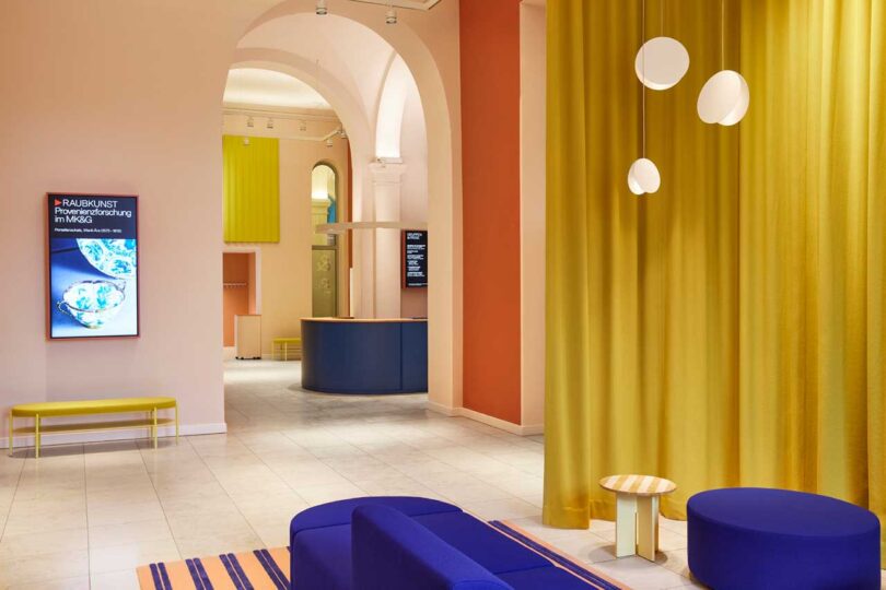
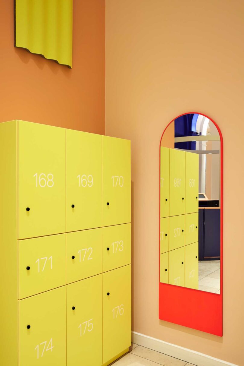
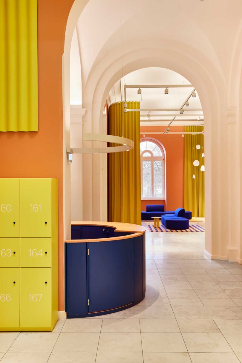
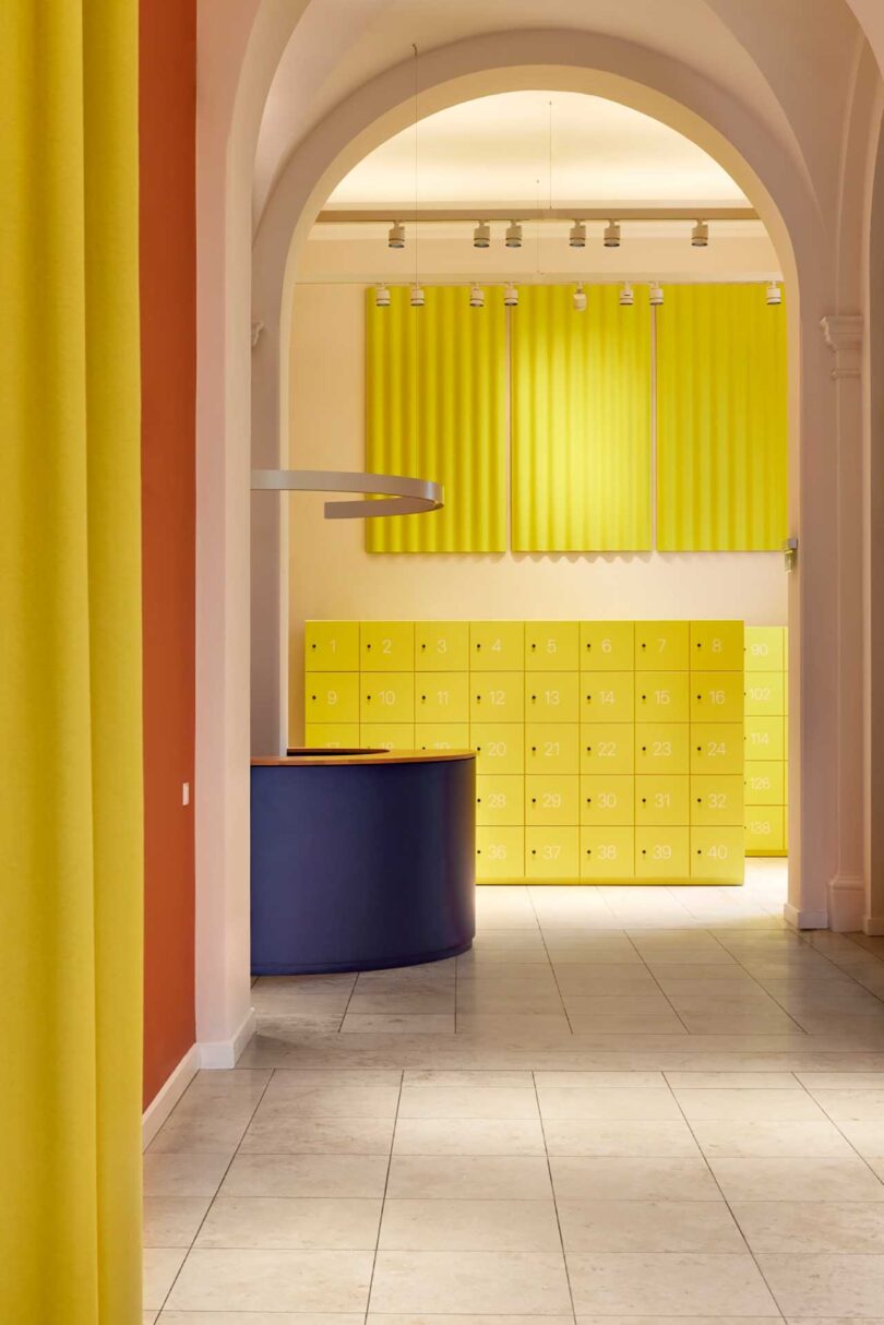
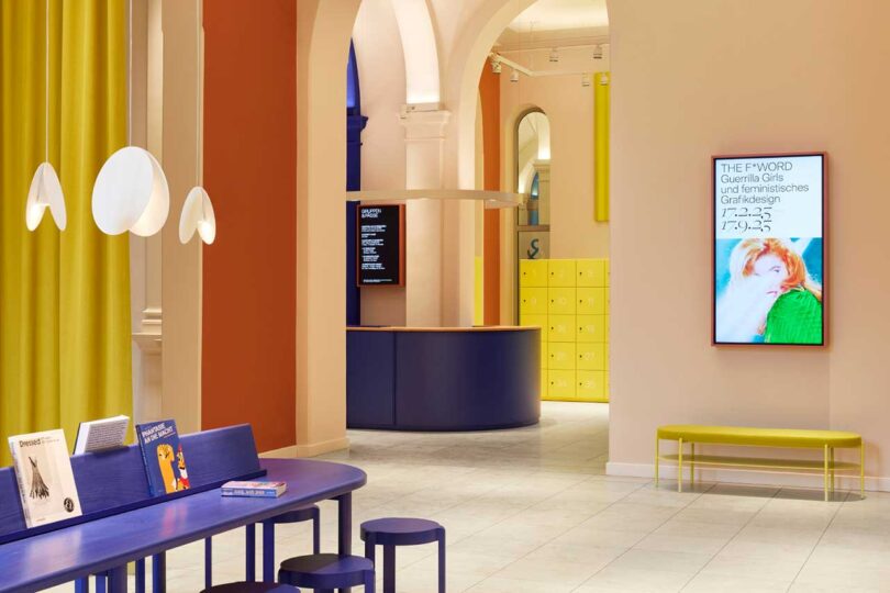
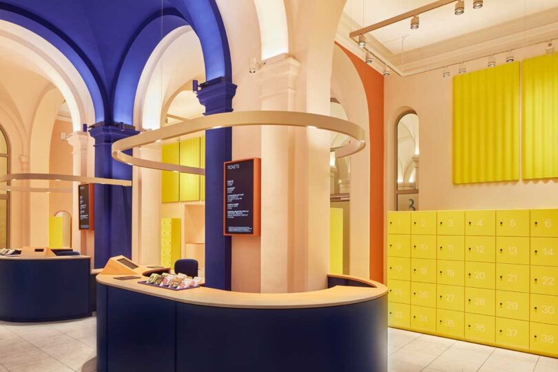
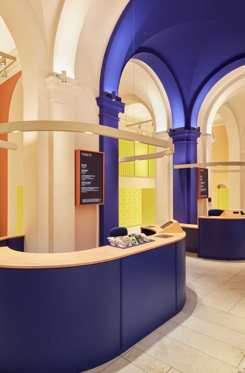
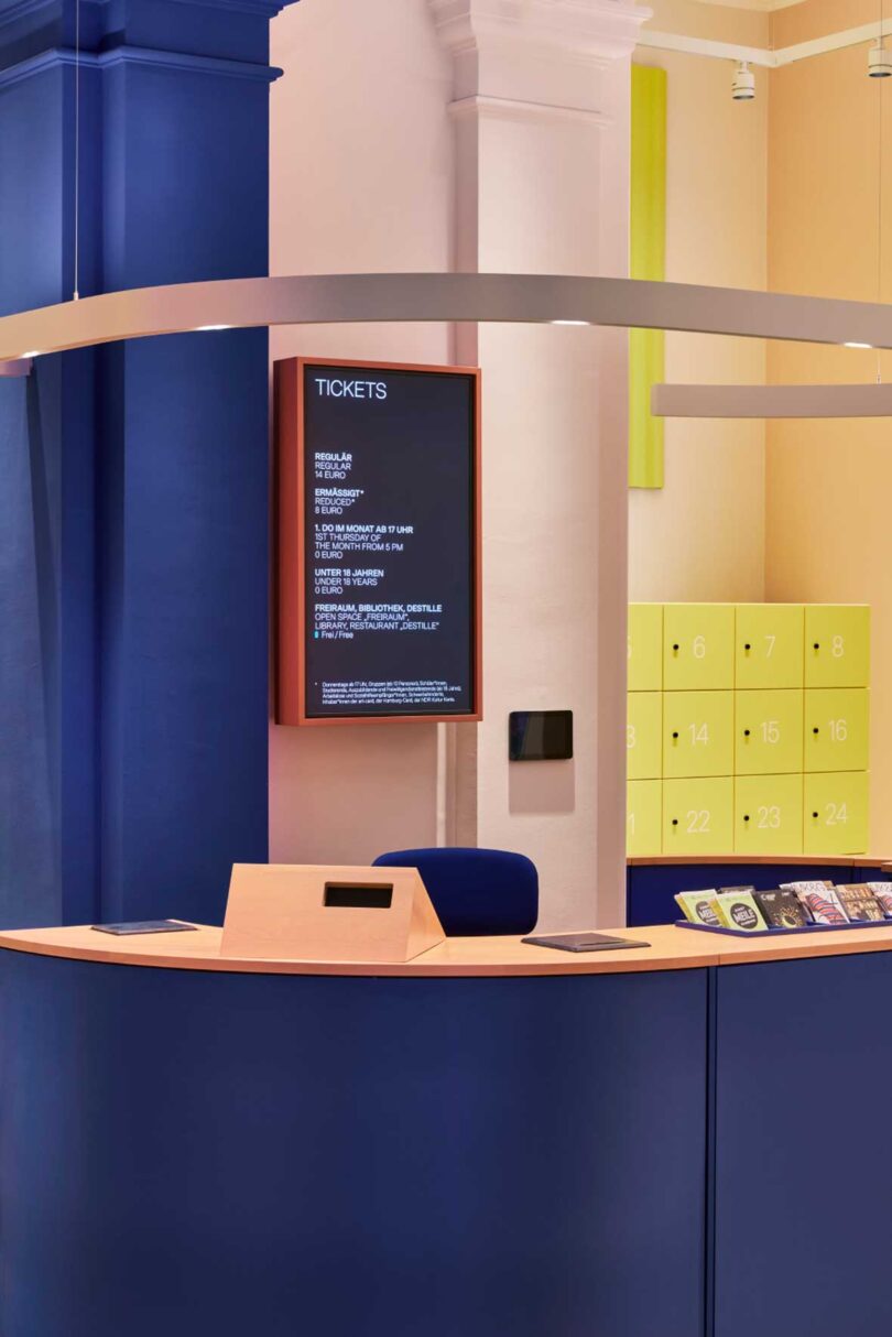
At the heart of the redesign, and after much observation of visitor flows, is a clear guidance system that not only ensures the safety and well-being of guests and staff, but also enhances the overall experience. The reception area is aligned along the entrance’s visual sight lines, ensuring smooth orientation for all visitors. Cloakrooms and bright yellow lockers are thoughtfully positioned to respect the logical steps of a museum visit while adhering to social distancing norms.
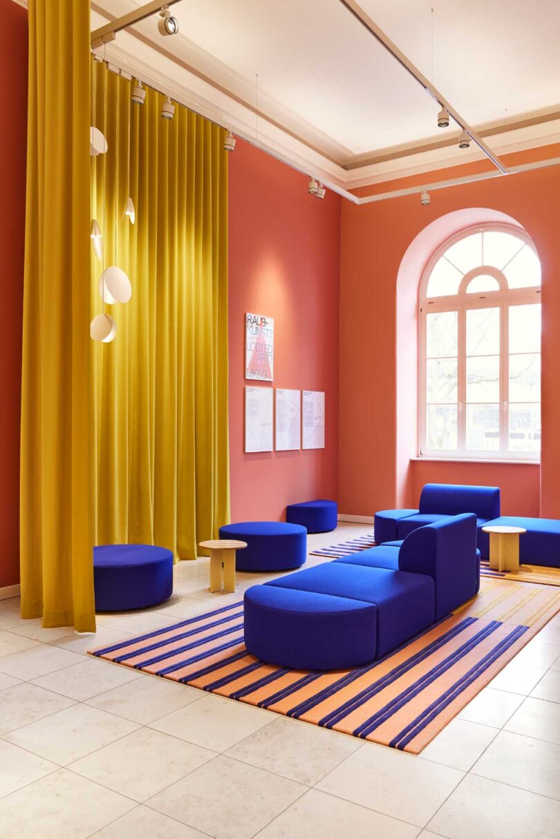
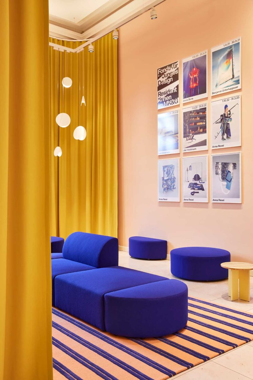
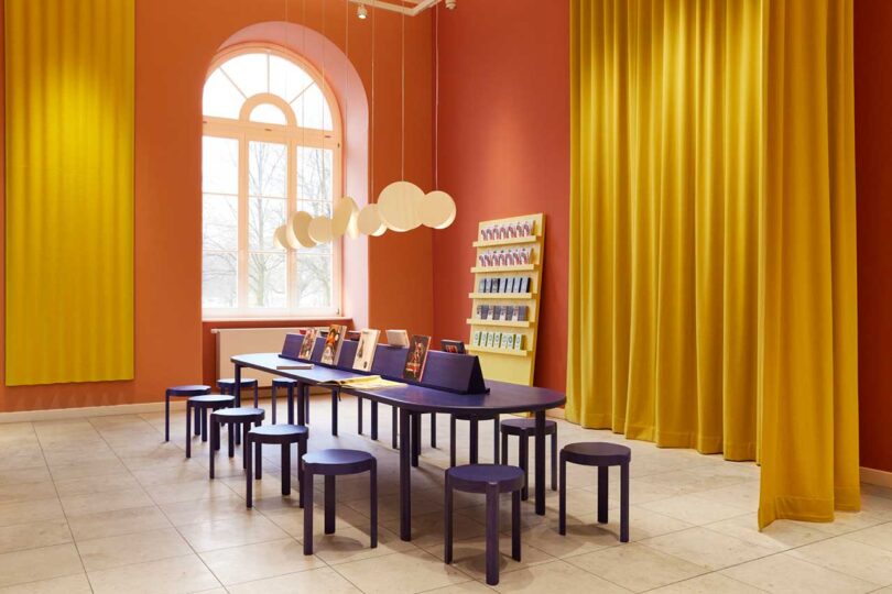
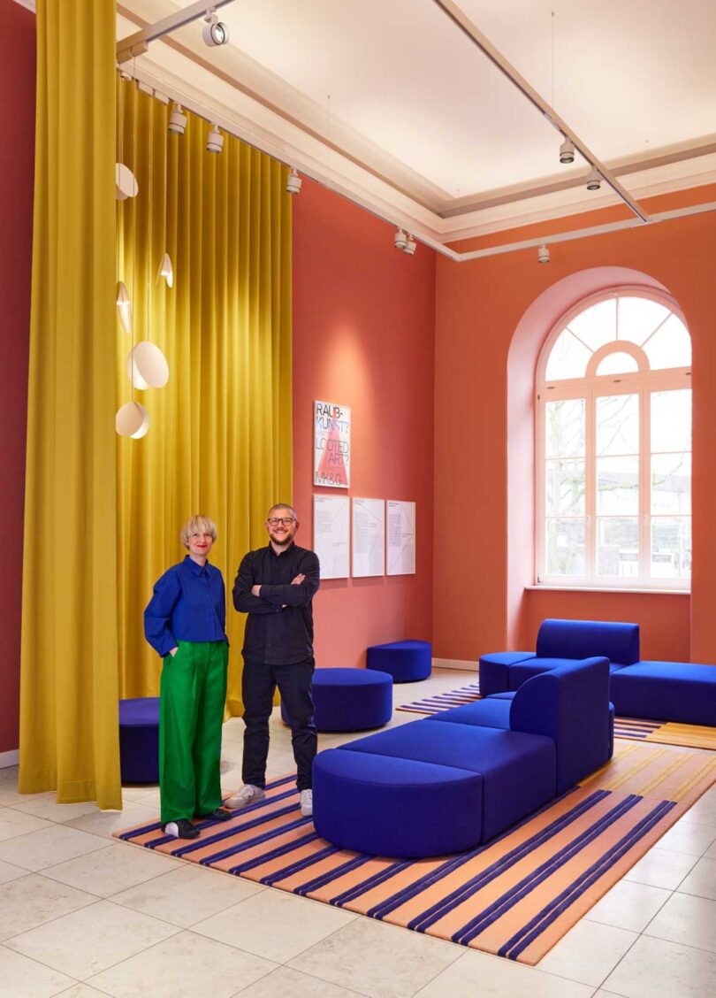
Off to the left of the foyer is a lounge space that boasts modular seating options in a bold cobalt blue that will invite visitors to take a rest.
Studio Besau-Marguerre created a vibrant color scheme, including vivid blue, bright yellow, and four shades of terracotta, to form a captivating guidance system. As visitors journey through the foyer, they’ll be intuitively led to the side spaces through four color gradations – from pale pink to dark terracotta. Not only do they give nod to the historical color scheme of the coffered ceiling in the vestibule, but they also infuse a contemporary flair that sparks creativity throughout.
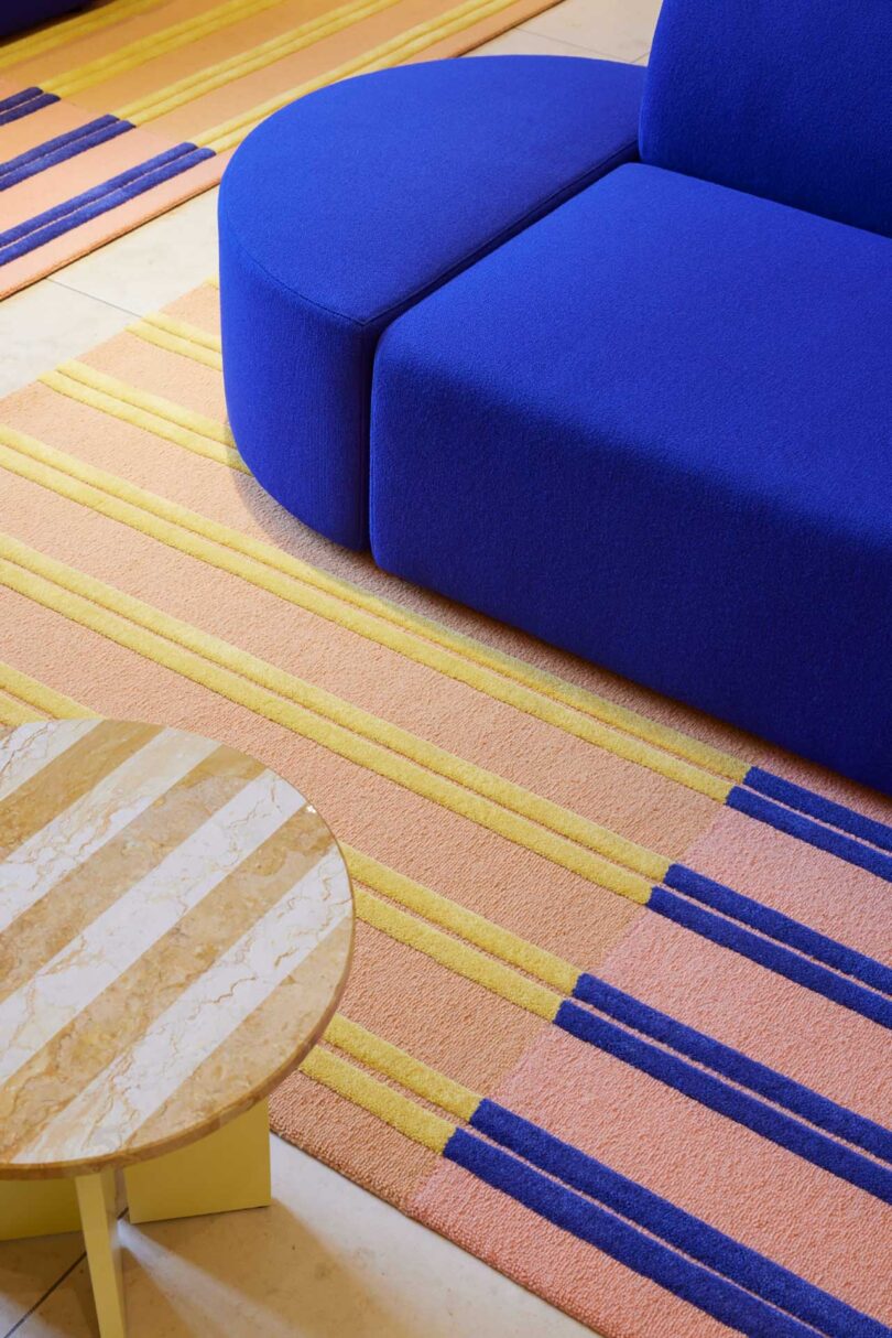
The interior evokes feelings of coziness and sophistication, with soft materials like wood, wool, and hand-tufted carpets. The designers have even paid attention to the acoustics, ensuring that the ambiance remains pleasant throughout each visit. Curtains hung in a semi-circle enhance sound quality, complementing the new acoustic ceiling and panels on the walls.
From Eva Marguerre and Marcel Besau:
We found redesigning the MK&G foyer to be an especially enjoyable task. This is where visitors get their first impression of the museum. So we endeavored to create an inviting spot that draws people into world of art and design while already sparking inspiration! Particularly exciting for us was the dialogue between the historical architecture and a contemporary interior.
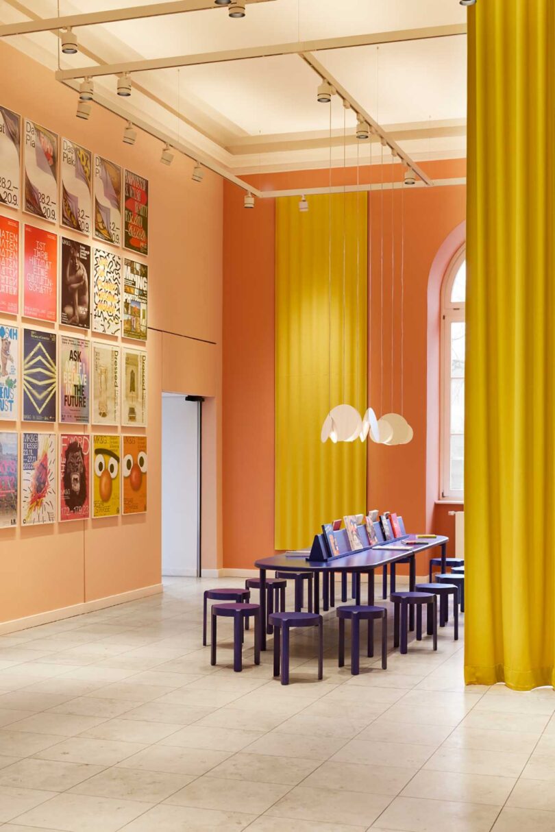
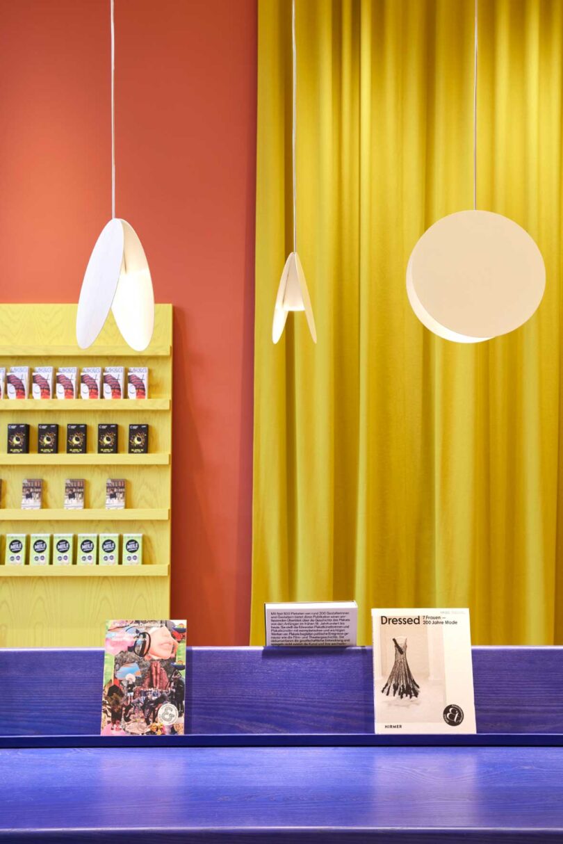
Equipped with a long blue table filled with literature on the themes showcased in the exhibitions, the media lounge is perfect for school classes or events. On the walls, a sea of exhibition posters from the MK&G’s diverse program, sets the mood for further museum exploration.
Inspired by the rounded arches in the museum’s historical building, rounded shapes are incorporated to create a cohesive feel.
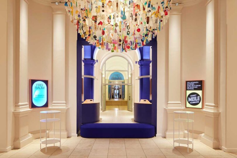
In the center of the foyer, Stuart Haygarth’s “Tide 200” chandelier greets visitors with a mesmerizing, colorful display of found beach plastics.
The redesign of the foyer area completed in cooperation with Sprinkenhof GmbH and in accordance with guidelines set by Hamburg’s Ministry of Culture and Media and Monument Protection Office. Also involved in the project were SWP Architekten, Wittmaack Ingenieurgesellschaft from Elmshorn, and Licht 01 Lighting Design from Hamburg.
Photography by Brita Sönnichsen.
from Design MilkInterior Design Ideas for Your Modern Home | Design Milk https://ift.tt/RiDAhX2
via Design Milk





No comments