Design ni Dukaan Explores Sensory Perception Through Novel Office Design
Design ni Dukaan subverts expectations of the architectural process from the creative brief to the fully realized concepts reflected in their fresh approach to interiors and space planning in an office project located in the city of Gandhidham in Gujarat, India. Through enhancing the intrinsic qualities of their material palette, the Ahmedabad-based architecture firm, helmed by Veeram Shah, seeks to elevate the level of craft one might expect in workplace design.
“Let us make an attempt to use our knowledge and details to reimagine office spaces,” Shah says in his client briefs. “Can we use materiality as a means to find a solution for this? Can we use this process to create a warm work culture? Can art inserts become a seamless part of the volume?” As evidenced by this project, an atmosphere empathetic to user experience has the potential to induce positivity and in turn foster a more productive workplace.
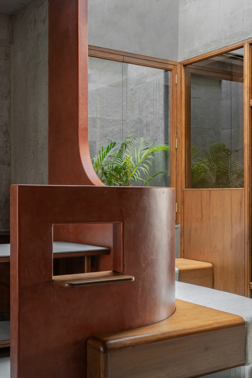
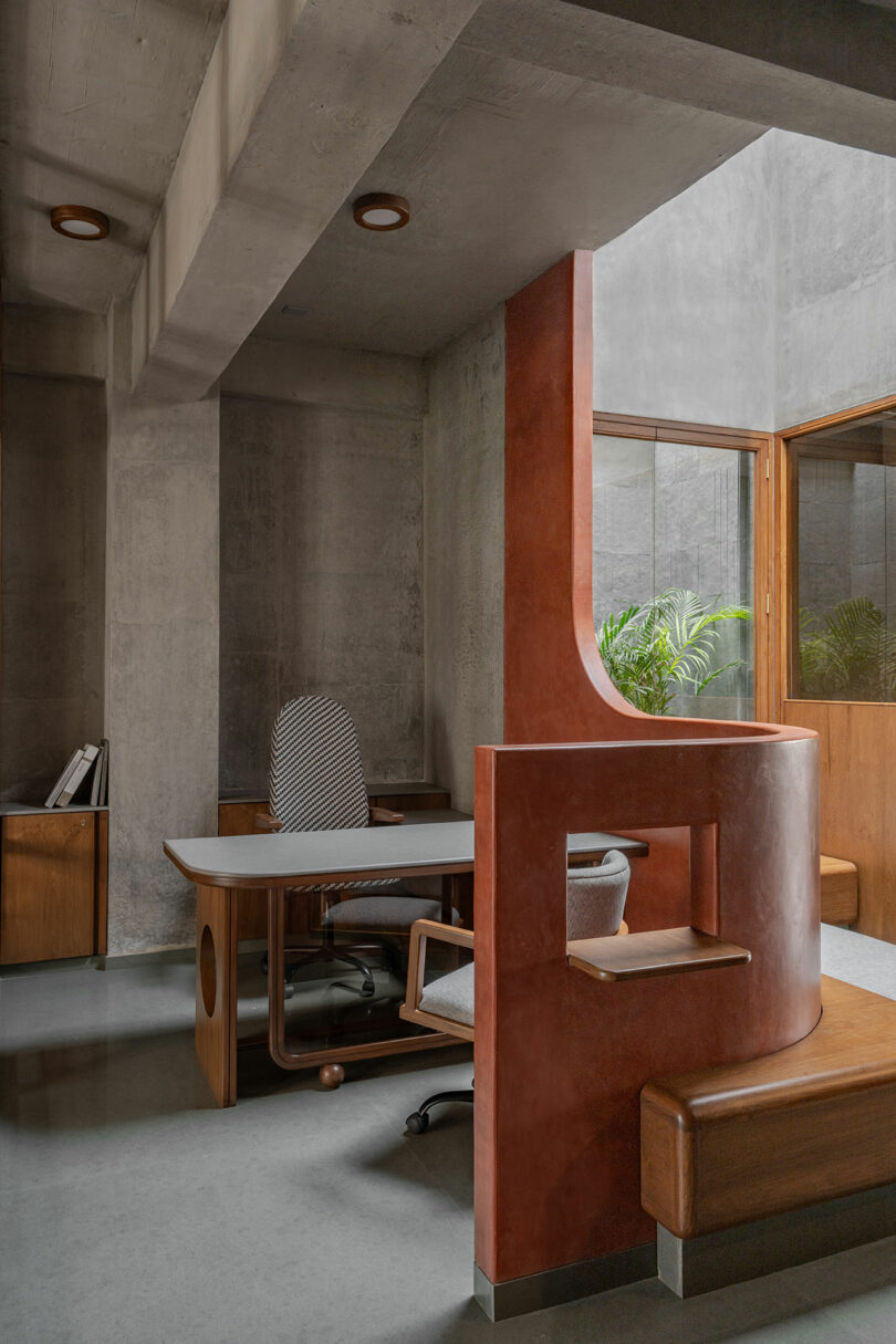
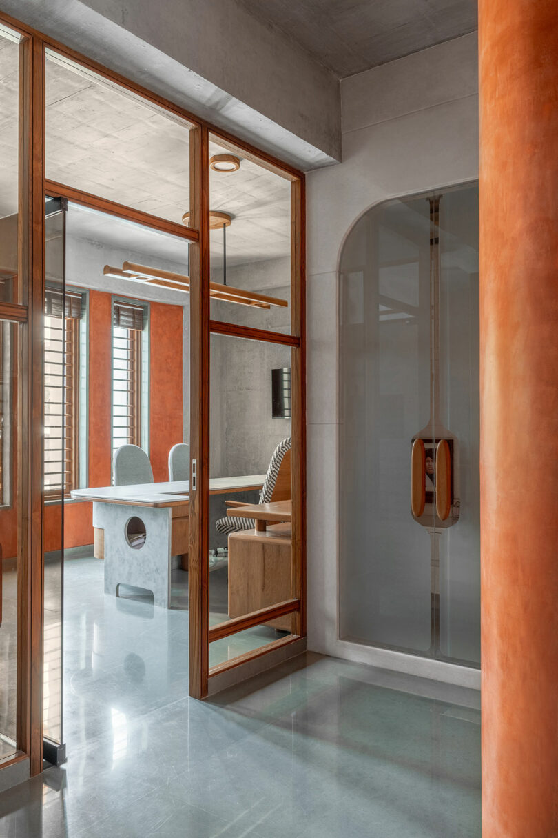
The 1,328-square-foot space embraces the existing architectural structure, weaving material and programming together through a volume that feels more like inhabiting an art installation than a corporate headquarters. Much like adaptive reuse, this approach conserves resources by forgoing the need for a great deal of virgin materials while allowing the building’s unique imperfections to be sewn into the present with warm teak, brown glass, and terracotta microcement. “We are glad that the client’s vision is aligned with ours,” Shah says.
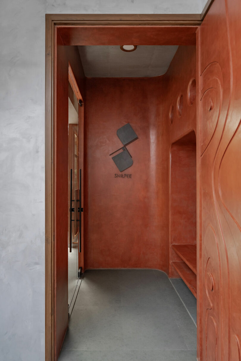
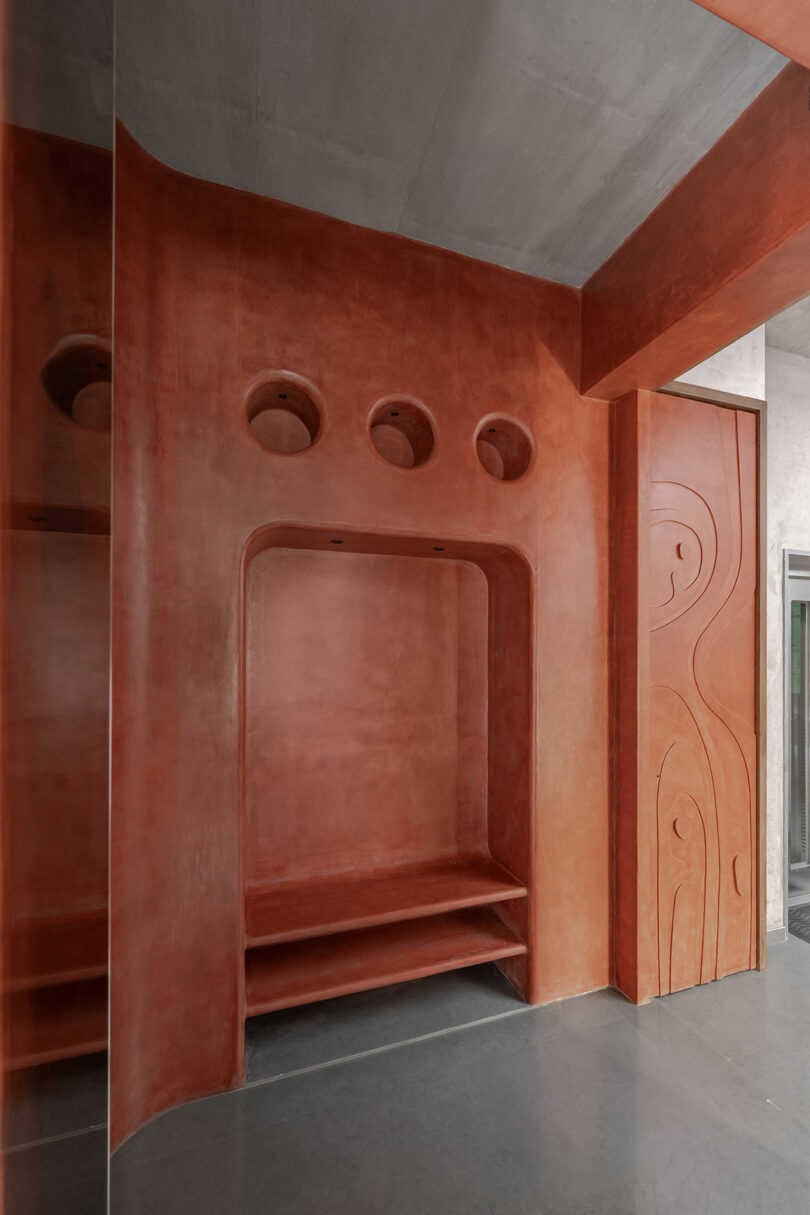
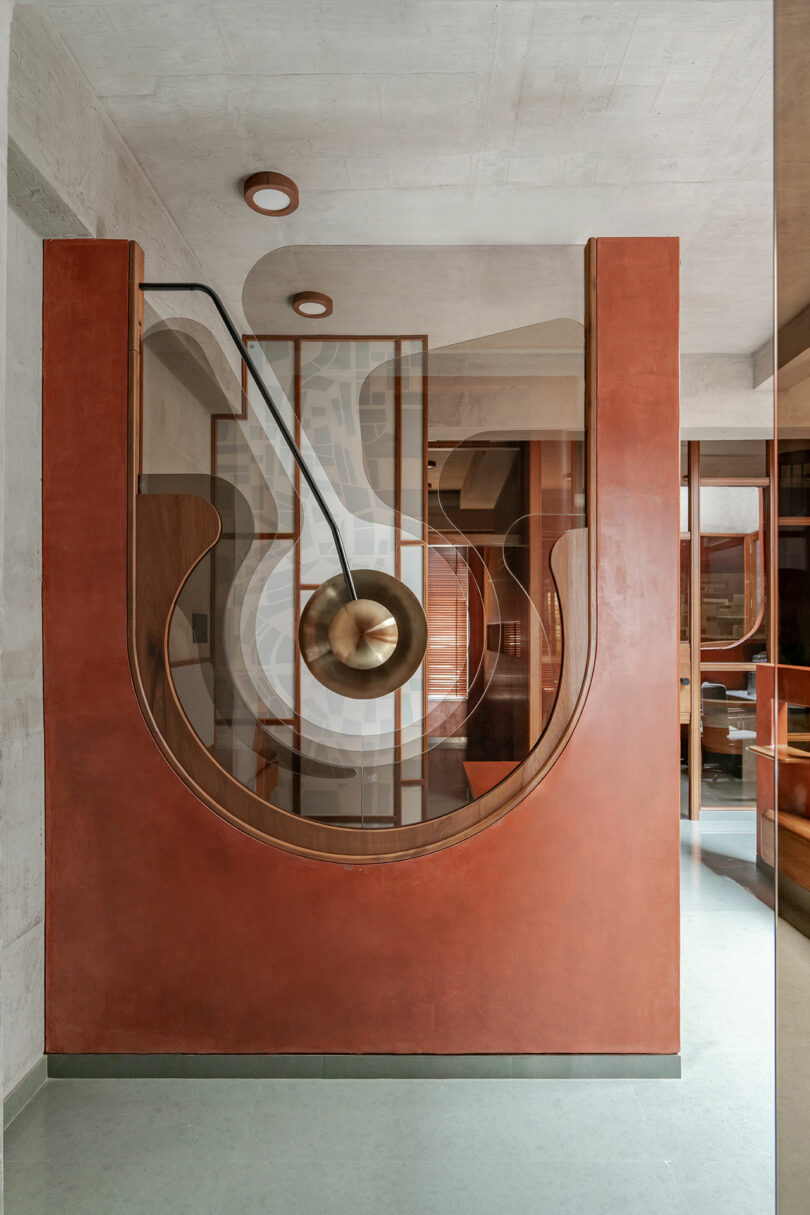
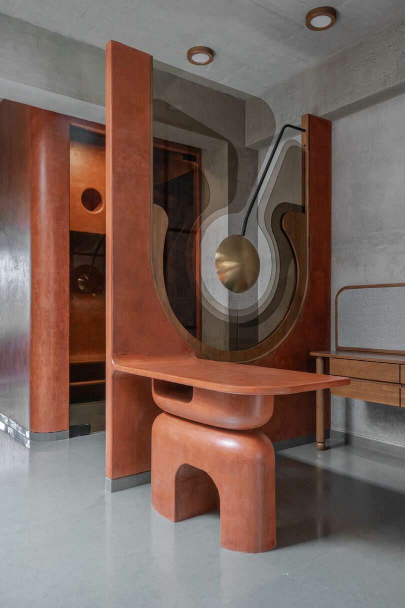
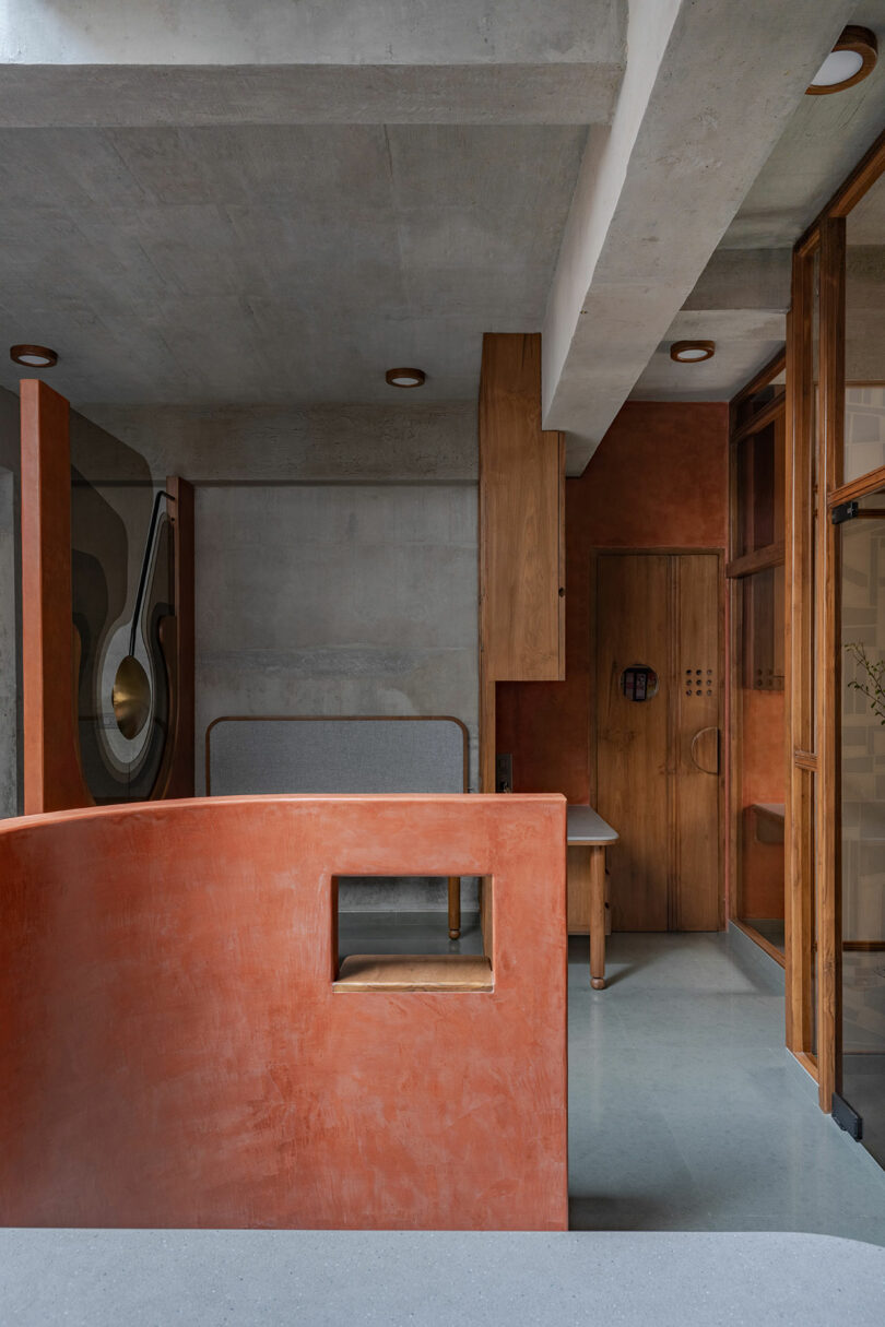
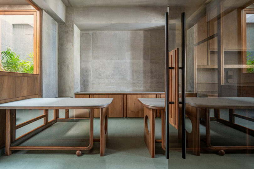
Traditional sliding shutters are traded for a folding door adorned with modernist patterns to avoid using commercial solutions upon entry to the building proper and foreshadowing the bespoke experience ahead. Visitors make their way to a vestibule seemingly carved out of stone, with ledges that serve as seating for rest and shelves to accommodate shoe storage, before turning the corner to be greeted by an art wall. The intervention is composed of 5 layers of 5mm thick brown glass that creates a halo effect when activated by daylight. A sculptural reception table pulls focus then moves the eye opposite to a sinuous curve wrapping around the waiting area and casual seating, which is flooded with daylight.
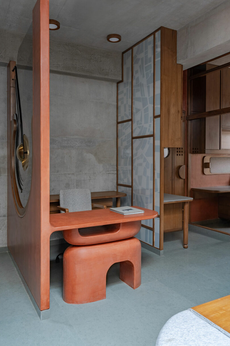
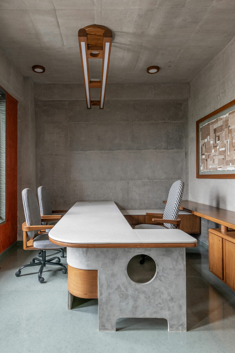
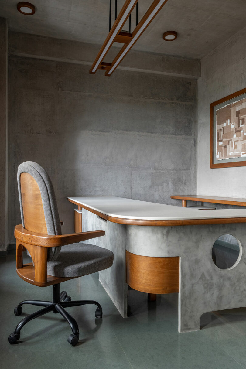
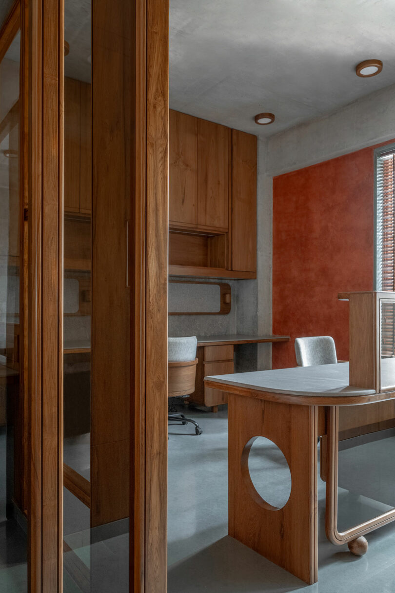
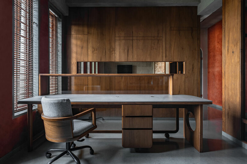
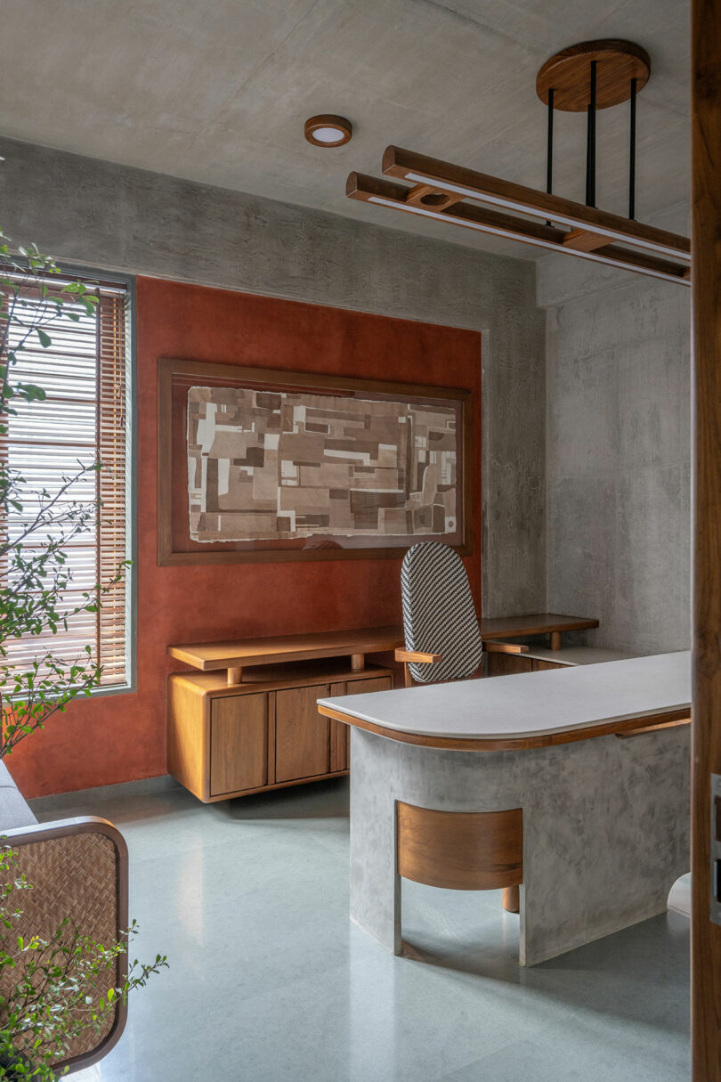
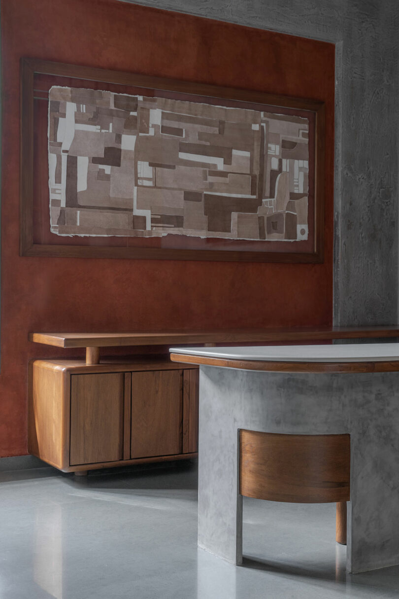
Flanking the public spaces are a variety of workstations with varying amounts of privacy. The southernmost end of the office houses the first executive cabin, kitchenette, and lavatory, while the opposite end features the second executive cabin and marble Mandir hidden behind doors with ornamentation to denote its significance. Furnishings like the tables take a cue from their context showcasing micro concrete punctuated by wood’s warmth.
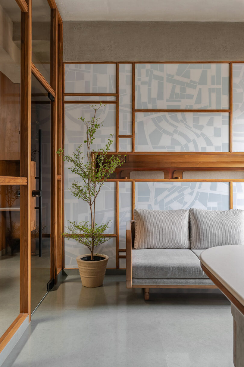
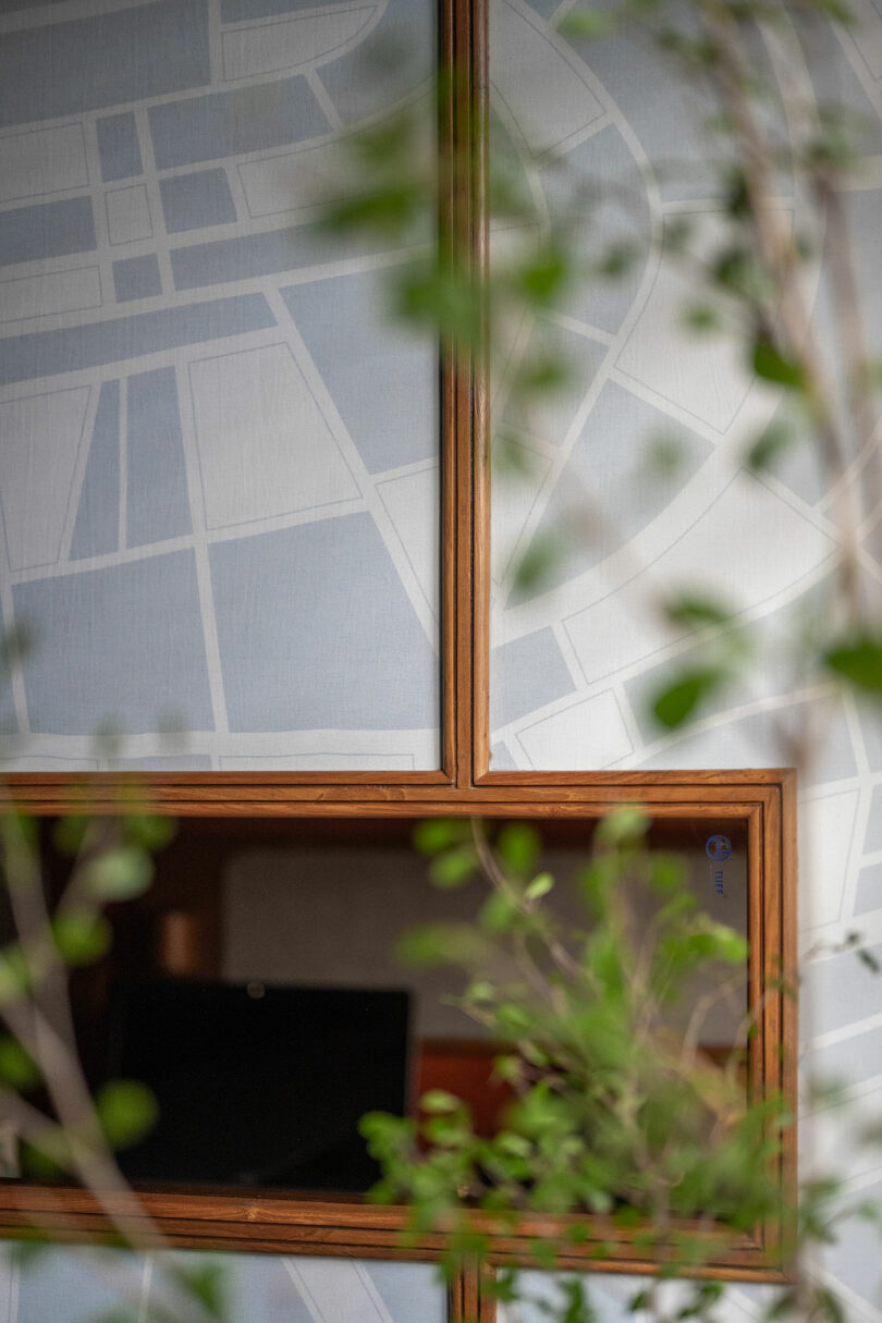
Illustrated elements also echo through wall treatments, installations, and artwork. Successful solutions are just as much a collaboration between the client and design team as they are conversations with the visual language of the past and present. Pattern-making is a particular device employed by the studio taking inspiration from Burle Marx to inspire surface treatments for solid partitions and sandwiched glass details.
The firm also collaborated with artist Rutva Joshi for original pieces that hang in the executive cabins. “We deliberated upon the conceptualization of an office environment characterized by monochromatic aesthetics. As an artist, my creative vernacular is rooted in map making, and in this particular context, I drew inspiration from the intricacies of Gandhidham city where the office is situated,” Joshi says. “The resulting artistic expression manifests in the deliberate integration of geometric forms within a cartographic framework. It’s crucial to note that the mapped representation of Gandhidham is a result of imaginative exploration, not an accurate depiction.”
This peculiar assignment evolved into a creative exercise for the architect rather than a curation of furnishings at the client’s behest, typical of some interior design. “Every facet of this project from the lights, loose furniture, office chairs, handle details, murals, art and even the logo of the company was designed by Design Ni Dukaan,” Shah adds. “The sense of artistic fulfillment that permeates this endeavor is simply sublime.”
Photography by Kuber Shah, courtesy of Design Ni Dukaan.
from Design MilkInterior Design Ideas for Your Modern Home | Design Milk https://ift.tt/38Equev
via Design Milk


No comments