The New Malin Makes a Statement With Bold, Graphic Language
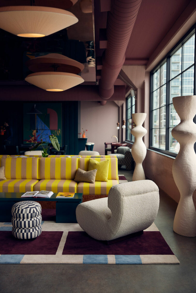
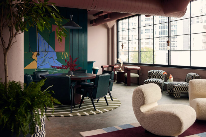
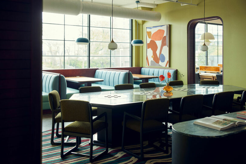
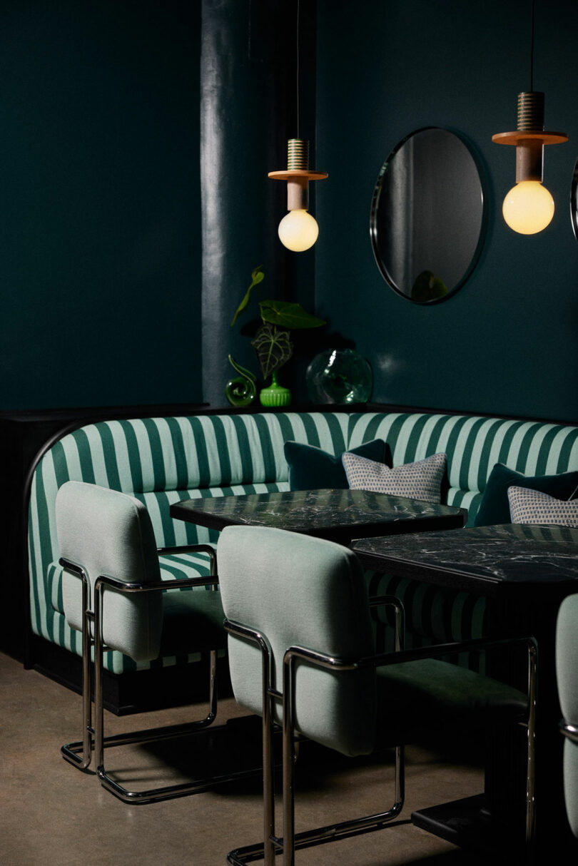
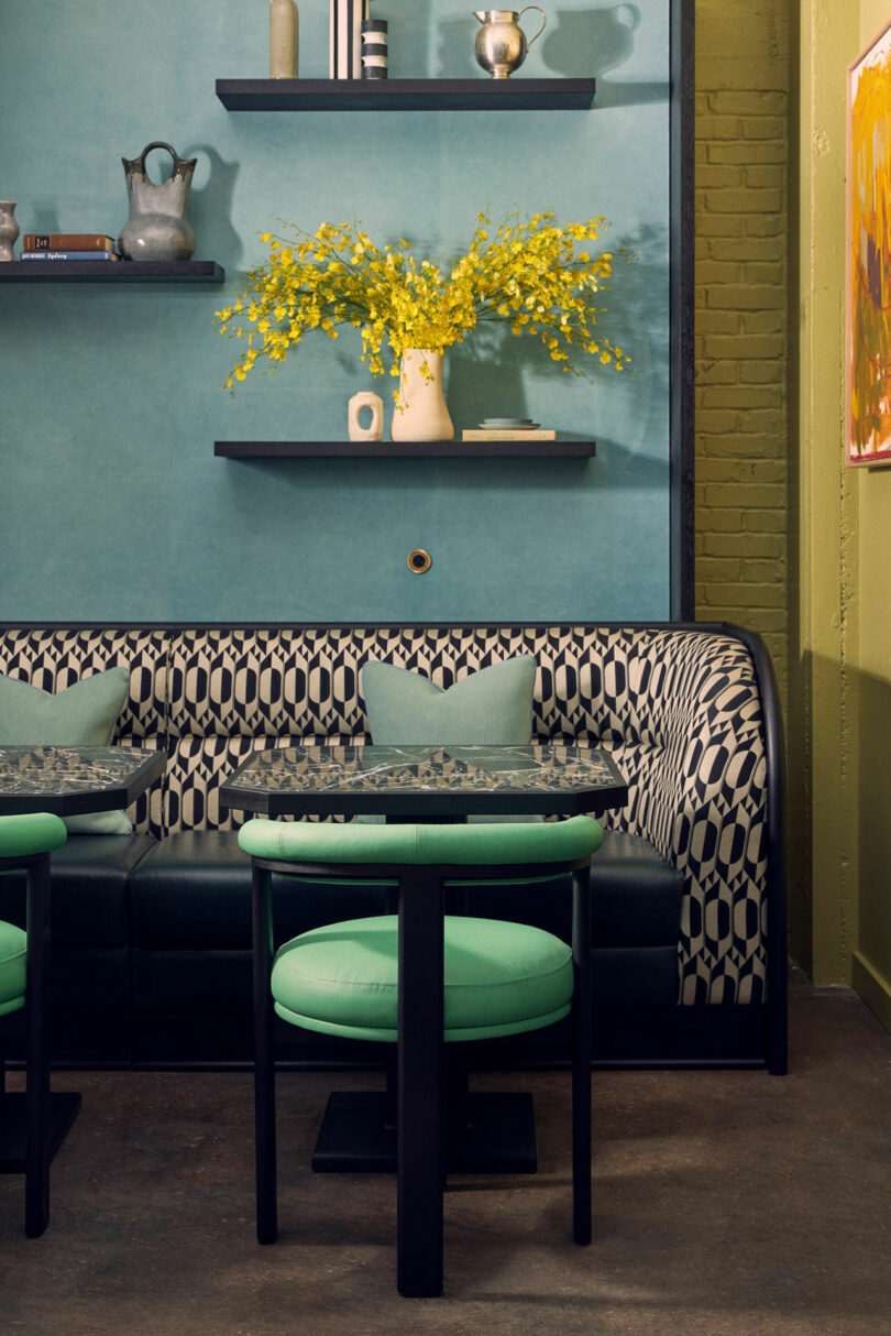
Contrasting jewel-tones supersaturate vibrant graphic patterns while panoramic grid windows conjure sculptural silhouettes from furnishings awash in sunlight to create an other-worldy atmosphere inside The Malin South Gulch opening in Nashville, Tennessee. The not-so-subtle alchemy of color, form, and scale, by Roísín Lafferty of her eponymous Dublin-based design house, makes for an amenitized, professional members club atypical of the drab coworking facilities that have failed to contribute much to their respective local fabrics.
“Nashville is a rising professional and cultural epicenter, with strong and vibrant local communities,” says Ciarán McGuigan, The Malin’s founder and CEO. “I’ve been a long time admirer of Roísín Lafferty’s confident concepts, something we thought would resonate well in the South Gulch. Their bold approach offers a fresh perspective within The Malin’s network and a downtown sensibility distilled through an imaginative and playful lens.”
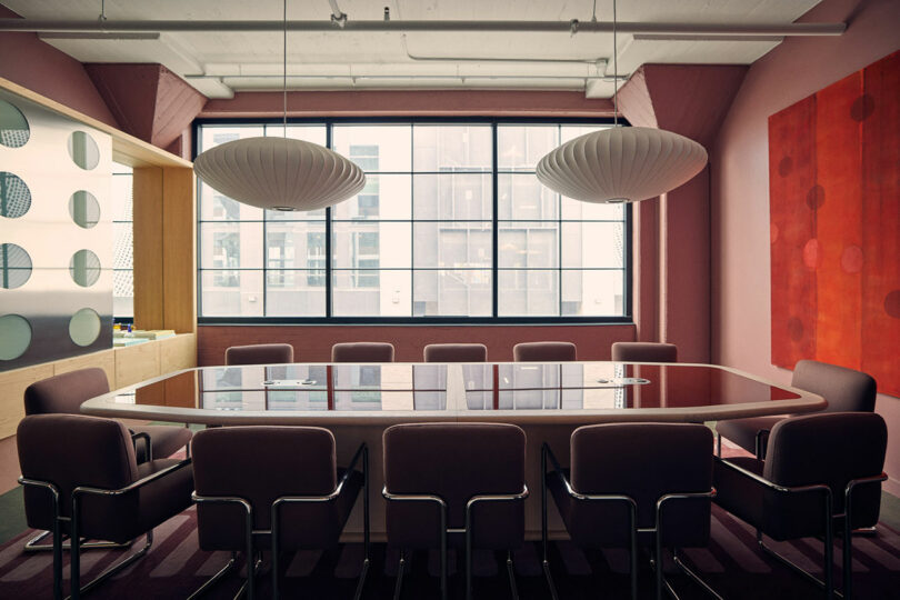
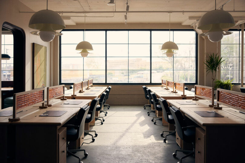
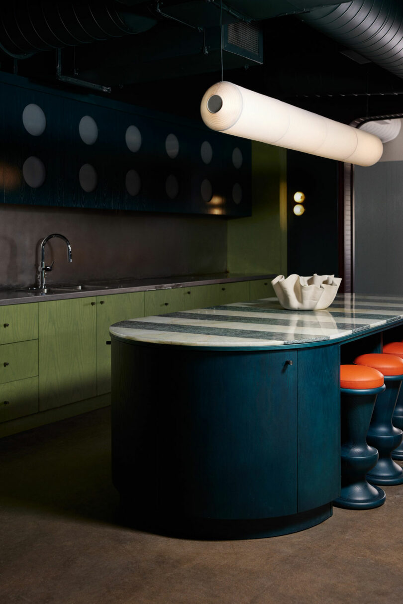
An adaptive reuse project in South Gulch’s Paseo development, the roughly 12,000-square-foot microcosm is situated within the historic Voorhees building comprising 58 dedicated desks, seven private offices, five meeting rooms, 10 phone booths, a library, and a kitchen with complementary cafe area. As its interior architecture frames the next vignette along each visitor’s programmatic journey, so too do The Malin’s tendrils extend to imbed themselves in the young neighborhood encouraging cross pollination between creative thinkers and professionals alike in a plush live-work-stay-playground.
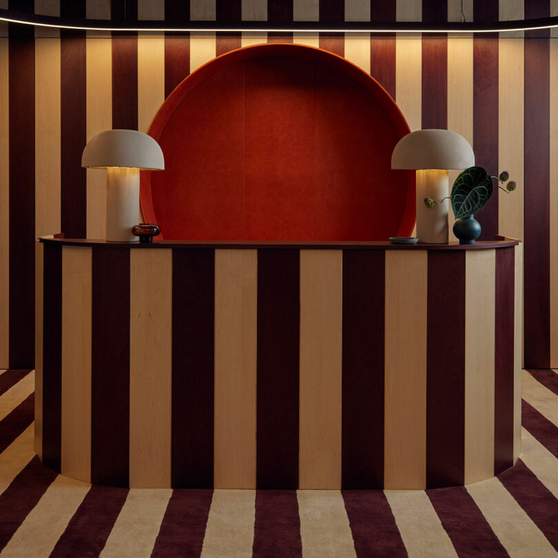
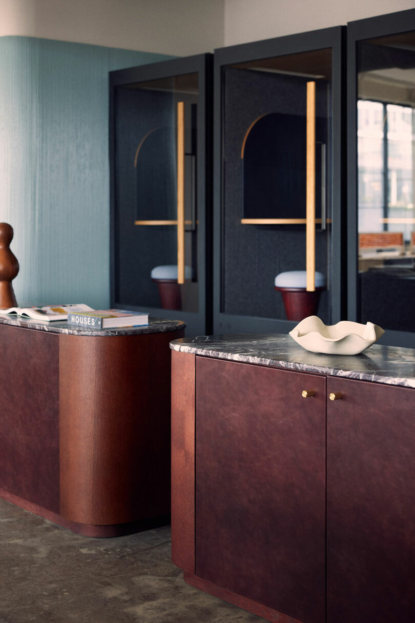
Bold vertical stripes wrap themselves around a reception desk upon entry for a formidable, yet playful, introduction to the space. The inlaid timber veneer corresponds to wall cladding and continuous line-work that meanders throughout like a roadmap. The rest unfurls in a careful choreography of rooms showcasing oversized forms and opulent finishes meant to blur the lines between l’objet d’art and home furnishing. “We’ve added a toy-like layer to the spaces… The principle pattern informed by the local architecture is refined into a playful, simple, timeless stripe, layered on an old world materiality of high gloss lacquer, wood, and sumptuous carpet,” Lafferty says.
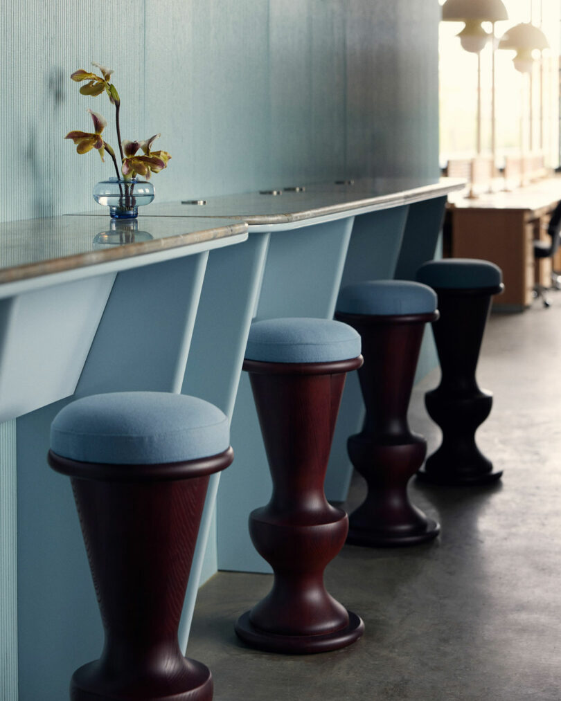
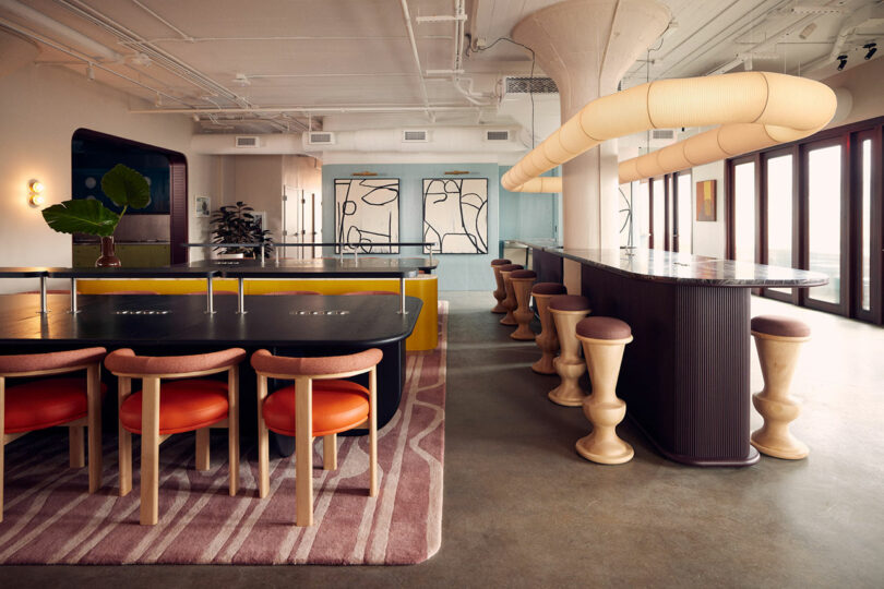
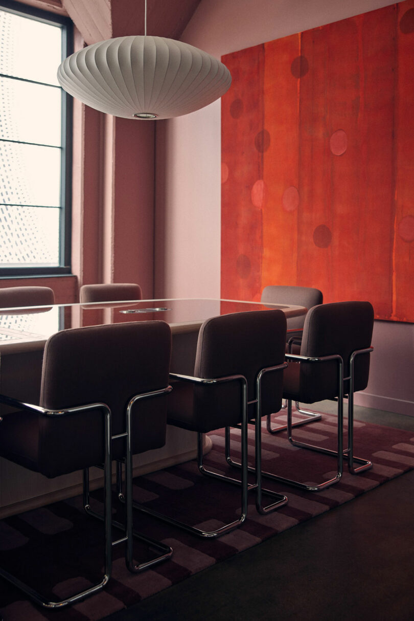
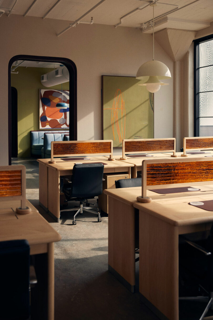
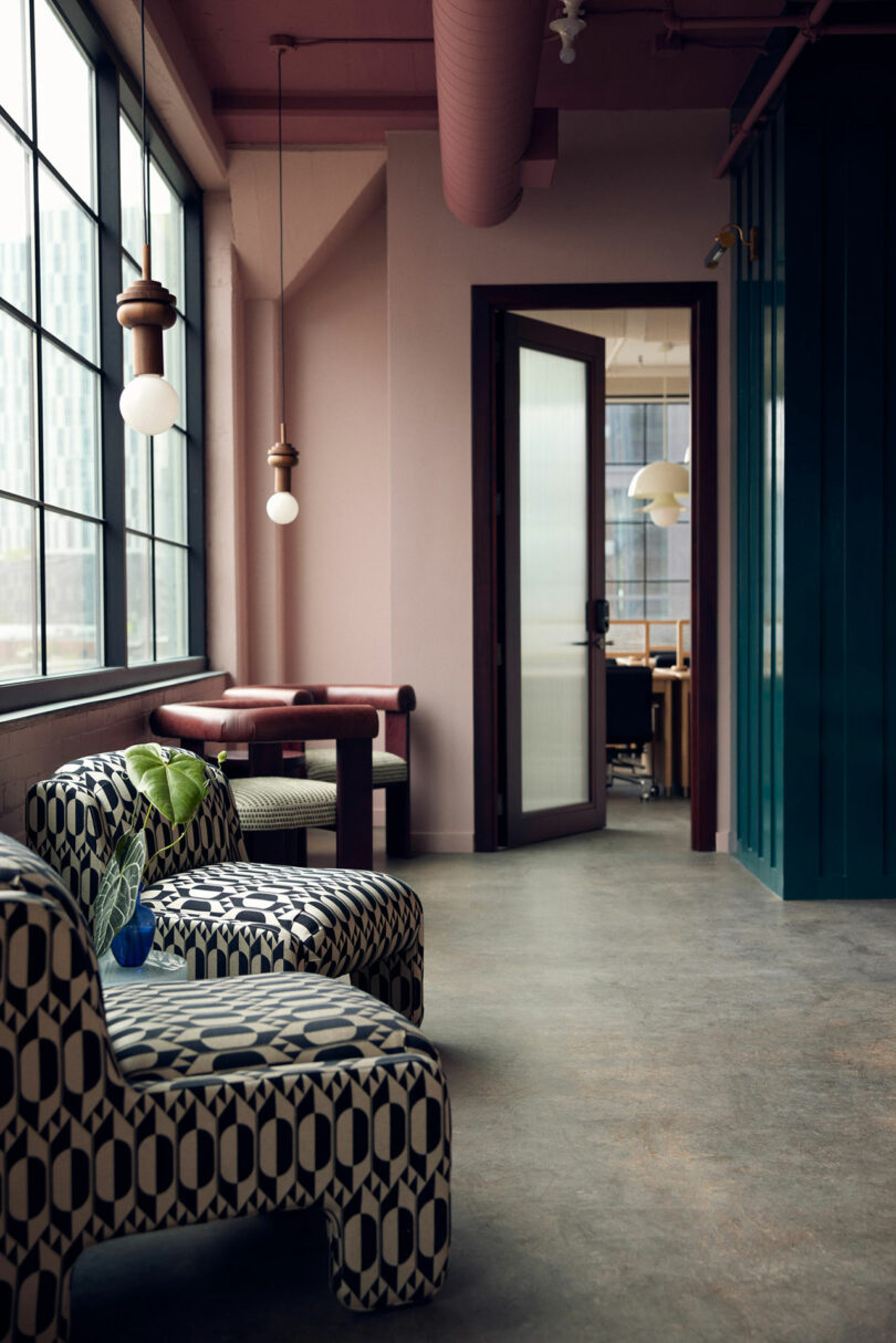
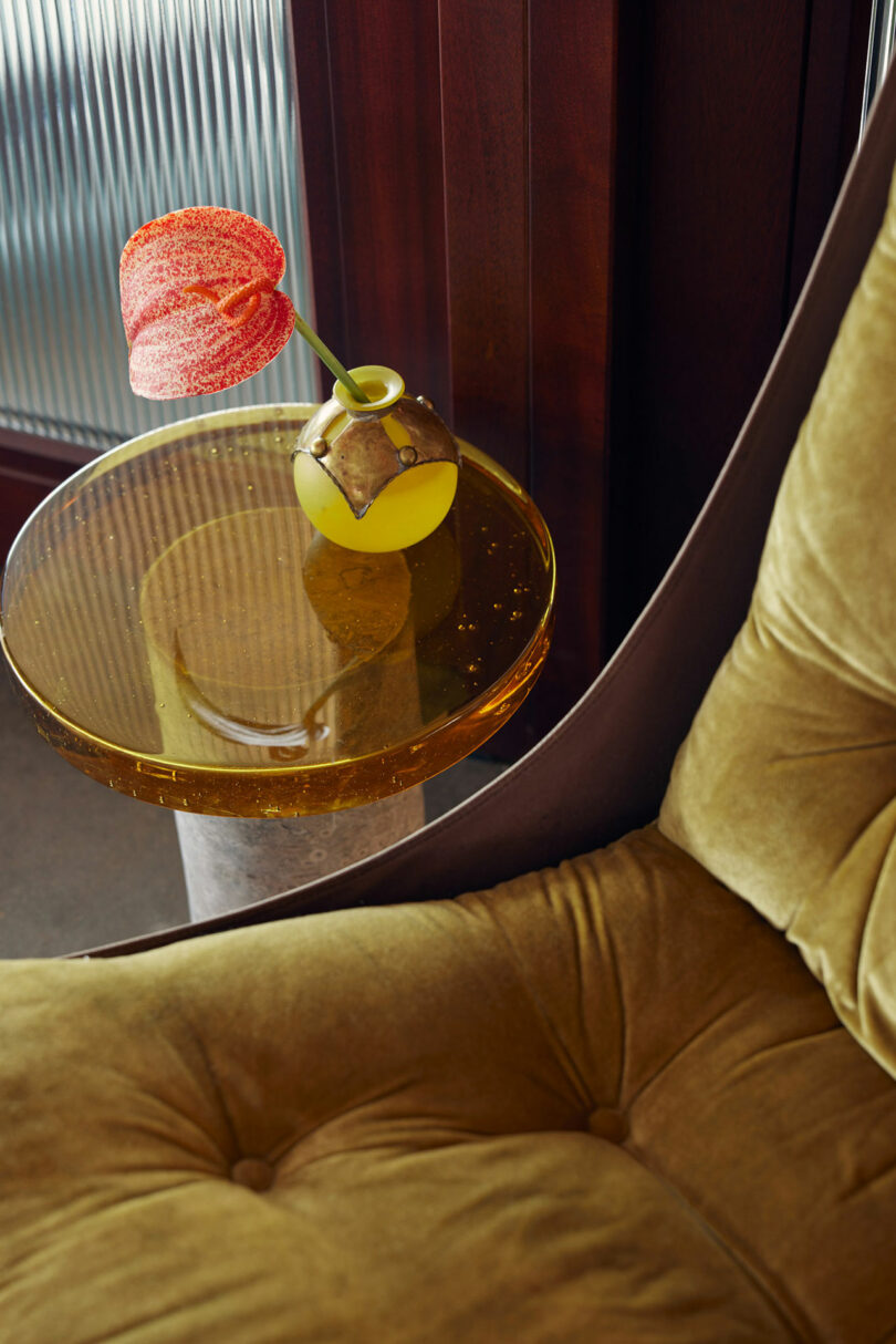
Generous fenestration allows daylight to draw attention to custom millwork, eclectic furniture, and captivating fixtures, as well as the joinery of different structural elements, all the while shadows dance across the room. Noteworthy still are the luminaire accents by Bover and Santa & Cole. Tabletop lights ornament workspaces as pendants draw attention to the original, refurbished ceiling. The typically cold cement floor is made warm with accent rugs and balanced by exposed ductwork to preserve a bit of that post-industrial feel from the complex. Reclaimed and repurposed elements continue to echo the district’s reinvention as much as they advocate for these sustainable practices.
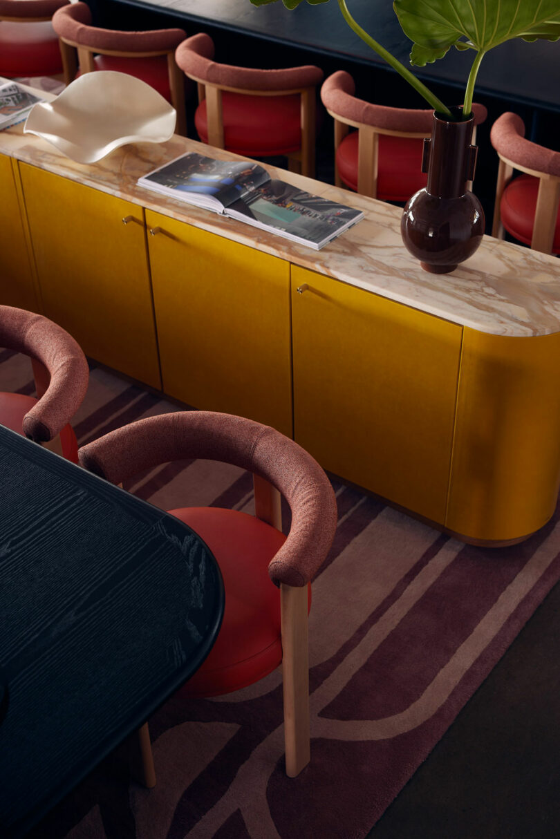
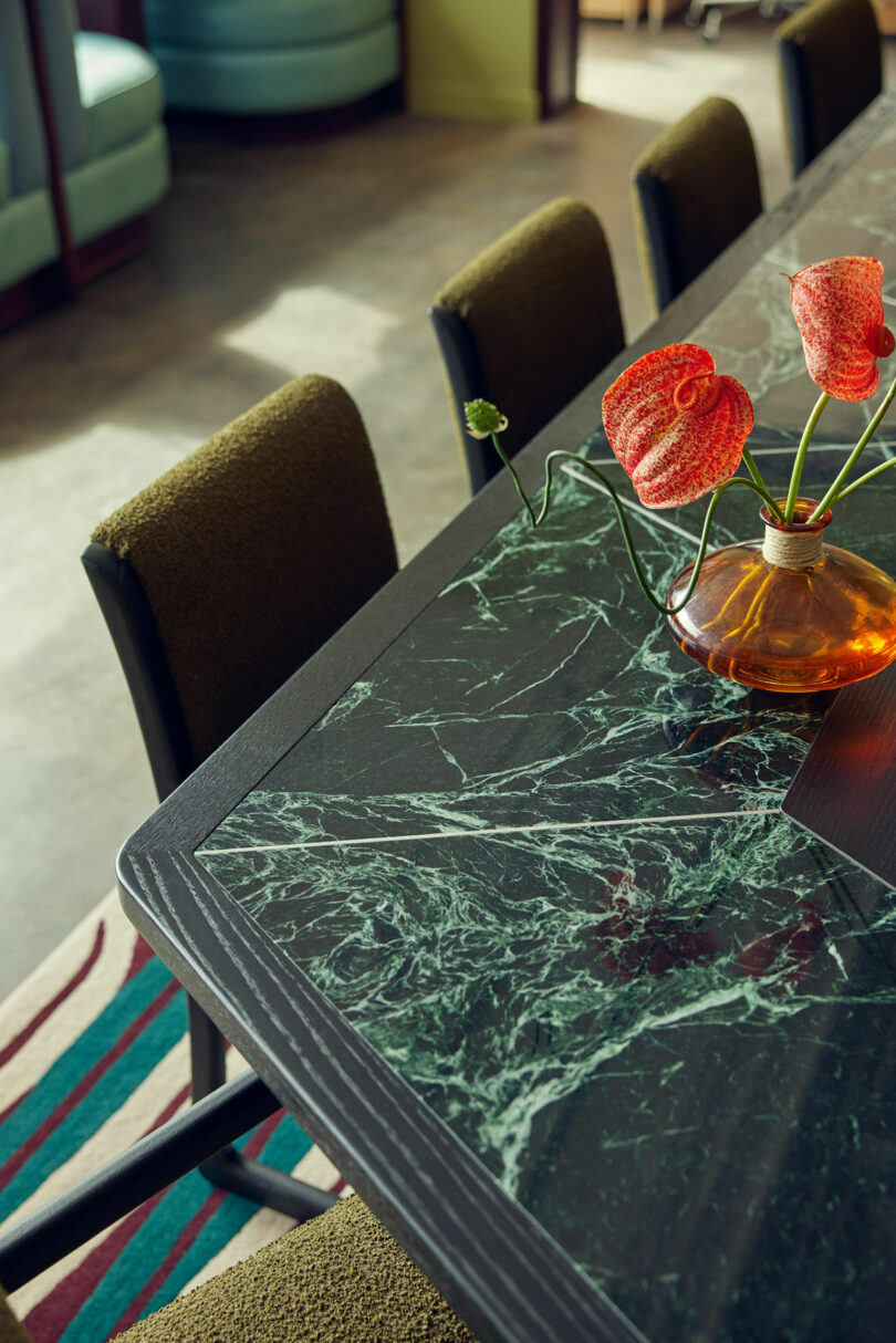
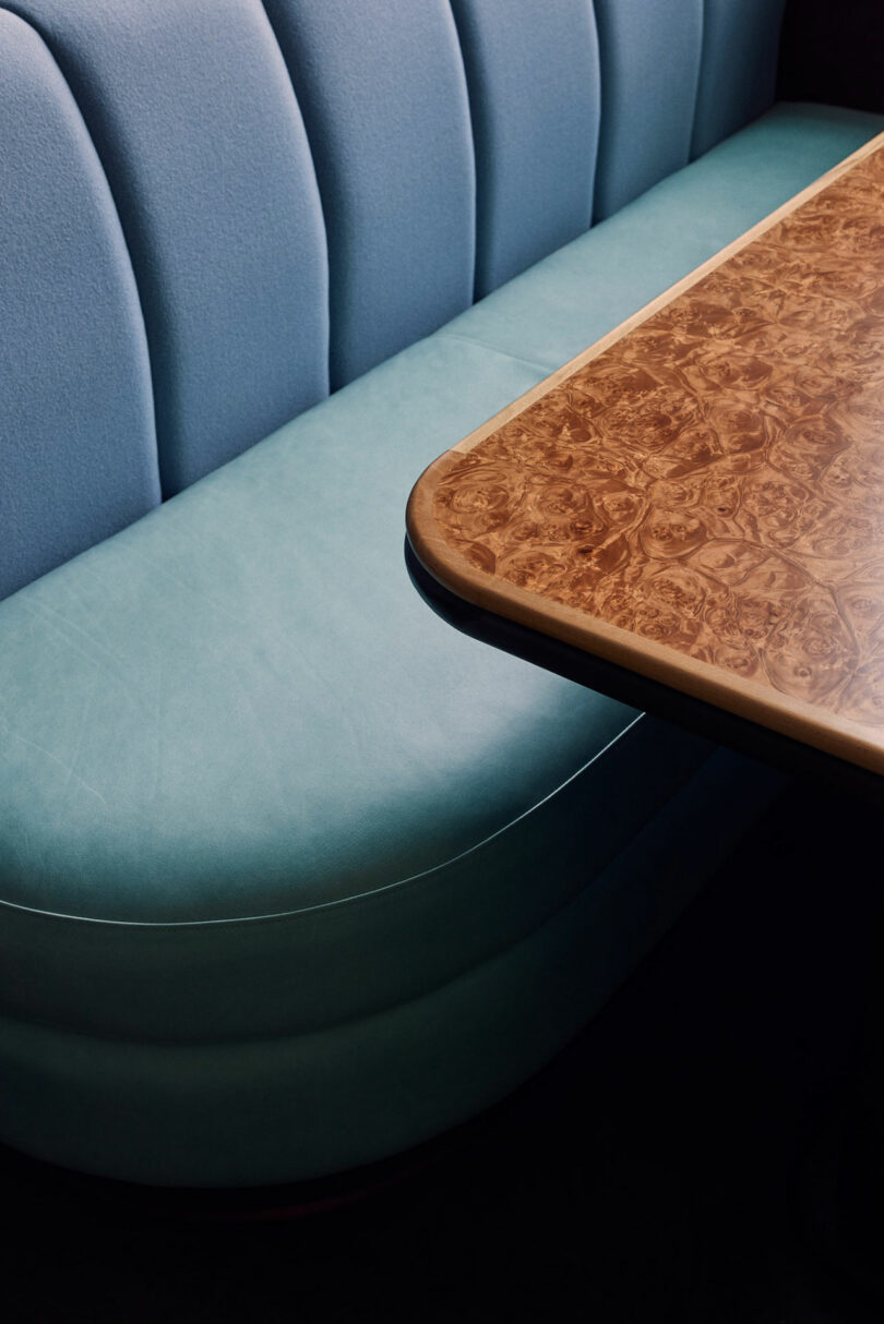
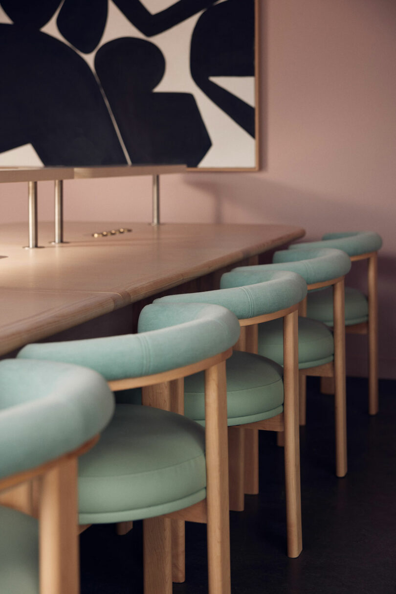
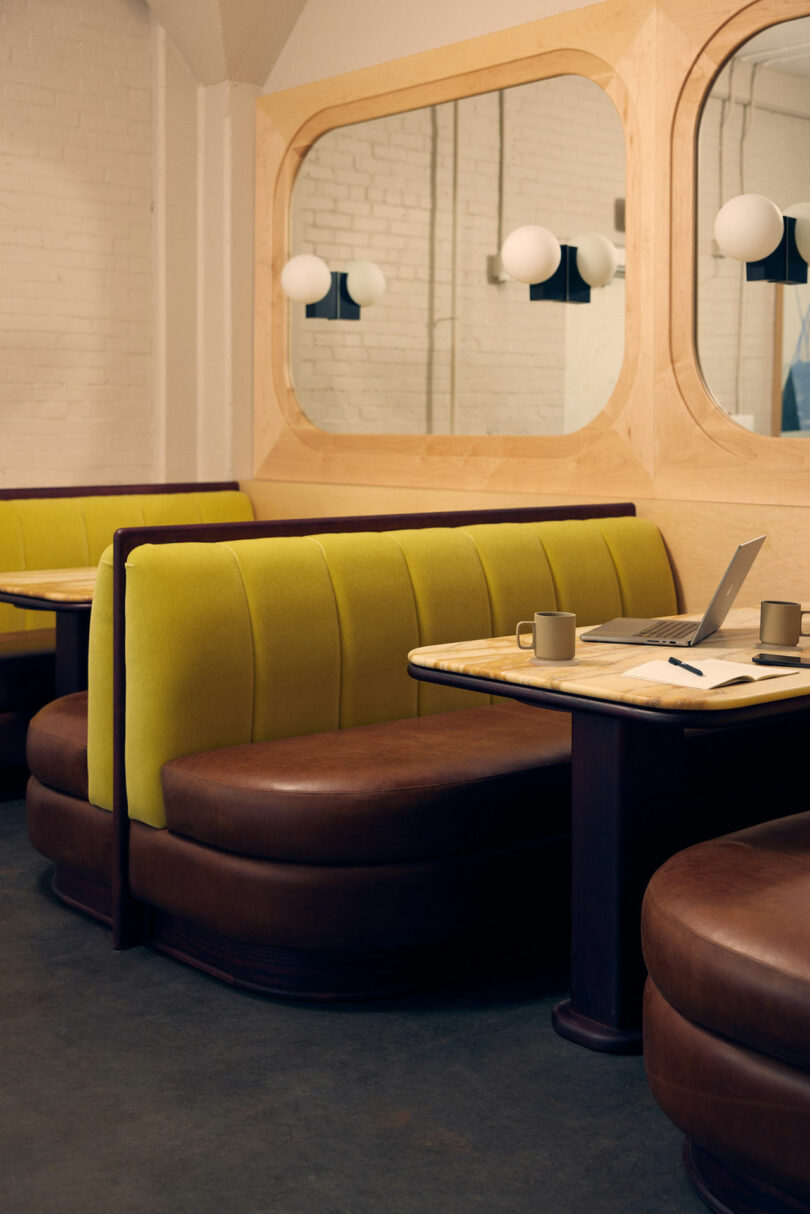
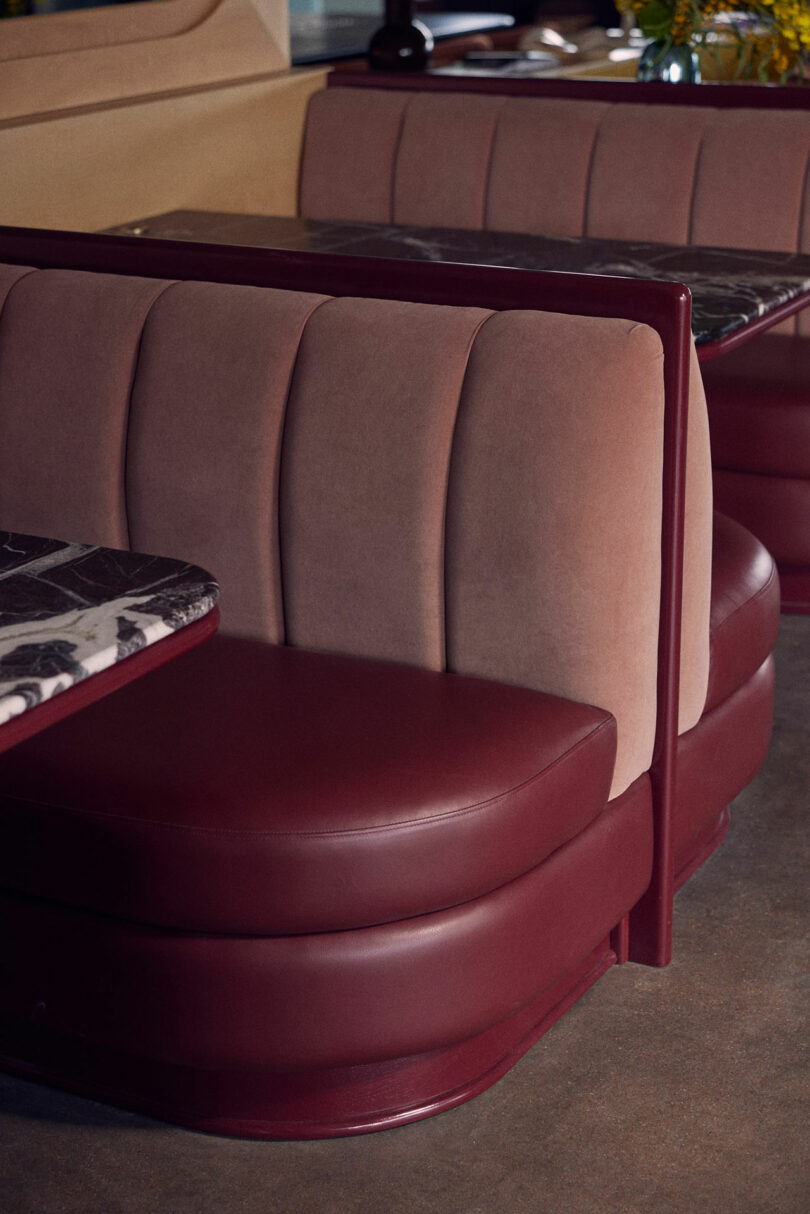
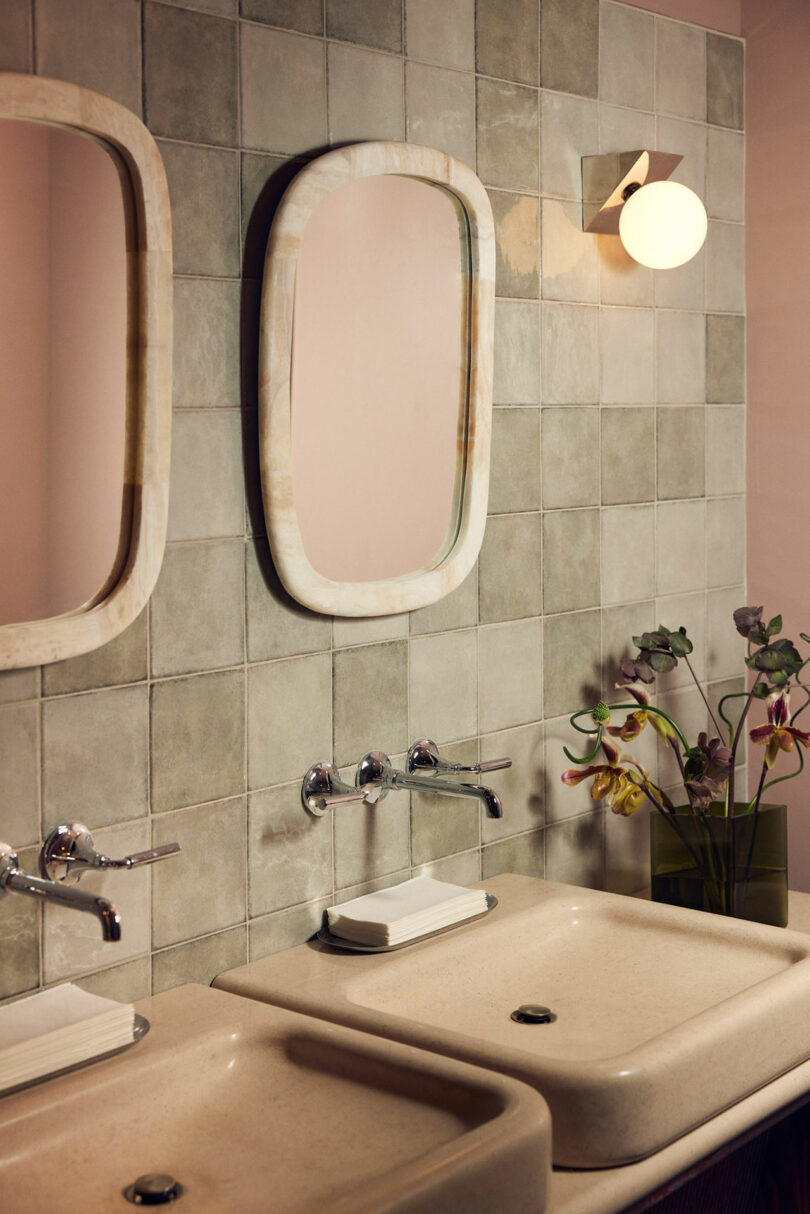
Communal spaces boast surfaces crafted in solid oak, marble, and limestone for a continued ambiance that guests just can’t quit. Case goods finished in high-gloss lacquer, burl wood, and more marble complement furniture donning leather by Yarwood and textiles by Pierre Frey. And a command of texture is demonstrated throughout accessories like the rippled crystal desk dividers in amber, steel, and bronze.
“Our design greets you with impact, boldness, and charm, inviting you in to discover an encompassing environment, reflecting the eclecticism of the Malin merged with the playfulness, depth and, materiality of Roísín Lafferty.”
To learn more about the co-working space visit themalin.co. And to see more of the designer’s exceptional work visit roisinlafferty.com.
Photography by Alpha Smoot.
from Design MilkInterior Design Ideas for Your Modern Home | Design Milk https://ift.tt/qTQK9Ua
via Design Milk

No comments