Surgical Precision Marries Minimalism With Tradition in Baby Point
Truly laudable homes are not the McMansions of obscene scale, nor are they houses that boast exotic materials and bastardized classical elements; they are those whose existence are thoughtfully composed to consider context and add to the local architectural patchwork as it unfurls. Nearly bound by the meandering Humber River and nestled within the tree-lined streets of Baby Point – the picturesque west-end neighborhood of Toronto, Canada – sits a stately residence exemplary of contemporary intervention with care. The addition and subsequent renovation by Reflect Architecture demonstrates the difference deference can make when approaching projects, leveraging context for clear articulation of contemporary design.
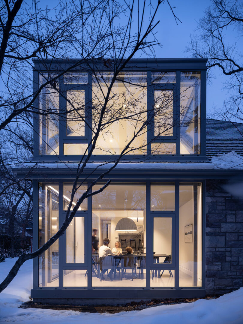
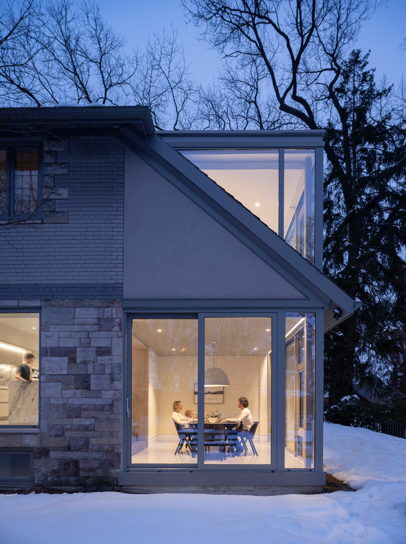
Unassuming in its exterior, the family home sits in the apex of a crescent creating the ideal vantage point to maximize vistas on three sides while arborvitae shield the inhabitants from the potential voyeurism of passersby. It is not until the corner turns that onlookers get a glimpse of Reflect’s contemporization. At the homeowner’s behest, the firm proposed something cheeky tempered by a series of pragmatic solutions. “There was this request to do something a bit sneaky and so we skewered the back corner of their house with this glass box,” says principal architect Trevor Wallace. “They mentioned that they didn’t want anyone to see what had been done until reaching that part of it, eliciting an ‘oh my God, wait, what’s that?’”
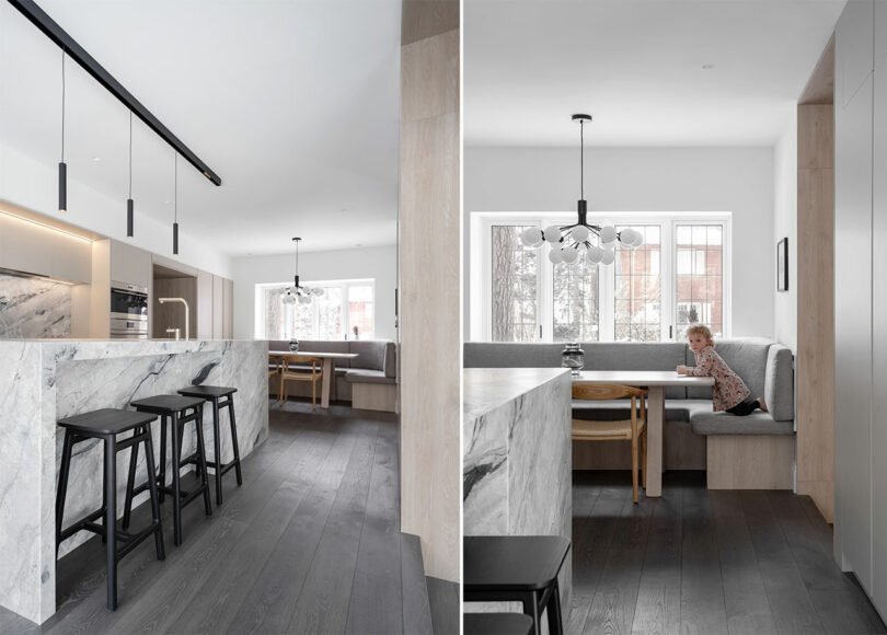
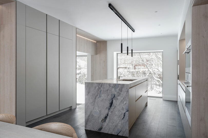
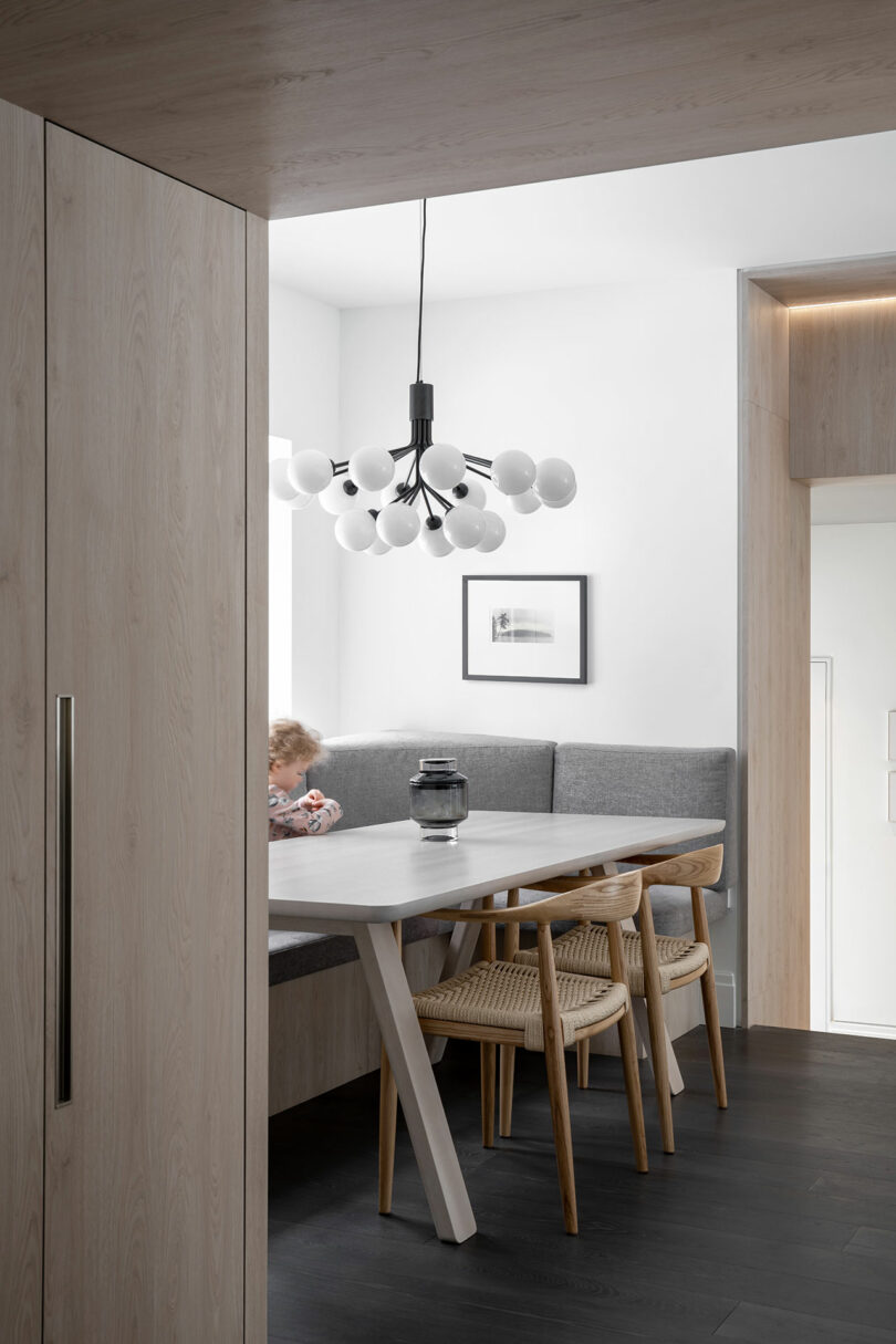
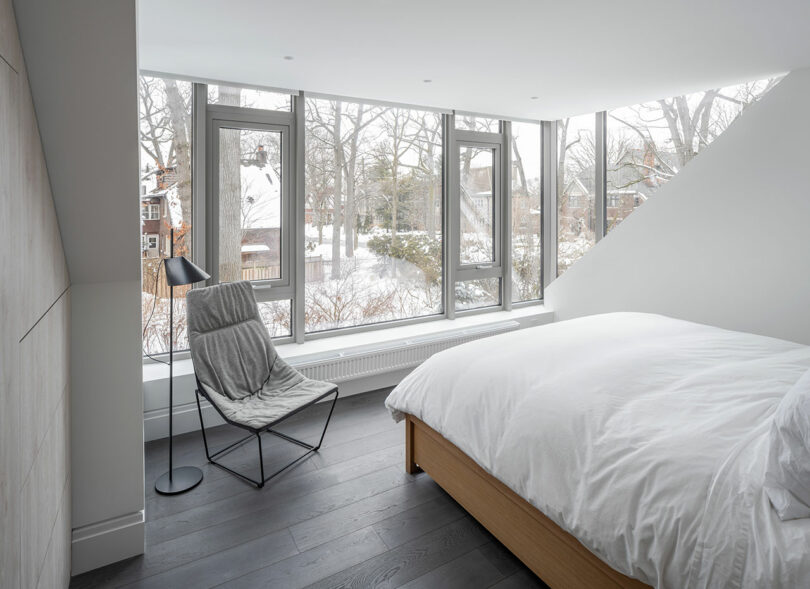
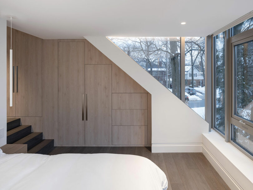
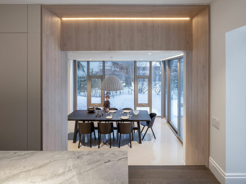
Of the existing structure – a conventionally arranged, central hall plan – very little is new build while the majority is revitalized interior architecture. The ground floor boasts holistic change without any manipulation to the boundary through a series of transformative gestures that relieve the structure of its previous inefficiencies and incongruities. Edits include the elimination of an unused, internal garage to make way for a new entry sequence in counterbalance to the traditional, formal foyer; a reorganized kitchen, cafe nook, and dining space to serve as a the home’s nucleus; reconciliation of the elevated main floor with the surrounding landscape; and a new projection to house a relocated primary bedroom.
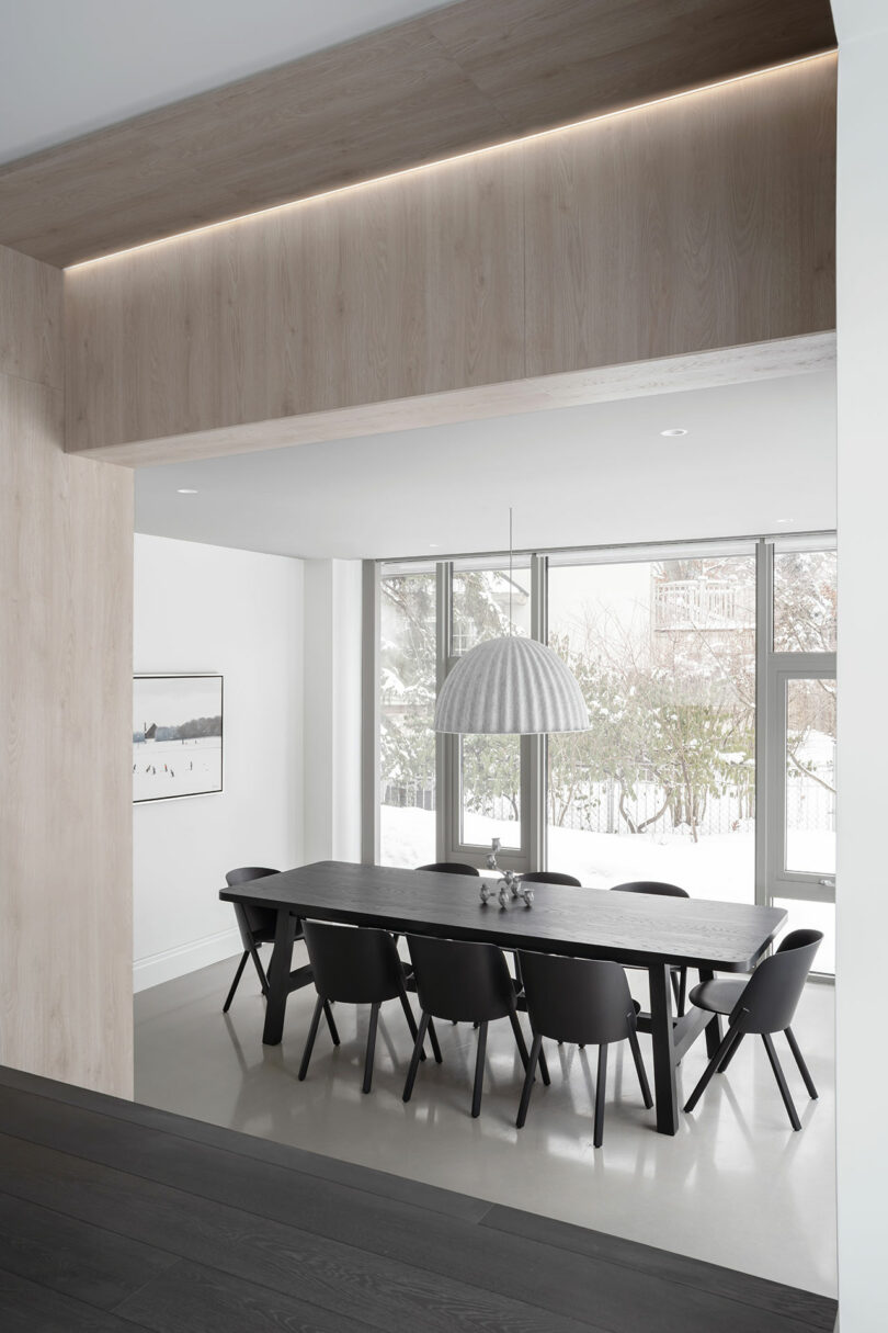
The new, two-story glass volume is of particular visual interest, enclosing a sunken dining room and bedroom above, with an extension expertly sutured into the existing roofline. In a peek behind the curtain, the new dormer peels back the sloped surface along careful incisions to reveal an elegant minimalist space underneath. A subtle material language of cool brick and stone cladding distills what might otherwise be an act of architectural aggression.
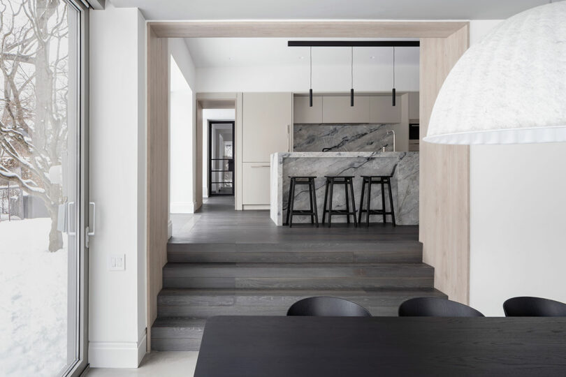
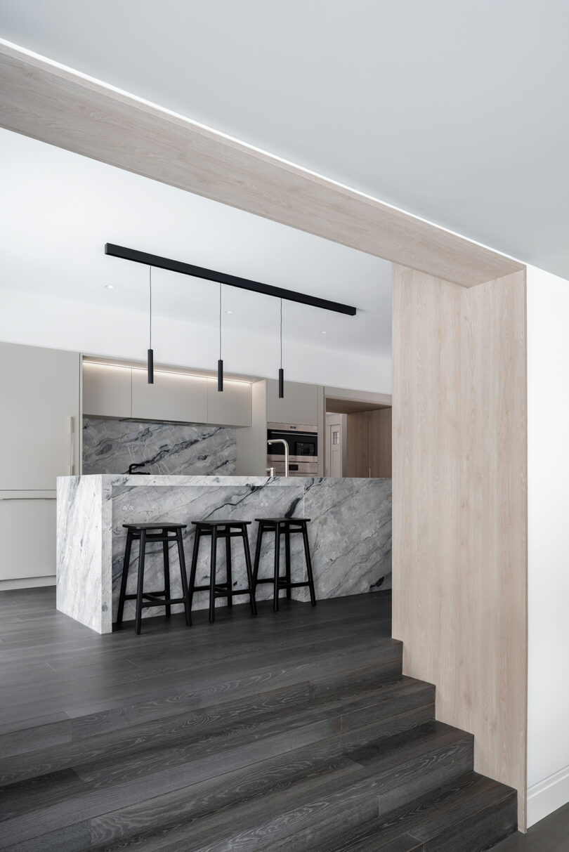
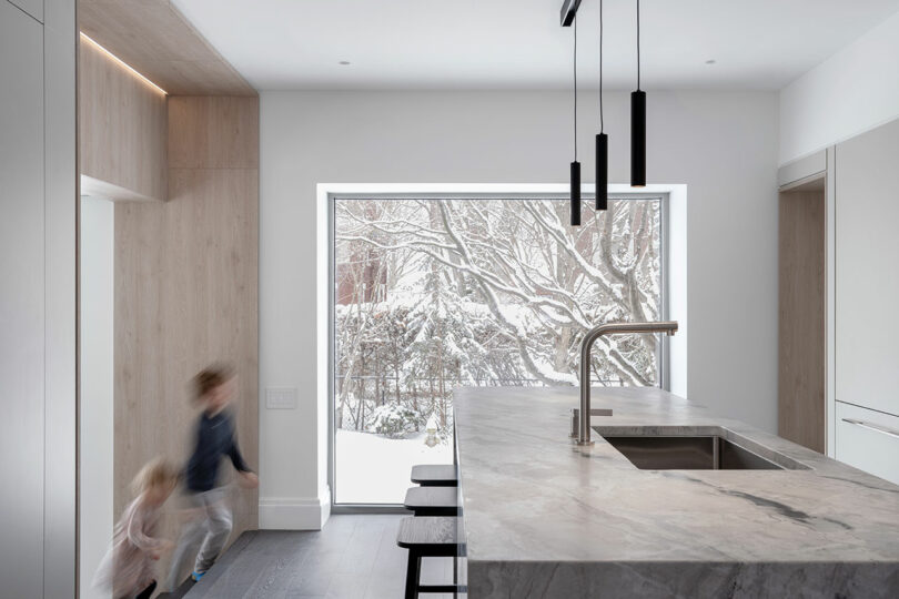
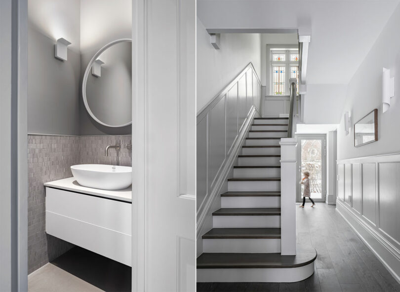
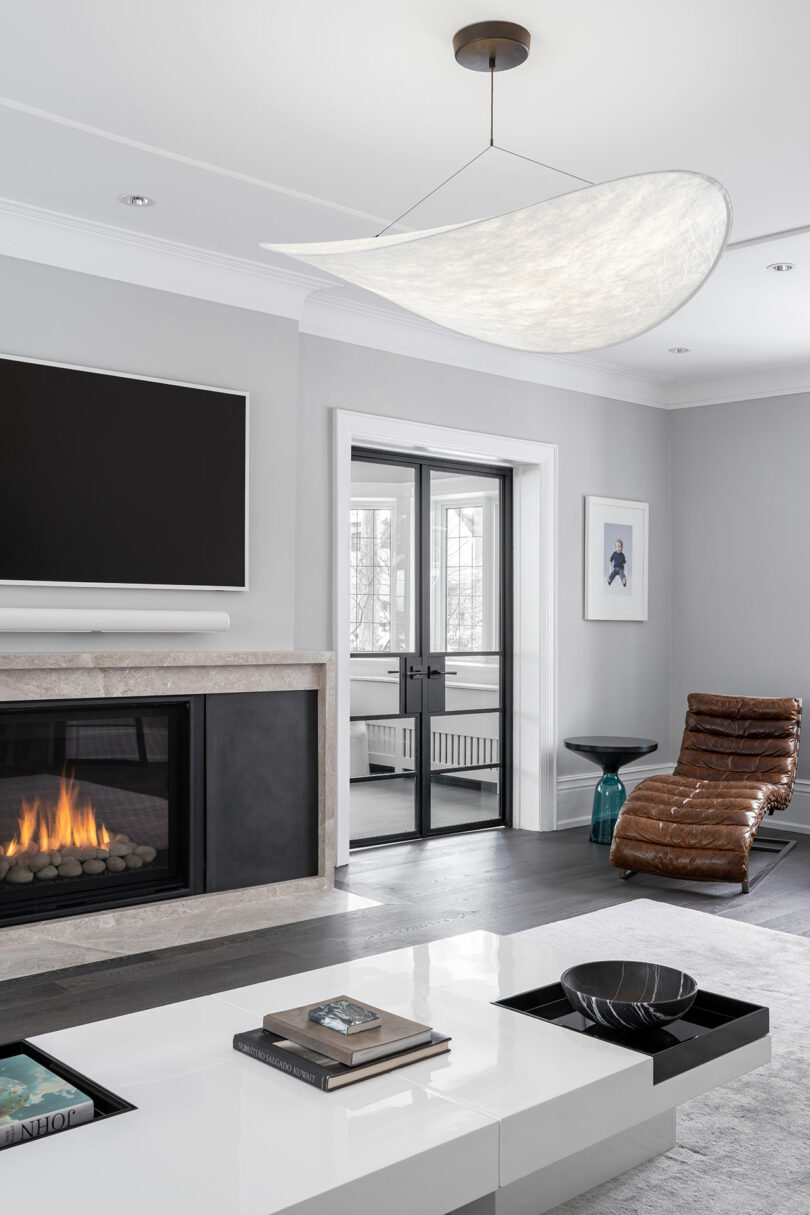
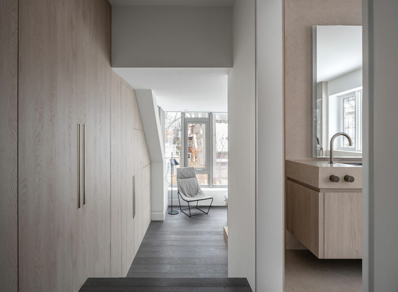
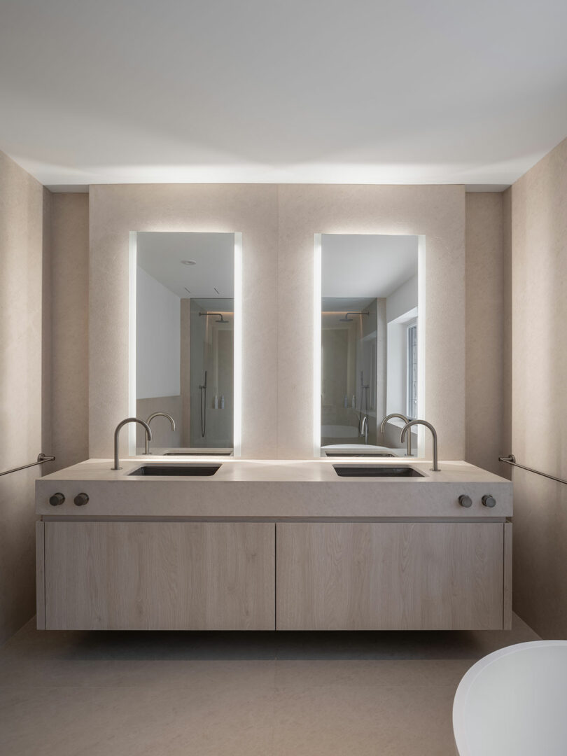
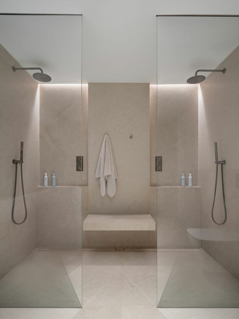
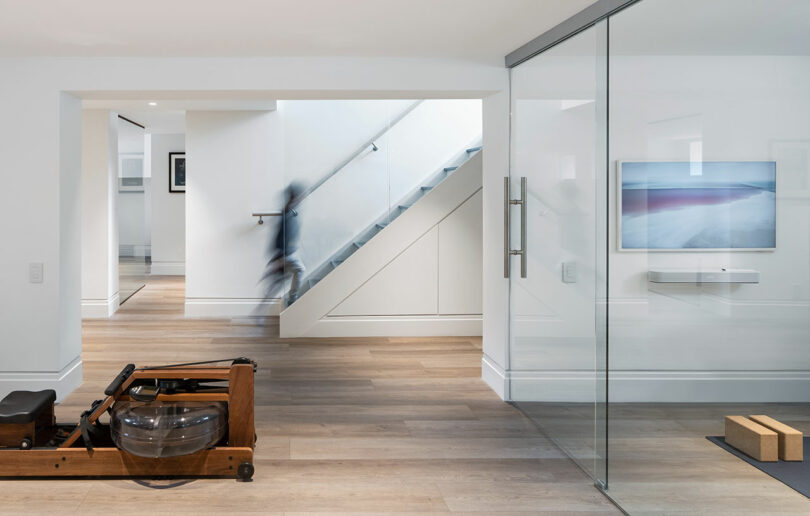
The slightly Scandi interior is introspective, considering new modes of habitation for the evolving modern family, as well as a means for traditional and contemporary design languages to exist in dialogue. The new deep, rich oak floors are anchored in the home’s original tone and texture while monolithic stone slabs and polished concrete impress upon the need to look forward. The traditional architecture’s inherent symmetry and established terminating views are thoughtfully deployed to maximize sight lines created by minimalist geometry.
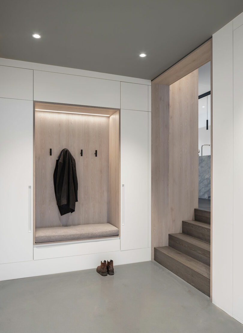
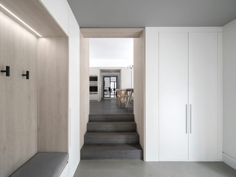
Moments of subversion allow for new perspectives while pointing out that which is often unnoticed. The new grade level mudroom entry creates an alternative longitudinal arrival sequence through thick thresholds that become liminal spaces spanning small lengths of the house, transecting the central axis. And a parallel transverse axis connects intimate spaces together along the rear of the home in a series of dramatic vignettes. Juxtaposition and the careful threading of elements in contrast yield a much greater return on investment than the promise of any new build construction.
“Knocking everything down is just not a great solution,” Wallace says. “But very carefully nuancing and operating with more of a scalpel, interventions such as this allow beautiful old projects and buildings to exist on the landscape giving them a whole new life without having to be demolished.”
To learn more about the practice, visit reflectarchitecture.com.
Photography by Scott Norsworthy.
from Design MilkInterior Design Ideas for Your Modern Home | Design Milk https://ift.tt/yUq8XbC
via Design Milk

No comments