Favorites from the Architectural Digest Design Show 2018
Instead of my typical trade show experience of feeling underwhelmed, jaded, and feeling like my eyes were glazed over from the shear vastness and lack of oxygen in the recirculated air, the Architectural Digest Design Show always delivers the goods. I’m (pretty obviously from that last bit) not typically one for trade shows, but the AD Design Show is a show where the visitors can actually discover new and genuinely interesting design. The event showcases a wide variety of products and furniture for the interiors trade, but the standout section annually is MADE – a juried selection of galleries, artists, and designers that are pushing that NEW NEW design.
Here is a roundup of some of our favorites from the show:
Artist/industrial designer Christopher Prinz, in partnership with Patrick Parrish Gallery, has created an incredible line of objects that float between design and art. At once minimalist and maximalist, Prinz’s wrinkled and electroplated zinc, steel, and copper forms are vaguely functional, but more importantly push the line in terms of what would normally be considered acceptable in the context of design.
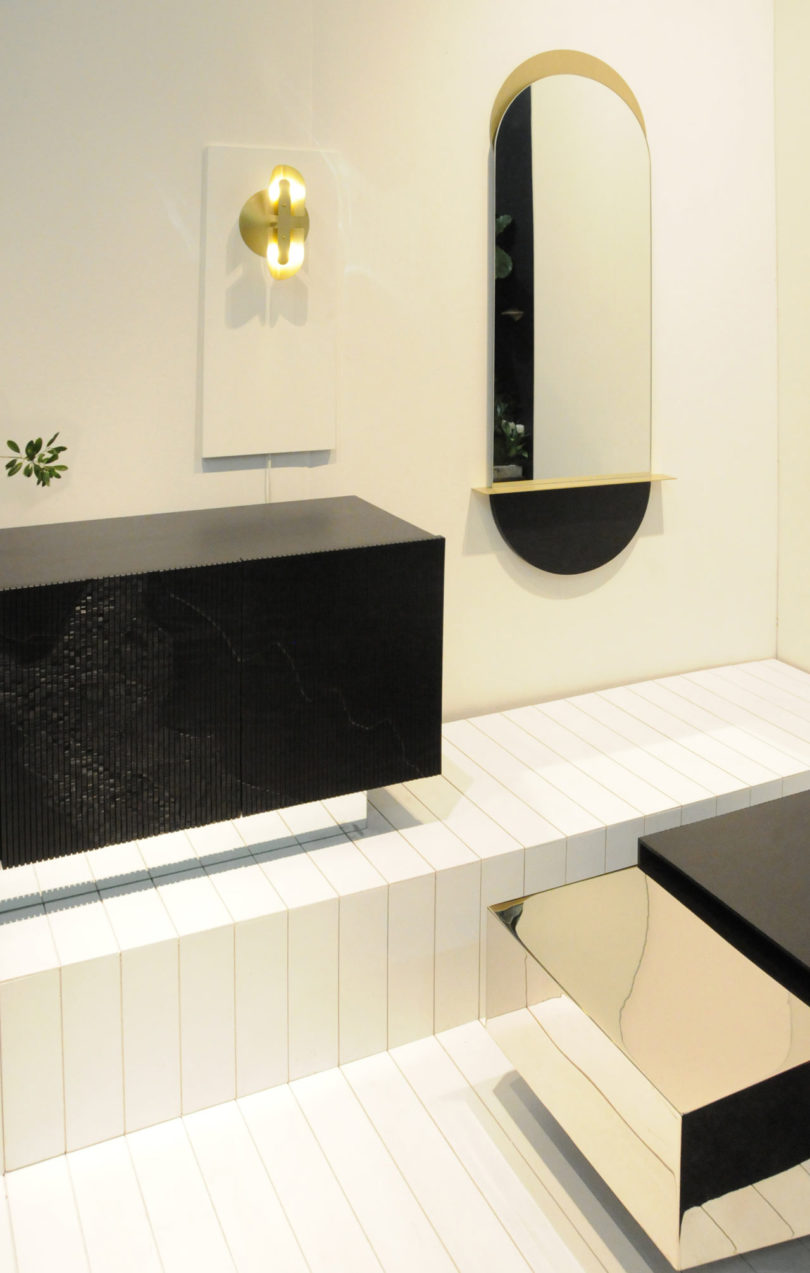
Kin & Company is the Brooklyn design practice of cousins Joseph Vidich, architect with a deep knowledge of metalworking and fabrication, and Kira de Paola, an interior designer with a background in high-end furniture. “We take simple, fundamental geometry but always look for a moment to break or subvert the form,” says Joseph. In their booth, they have partnered with Brooklyn’s Wallpaper Projects to create a space showcasing ethereality, materiality, and a Bauhaus mentality towards form and craft.
Brooklyn-based ceramics studio SIN is the namesake of its founder – Virginia Sin. Mostly focused on home goods, Virginia is newly branching into the lighting world with terra cotta sconces that are meant to cast sunburst patterns onto the wall.
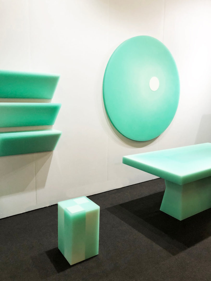
New to the scene, Brooklyn’s-own Facture is showing an incredible furniture line. On the surface, the maximalist, green epoxy resin pieces are bold. Upon closer inspection you realize the subtle changes in color are completely controlled by the depth of the resin cast. Each piece is a hand-carved armature for a resin outer shell.
Simon Johns creates furniture in the woods of Quebec. His minimal forms paired with strong materials and bits of raw-edged, unedited nature create a playful dynamic that is contemporary, and references the place where he creates.
Tantuvi’s founder Arati Rao works with Ikat weavers in South India and Dhurrie weavers of North India to interpret and challenge traditional rug weaving techniques. While working to conserve the rich culture and community of weavers, she challenges the design with her new Kona line. While referencing the history of production, the patterns and colors are all playful and present.
Birnam Wood Studio is the research-driven practice of Brecht Gander. He likes to make materials “spark, become molten, desiccate, oxidize, exhale and twist”. The focal point of the showcase is his wardrobe made from blackened steel frames and deeply textured orange concrete casts. Birnam Wood Studio has also partnered with Italian jewelry designer Suna Bonometti to create a stool that is as much a material experiment as it is a reference to Suna’s geometric jewelry.
The Principals, maybe best known for their immersive installations at MoMA PS1 and the Ace Hotel and their products for Areaware and the New Museum, have created a new, home-sized, shiny chrome and brass planter. The aggregating system can be used as singular planters or create a room-filling green environment.
NY Based Fabricator Marretti has just launched Origami – their cantilevered, ultra-thin (8mm), Corten steel staircase system. Off-the-shelf stair systems are never this design-forward, never this minimal, never this light. I am really looking forward to using this in projects.
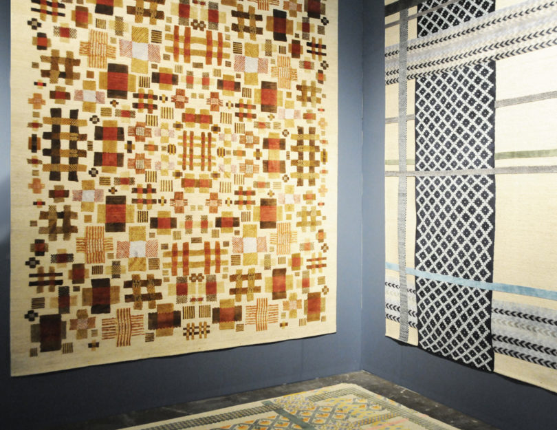
Jan Kath Design has made a series of rugs in Partnership with the Museum of International Folk Arts. Each rug in the Common Threads collection are inspired by tiny embroideries from the late 18th to early 19th centuries created by working women in Belgium, Sweden, Germany, Switzerland, and North America. The originals, roughly the size of a tissue, when enlarged to fill a room speak to a intense level of care and craft of the source – but also have a distinctively contemporary feel. Verrrry Hygge.
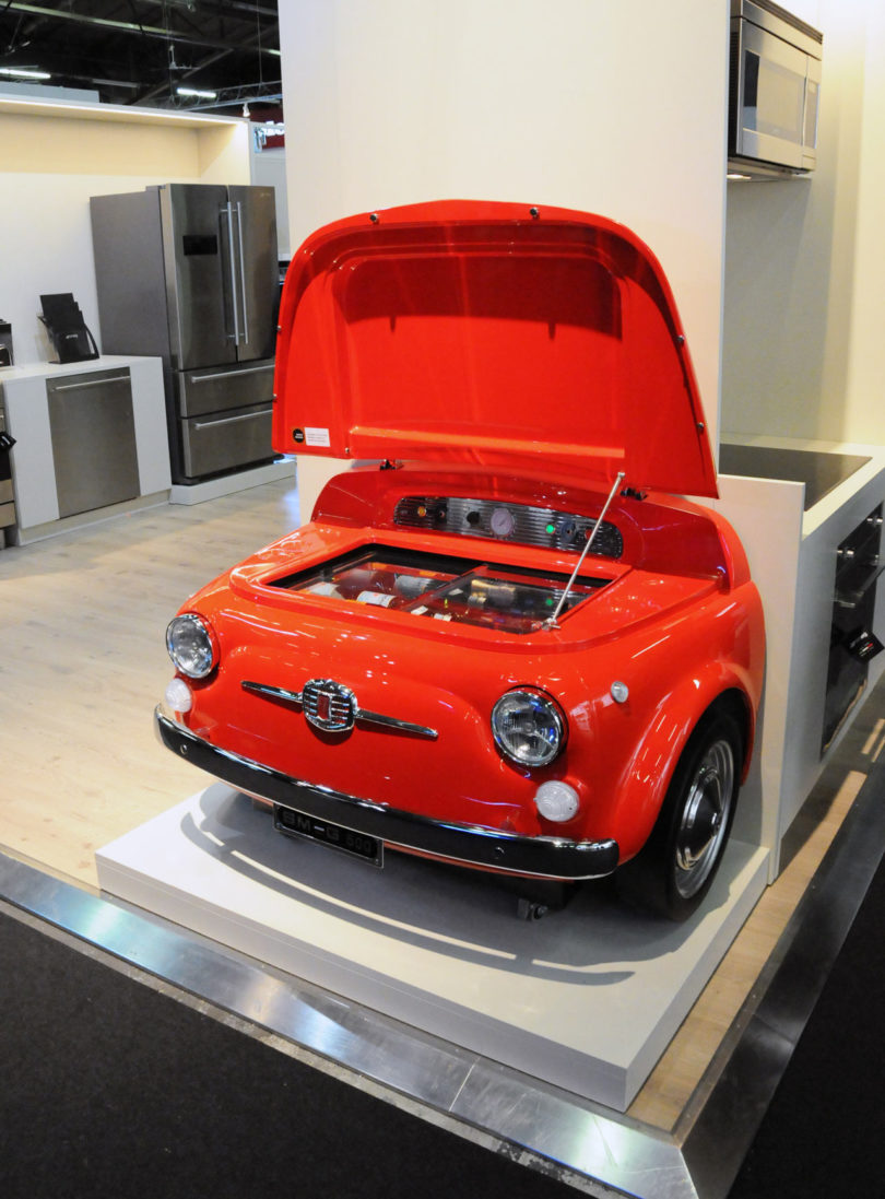
Manufacturer Smeg, famous for their cute, rounded, colorful appliances, has partnered with Fiat, famous for their cute, rounded, colorful cars, for the 50th year anniversary of the original Fiat 500. They created a wine refrigerator with the original molds of the car hood for no reason other than in their own words “a refrigerator is not just an appliance and a bonnet is not just a part of a car.” Good enough for me :)
Photography by Michael Yarinsky.
from Design MilkInterior Design – Design Milk https://ift.tt/2ITODFJ
via Design Milk


No comments