A Sculptor’s Apartment With Curved Translucent Glass Walls + No Doors
Located in a Prague housing estate, a unique project pushes the limits of conventional apartment design. NEUHÄUSL HUNAL designed the Sculptor’s Apartment with an experimental approach to spatial concepts and material fluidity, asking the question: What are the maximum possibilities of a classic prefabricated flat? Their solution is a one-of-a-kind apartment created for sculptor and glassmaker Vladimír Bachorík, featuring a glass workspace, a series of translucent glass walls, and the absence of traditional doors.
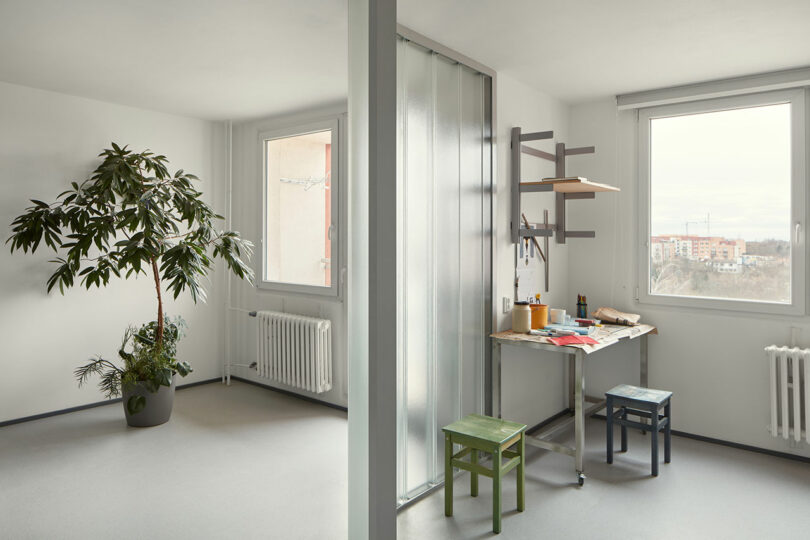
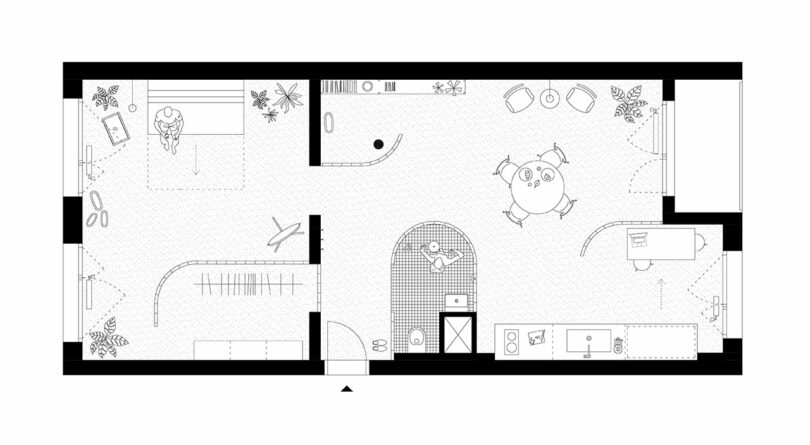
The client imagined an apartment that seamlessly integrates his workspace with his living area. His request was to eliminate the barriers that typically compartmentalize a home. Embracing this unusual brief, NEUHÄUSL HUNAL embarked on a plan to explore the maximum potential of a standard prefabricated flat. The result is a hybrid typology that blurs the boundaries between different functional zones through an open and flowing floor plan.
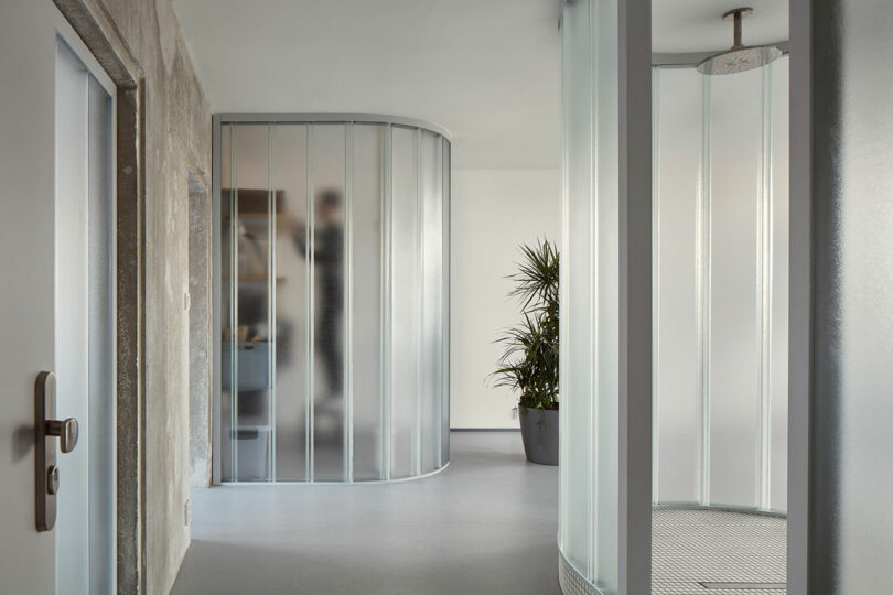
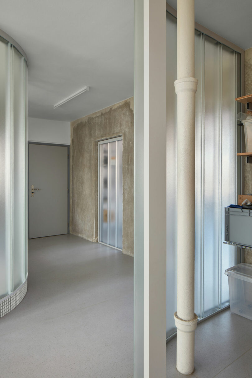
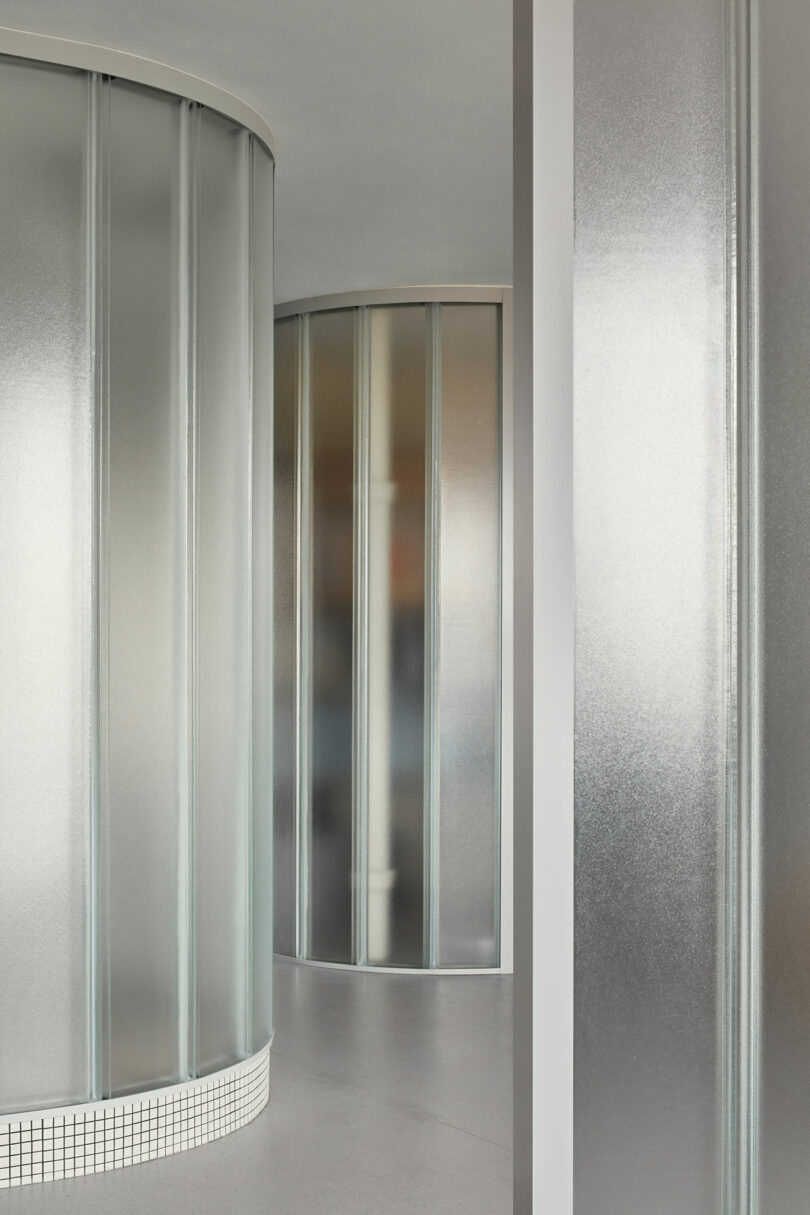
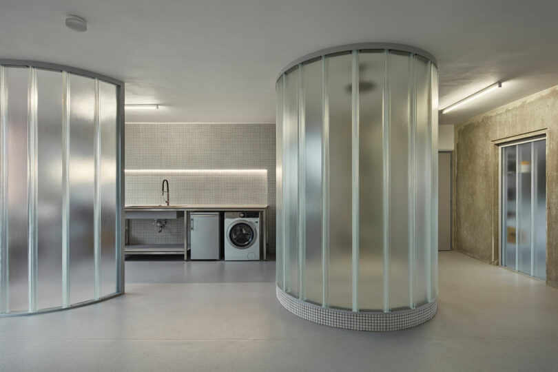
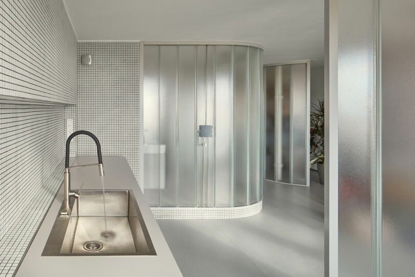
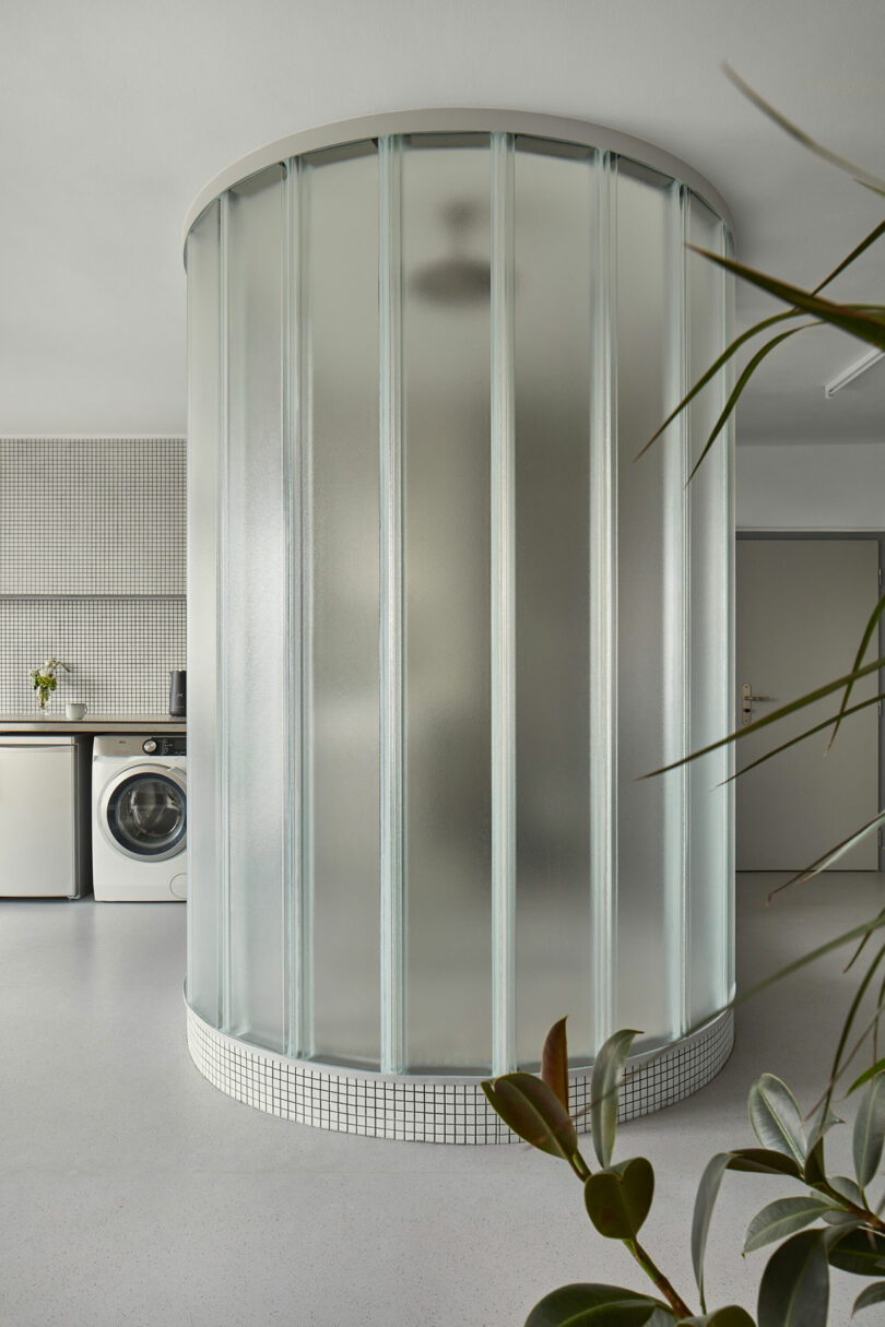
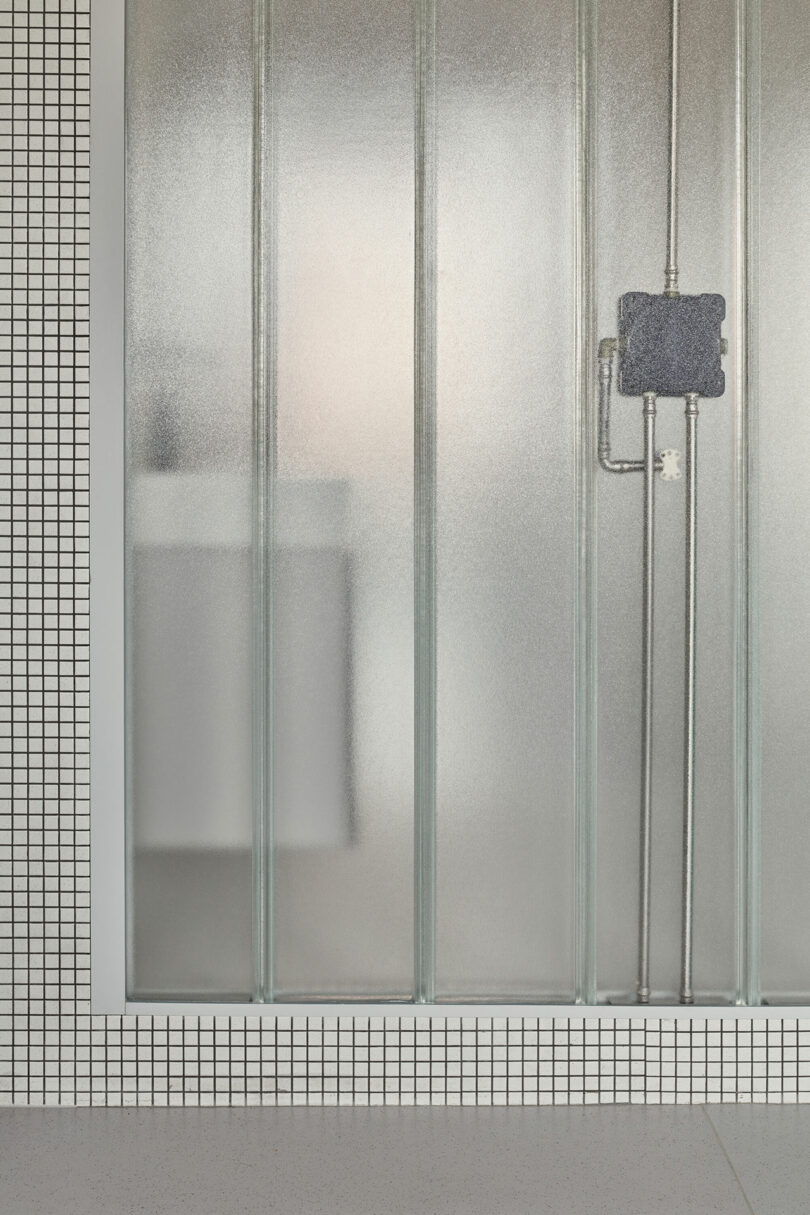
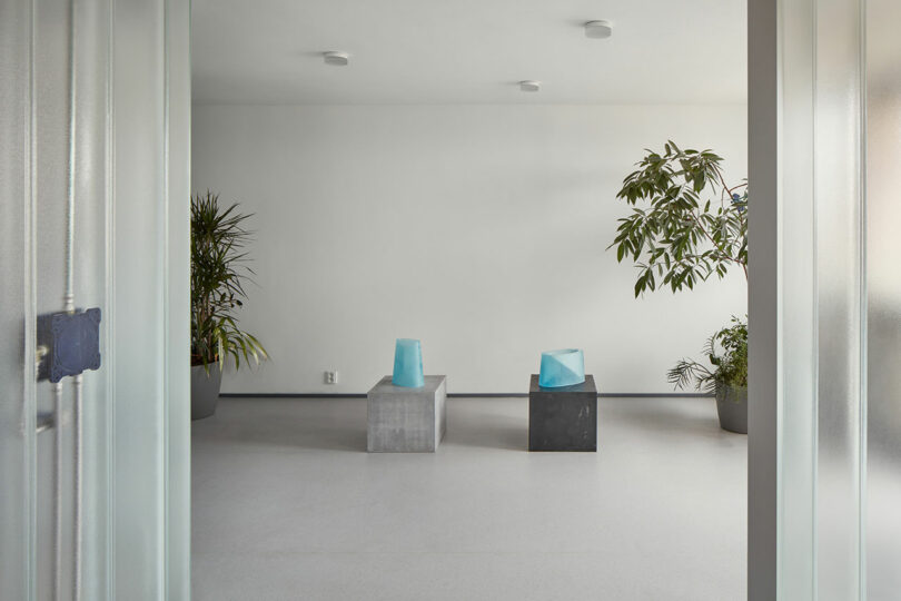
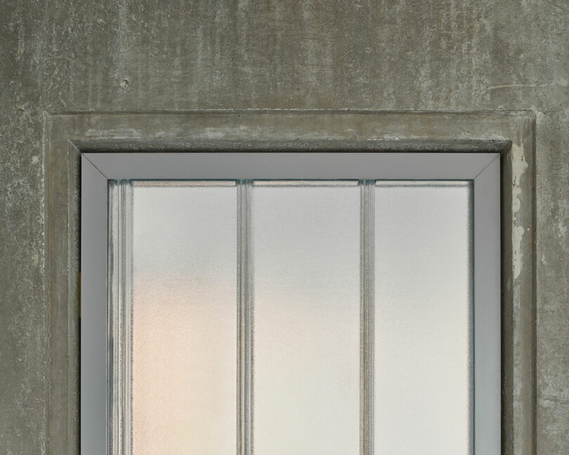
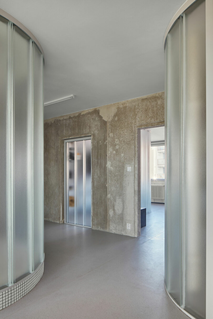
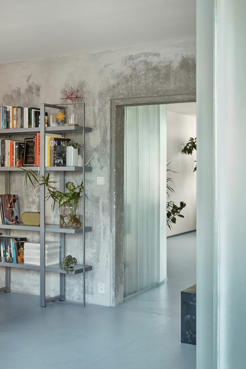
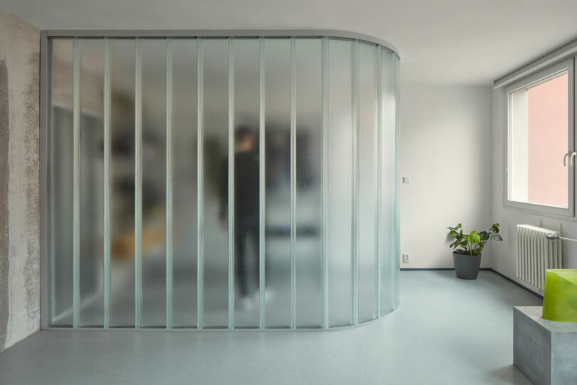
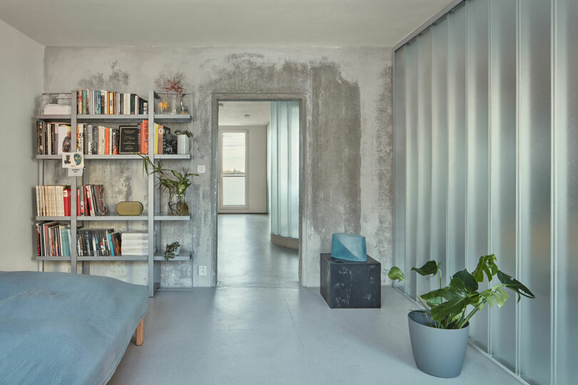
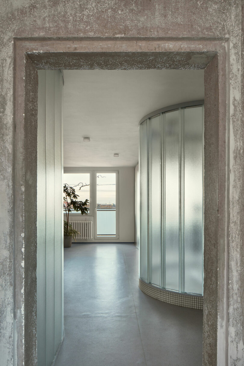
Central to the apartment’s design are arched half-sections of U-profiled glass that divide the space. These translucent glass blocks not only allow light to permeate throughout the apartment but also reference Bachorík’s lifelong work with the medium. The lack of doors creates an uninterrupted layout, with the glass curves subtly defining areas like the cloakroom, storage, and kitchen workspace. This approach maintains a high degree of openness, allowing for future reinterpretation of the space, should the owner desire it.
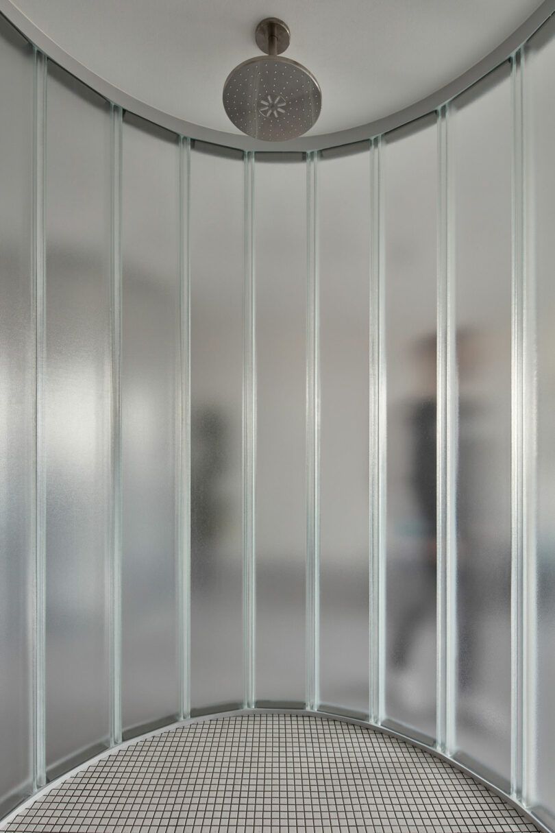
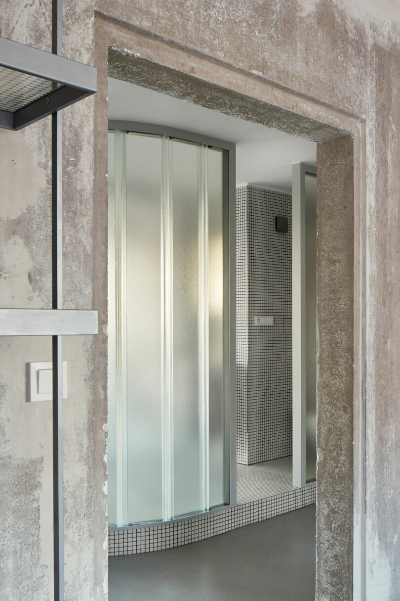
The only constraints faced with this open design comes from having to accommodate for water and sewage connections. This necessity led to the creation of the most enclosed space in the apartment – the rounded bathroom, elevated to denote its spatial significance. The careful positioning of the bathroom, along with other key functional areas, showcases how constraints can inspire innovative solutions.
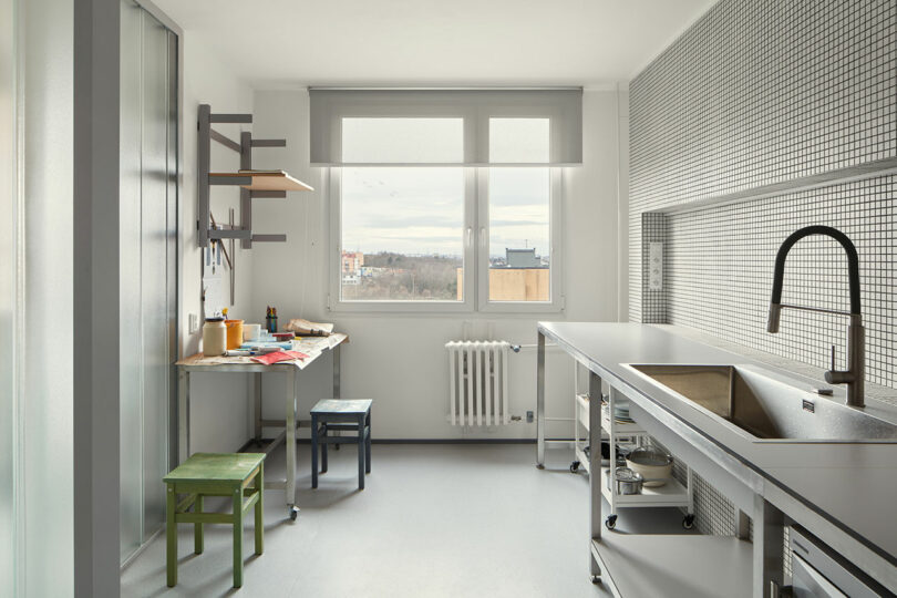
The minimalist kitchen is designed for function, as the homeowner uses it more to produce art that meals.
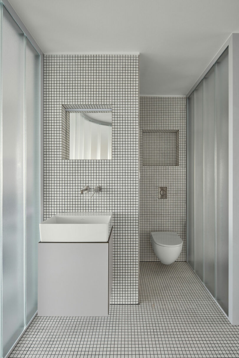
The translucent glass keeps the bathroom’s interior well-lit while leaving little to the imagination, which works for someone living alone or as a couple. The same small mosaic white tile with dark grout is carried over from the kitchen into the bathroom space for continuity.
The reinforced concrete load-bearing wall stands as a central, stripped-down element that embodies the apartment’s identity. The rest of the space features plain white plaster walls and ceilings that provide a neutral backdrop, helping to avoid the excesses of concrete which can lend itself to becoming too industrial.
Photography by Radek Úlehla.
from Design MilkInterior Design Ideas for Your Modern Home | Design Milk https://ift.tt/fTMhQAC
via Design Milk


No comments