F5: Fabrice Juan Talks Unexpected Architecture, a Favorite Italian Museum + More
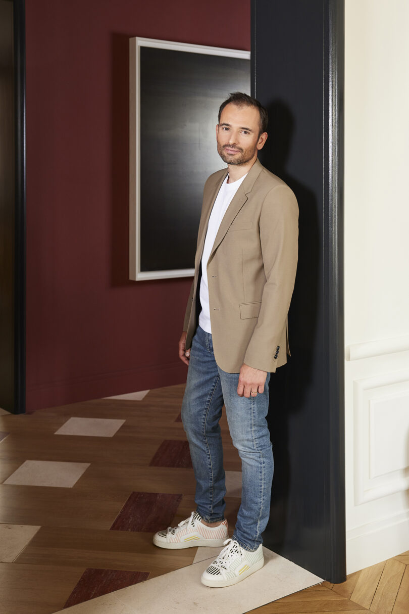
Fabrice Juan first stepped out to found his own agency in 2011 following extensive work experience as Jean-Louis Deniot’s project manager – and a supportive push from his wife. Committed to the French art of living, he draw’s inspiration from classic architecture, high-end materials, made-to-measure work, and intimate collaborations with craftsmen.
A dialogue between architecture and furniture design, innovation and style, presents itself across Juan’s portfolio. The overall aesthetic he crafts for clients is one of timelessness, seamlessly combining classic elements and contemporary styling. You’ll find examples of this in the balance between the staircase and the patinated living room finishes in his Iéna project, or the Twin Peaks coffee table as angular American walnut and Calacatta marble overlap, and the Sunray sideboard as glossy lacquer, brass, and matte wood veneer meld. Arguably some of Juan’s pieces, such as the Saint-Germain bench and the Capsule armchair, could already be considered iconic.
Juan himself has an education in both woodworking and interior design, giving him a unique perspective on the creation and curation of product and spaces. He still has ties with the talented individuals he discovered during his woodworking training, and some relationships, such as with the Gohard and Prométhée workshops, have led to wonderful working partnerships.
Other influences include designers Jean-Michel Frank and Gio Ponti, along with accrued life experiences, such as his first visit to the The Palais Bulles, Pierre Cardin’s house. “It is located in the south of France with a beautiful view of the ocean. I was amazed by the organic forms and unusual layout of the buildings, as well as its pink color, which made it a very iconic piece of architecture,” Juan reflects on his first impression of the structure. “In addition, I like the fact that it was owned by a fashion designer, Pierre Cardin, who completed the construction.”
Another, perhaps unexpected, inspiration for Juan is found in film scores, such as the work of composers Michel Legrand, Ennio Morricone, and Francis Lai, gifted musical artists from the 1970s. “I have always been inspired by film music. If I were to try another artistic medium, it would be film music composition,” he shares. “To me, a film score can make the most transformative difference in understanding the vision of a director.”
It’s compelling the way that Juan borrows from different experiences, relationships, and influences to craft his own influential style. His recent projects have included several private residences in France and abroad, and we’re looking forward to his storied future.
Fabrice Juan now joins us for this week’s Friday Five!
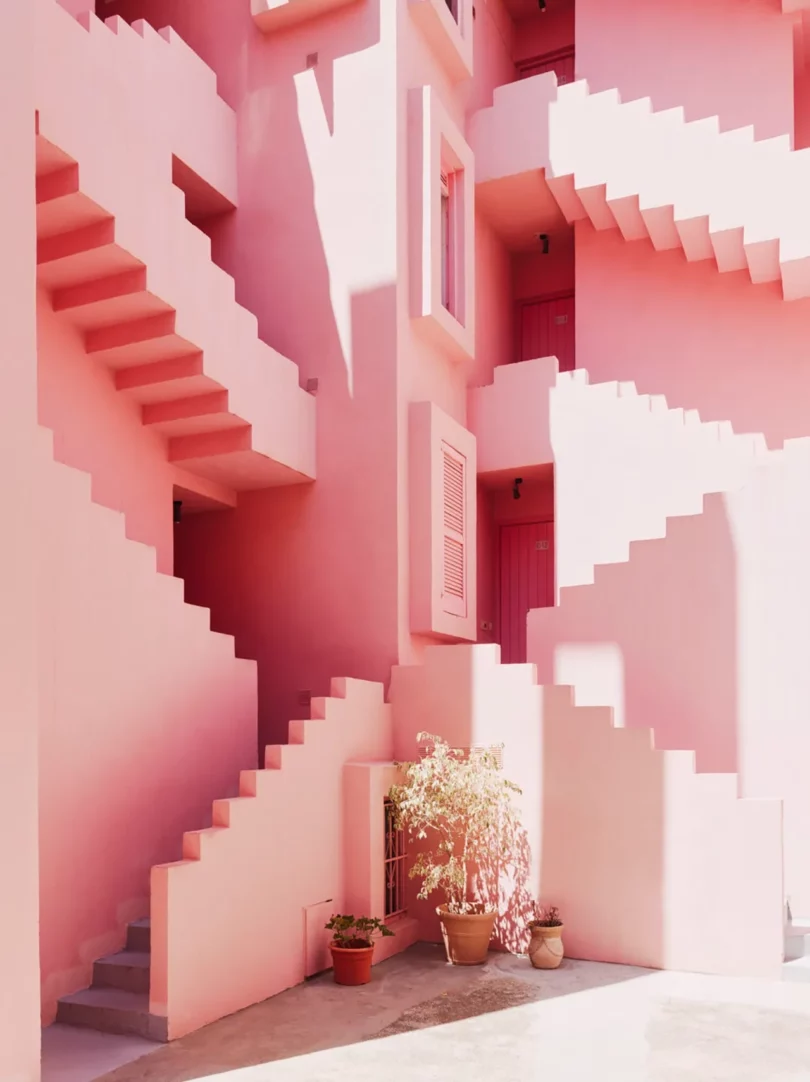
I love his architecture and the brutalist feel of his work. In most of his buildings, you can experience a perfect balance, a symmetry, or, on the contrary, an assumed asymmetry. His architectural designs are reminiscent of children’s playthings, with some buildings using strong colors: pinks, blues, and reds. There’s always something surprising about his creations.
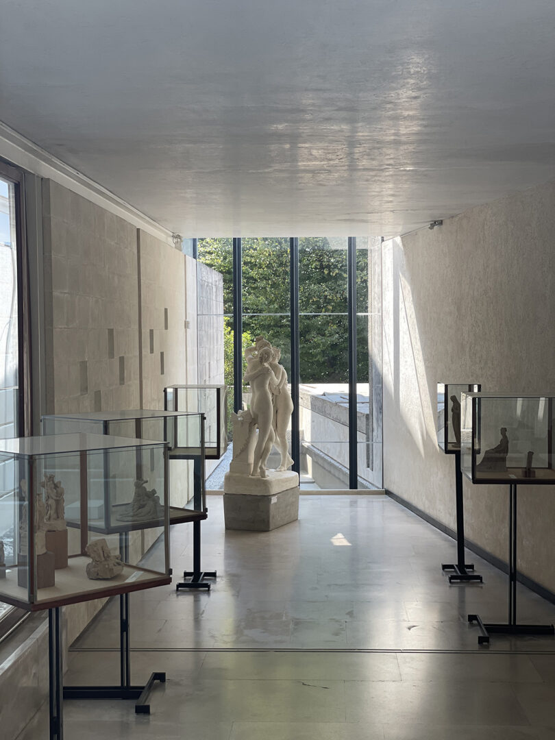
The Antonio Canova Museum is a place I’m very fond of. It’s in the north of Italy, in the town where the 19th-century painter and sculptor was born. It’s a region I visit regularly, and I love spending time in the museum, which brings together many of his sculptures, as well as visiting a part of his private home. What I also really enjoy in this part of the world is the renovation work carried out by Carlo Scarpa, an Italian architect, in the 1950s, which in turn inspires my own work.
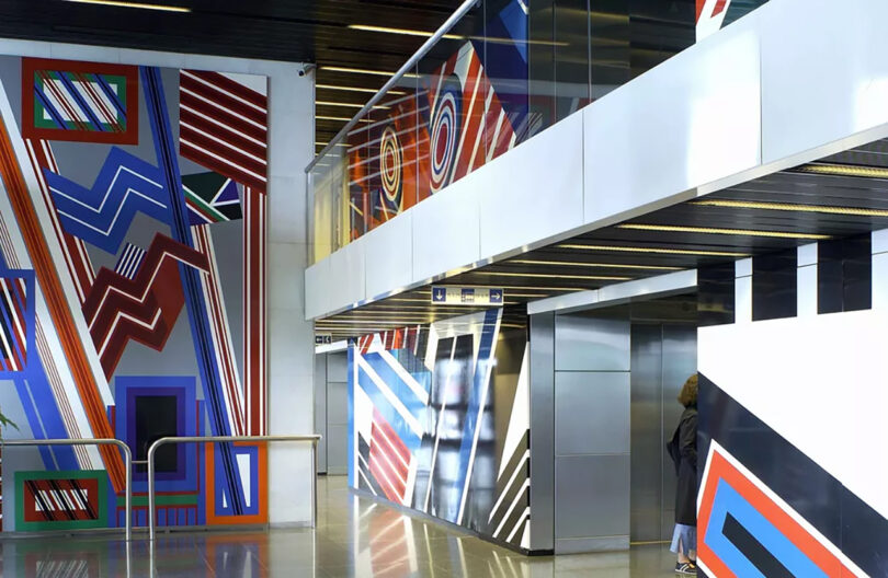
3. Jean Dewasne
I’ve always been very impressed by the format of Jean Dewasne’s works: huge, graphic, and extremely colorful frescoes made up of lines, rectangles, and circles in brilliant finishes. In each section of the work, something is expressed through the motifs. You might even get the impression that there is no end to the geometry that makes them up, and I love being able to draw inspiration from them to create a pattern or a shape that will then feed into my designs and furniture creations.
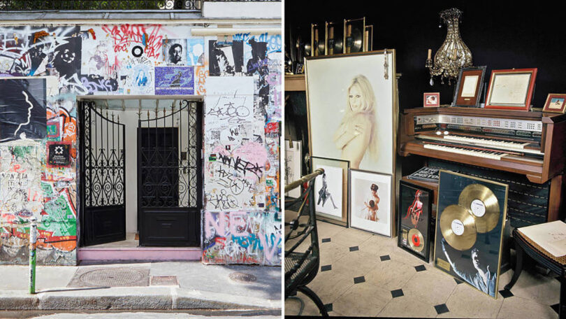
It’s a unique place, a mysterious house belonging to one of the greatest French artists of the 20th century, which has just opened to the public. I was lucky enough to visit Serge Gainsbourg’s home on rue de Verneuil in Paris, a place filled with emotion and very moving. A multi-faceted artist, singer, composer, director, writer, and painter, he proves through these different talents that creation can be diverse and that inspiration can come from all horizons. I’ve always loved his taste in decoration because he loved objects and valued their placement, especially in the way the rooms were decorated, with the placement of the photo frames, the black fabric on the walls, and the skillful use of black and white in this inspirational home.
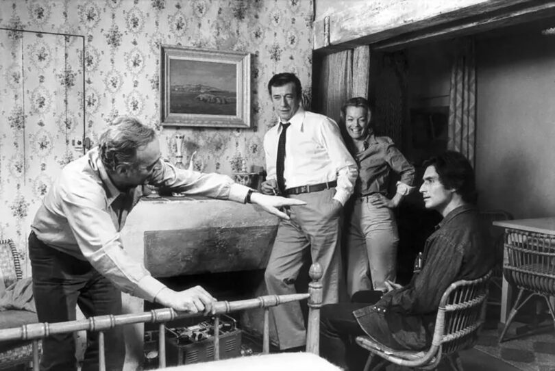
I’m particularly fond of films from the 70s, with a preference for the filmography of French director Claude Sautet, who had some of the greatest French actors and actresses in front of his camera. In this photo from the film César et Rosalie with Romy Schneider, we see Yves Montand and Samy Frey chatting with the director in a seaside bedroom setting, with rattan furniture and a rope carpet, typical of the era. I love the way this director tackles simple subjects that everyone can relate to and the atmosphere, the colors of the sets and the photography in his films are always a source of inspiration for me.
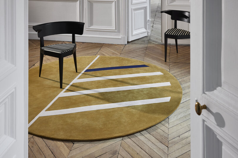
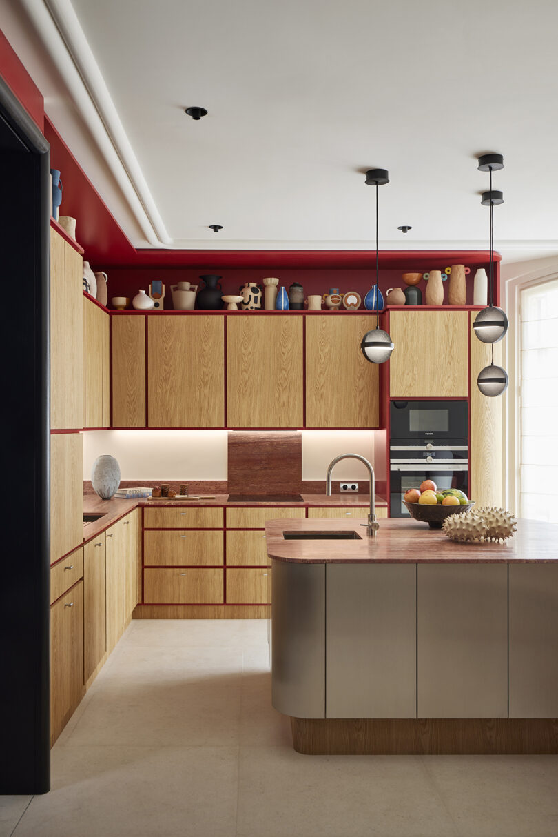
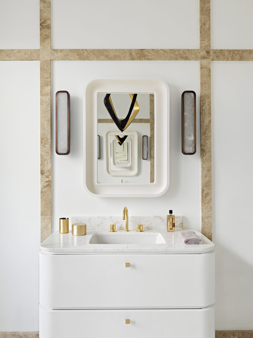
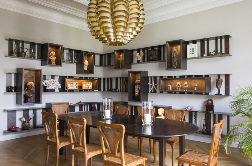
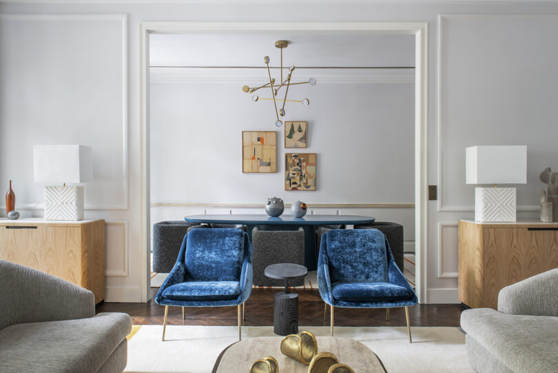
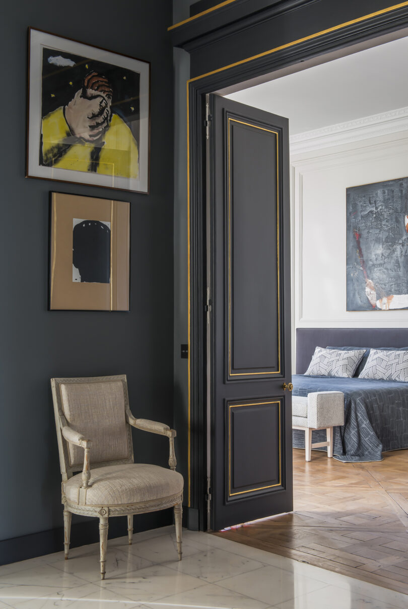
Work by Fabrice Juan:
from Design MilkInterior Design Ideas for Your Modern Home | Design Milk https://ift.tt/c4hLHvD
via Design Milk

No comments