This North Dallas Home Exudes the Brilliance of Brazilian Modernism
The masterful renovation of an 8,000-square-foot north Dallas home has turned this exemplary piece of late 1970’s architecture into a time capsule packed with vibrant artworks set against a minimalist backdrop in a testament to the physical joy of Brazilian Modernism. Marc McCollom, Joshua Rice, and Temple Shipley – the architect, interior designer, and art consultant, respectively – synthesize their expertise to transform a rambling conglomeration of rooms into an organized, sprawling space plan reflective of the expansive exterior surfaces and bold visual language of its time.
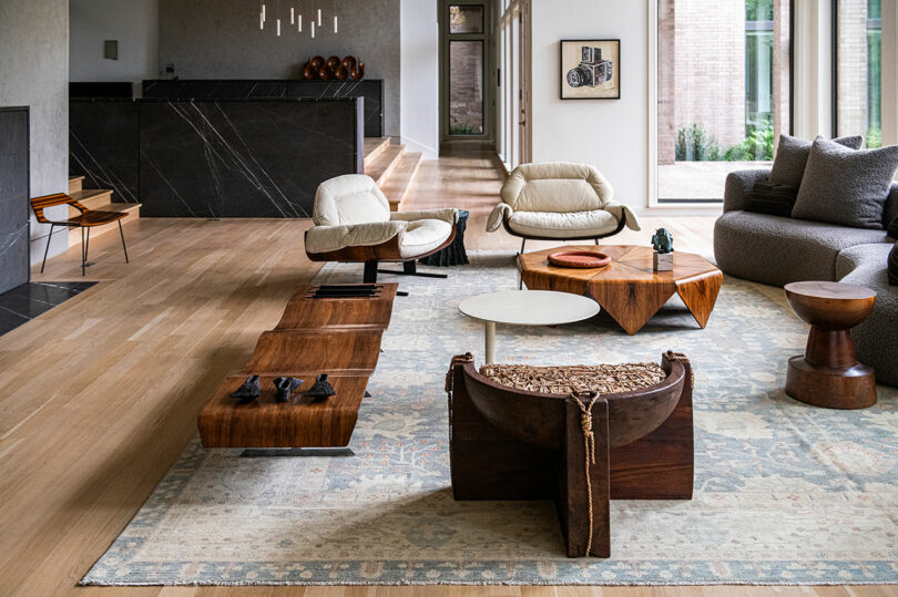
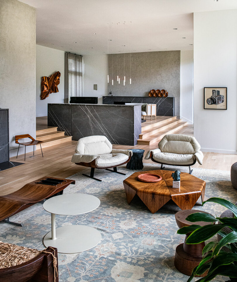
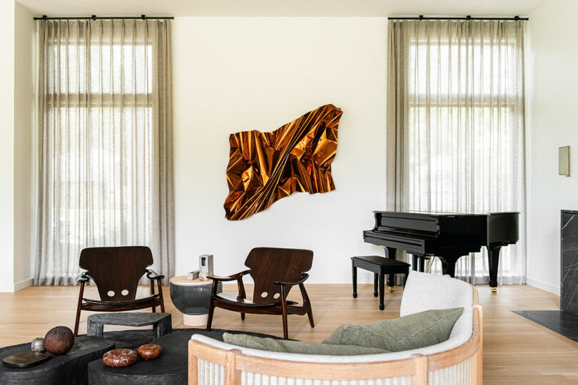
Entry space and sunken parlor \\\ Cast bronze size table by Jojo Corvaia through Garde. Vintage Presidencial armchairs, Petalas coffee table, and Onda bench by Jorge Zalszupin. FAO sofa by Christophe Delcourt for Collection Particulière. Ciranda side table by Ricardo Fasanello. Bedsa chair by Aequo through Garde. Turned walnut pedestal by Chris Lehrecke. Vintage Oushak rug through Esmaili Rugs. \\\ Photo: Robert Tsai
Brazilian modernism is inherently organic, informed by challenges or opportunities the natural environment presents in a reliance on locally sourced materials to strike a balance between mid-century sensibilities and tropical flair without the pomp and circumstance. This single-story structure hugs a creek native to the site encouraging the unusually wide linear layout, which is anchored by a split-level sunken living space.
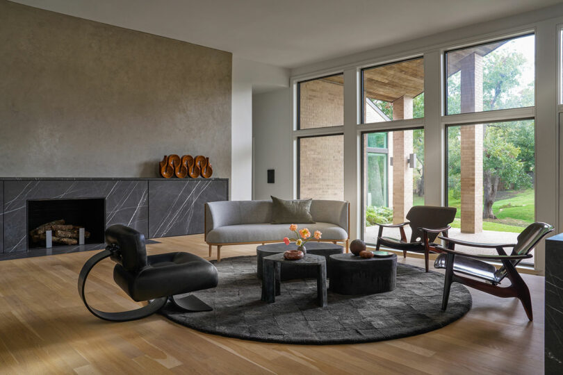
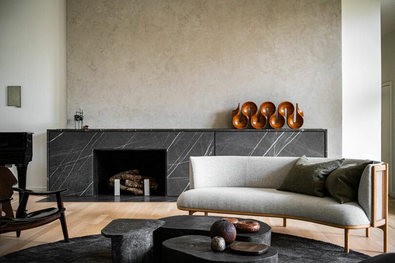
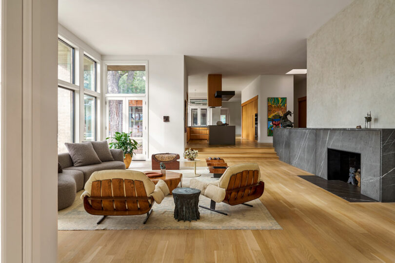
Raised living area \\\ Vintage Alta lounge chair by Oscar Niemeyer. Vintage rosewood Diz chairs by Sergio Rodrigues. Sideways sofa by Rikke Frost for Carl Hansen through Garde. \\\ Photo: Nathan Schroder
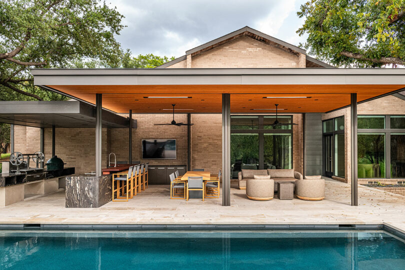
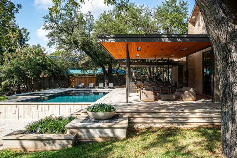
Vast sightlines and spatial dynamism yield high-impact views as guests have an uninterrupted vista from the entry through multiple lounge areas, the kitchen, and dining room, until it spills outdoors. An office, guest suite, primary suite, and three additional bedrooms bookend the core with clear delineation to retain privacy. The property also boasts a large pool with an adjacent outdoor living space, a public park sized playground, and its own tennis court.
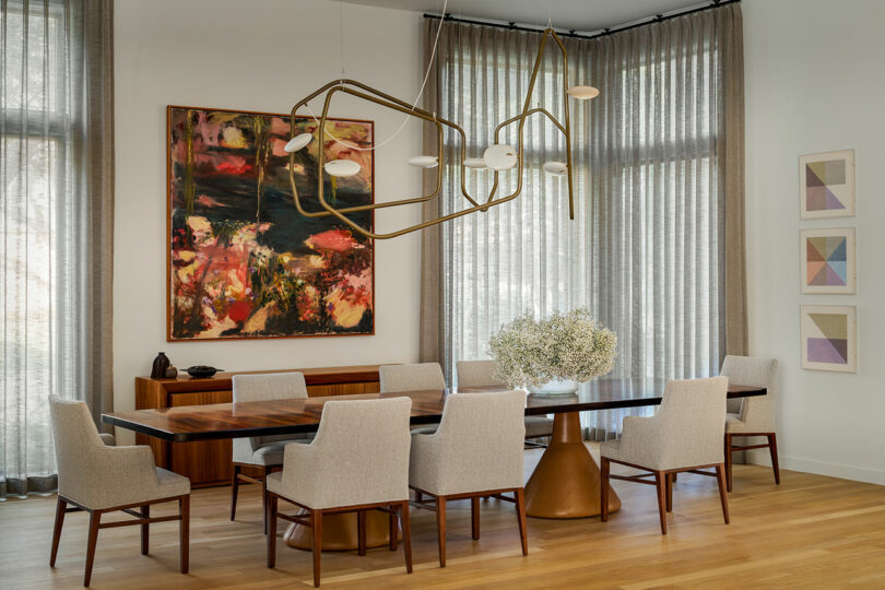
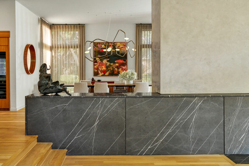
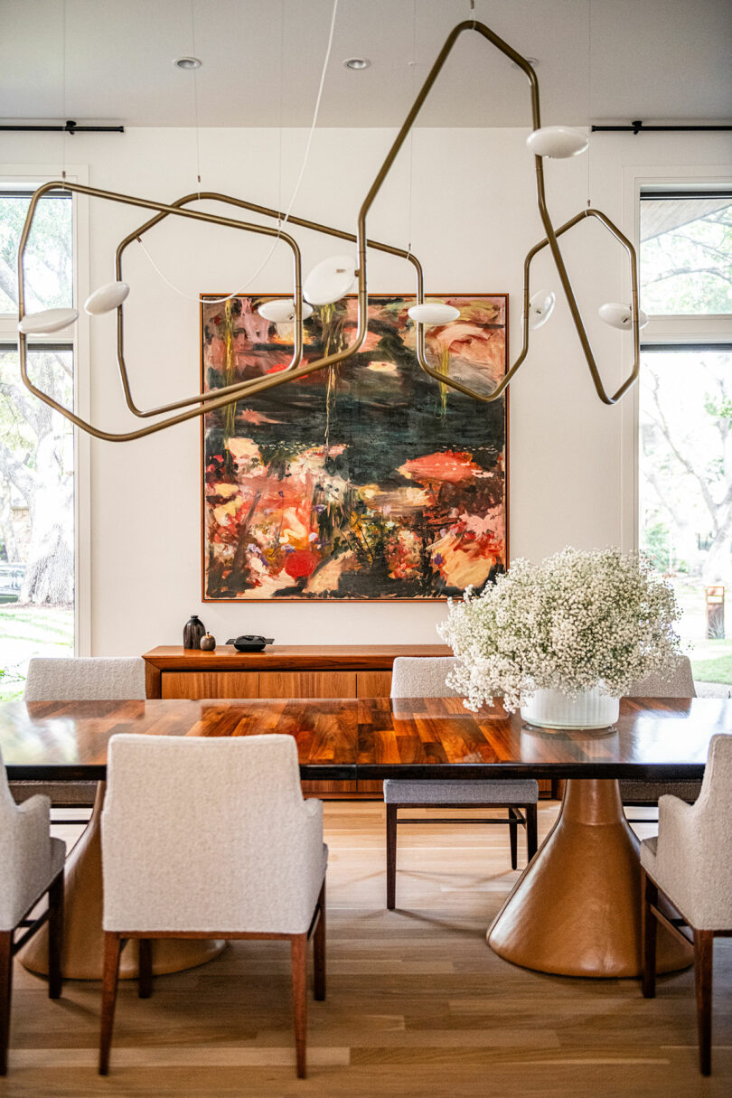
Dining room \\\ Palindrome light fixture by RBW. Jorge Zalszupin guanabara rosewood vintage dining table. Vintage dining chairs by Edward Wormley for Dunbar. Vintage mirror by Joaquim Tenreiro. \\\ Photo: Nathan Schroder
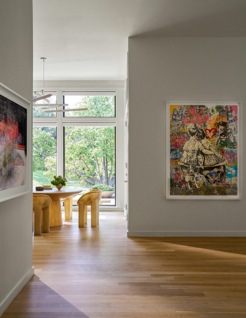
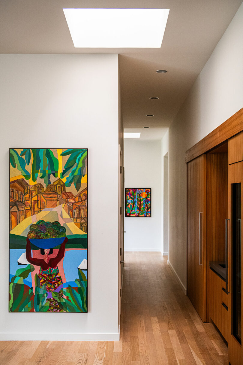
The homeowners, a family of four originally from Mexico City, bring a sense of warmth and whimsy to the residence, as well as an extensive collection of art and design objects, which grace the interior. Certainly not an exhaustible list, some notable design pieces include those by Faye Toogood, Jojo Corvaia, Oscar Niemeyer, and Jorge Zalszupin, as well as artworks by Joaquim Tenreiro and Sol LeWitt. From freestanding to wall-mounted, vibrant collectibles stand out against a neutral backdrop in a careful curation for museum-like movement through the house that is equal parts circulation and choreography.
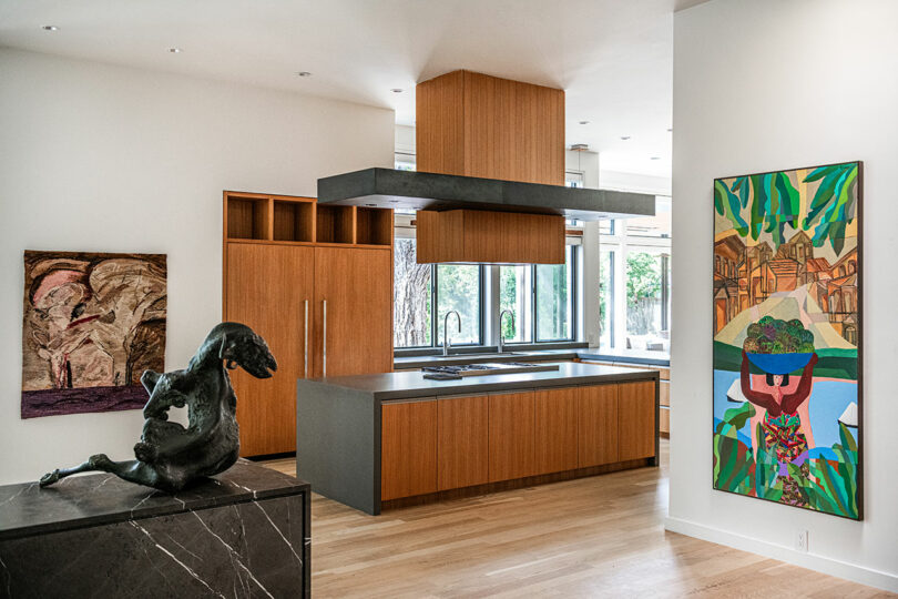
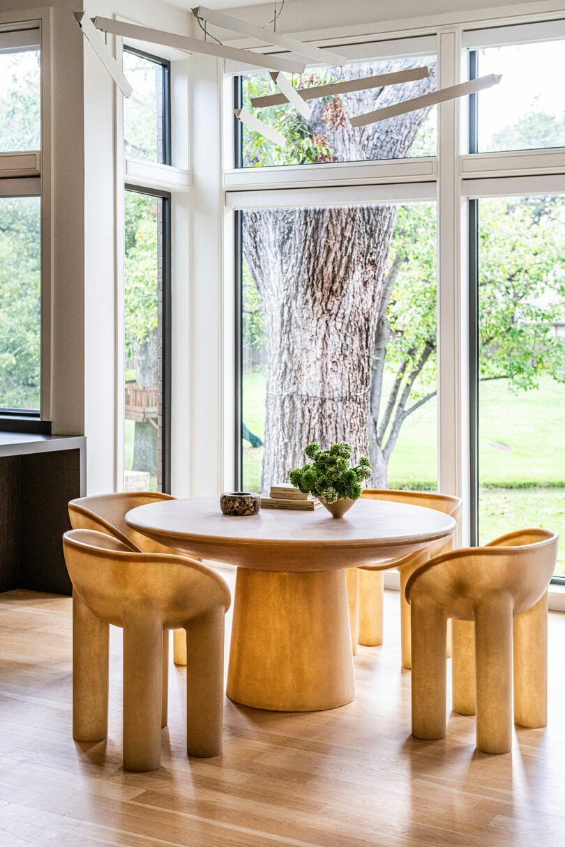
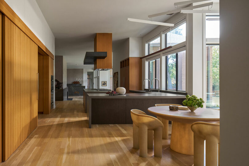
View into kitchen from central space \\\ Outfitted in teak veneer and bronzed textured panels by Forms + Surfaces. White oak flooring. Fiberglass Roly-Poly dining chairs and table by Faye Toogood through Garde \\\ Photo: Robert Tsai
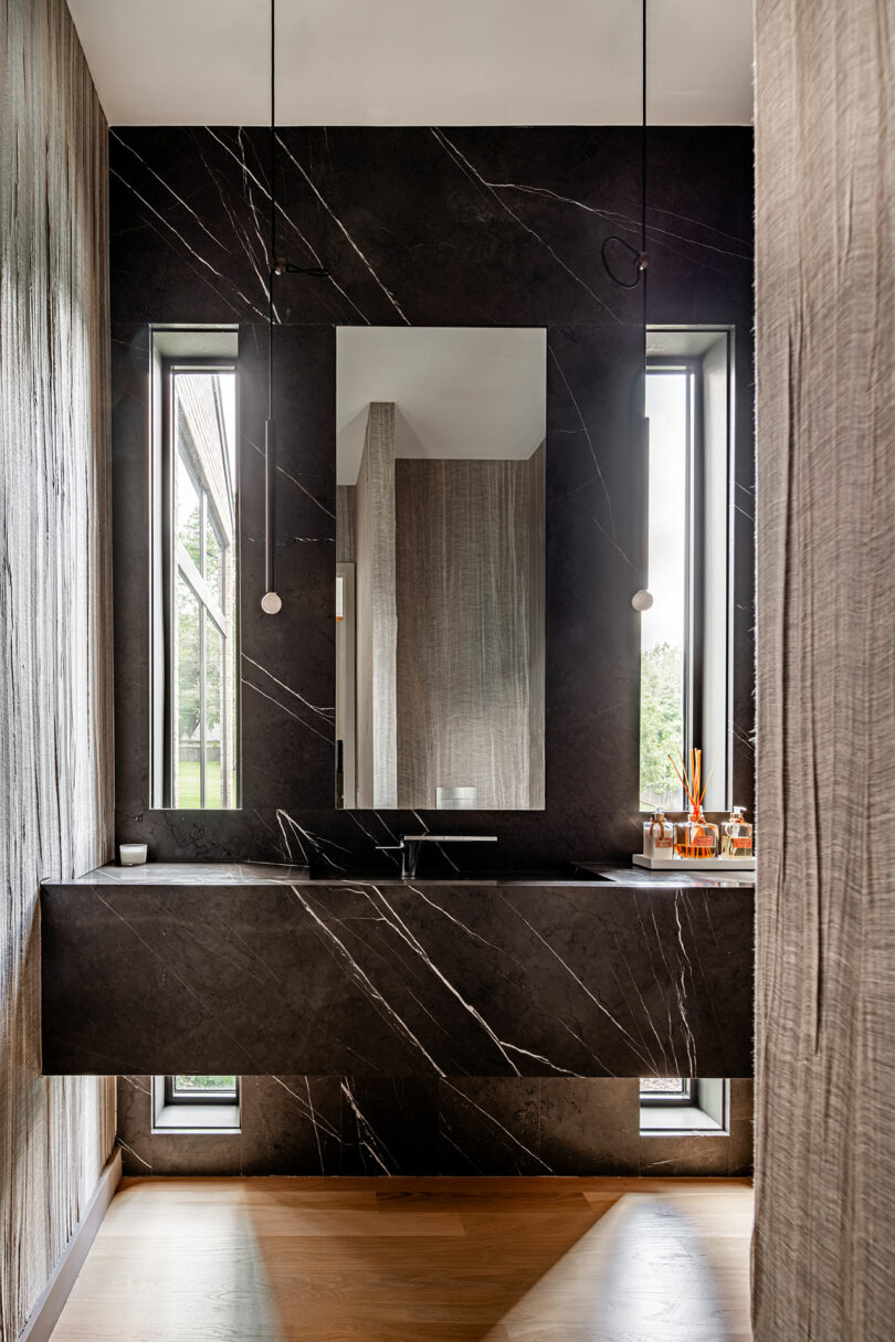
The extensive renovation makes sense of the once chaotic interior through thoughtful material interventions, hierarchical programming, and expertly scaled formal additions for a renewed architectural clarity. “Because the ceilings were so high and the spaces were so grand, we presented some huge light fixtures for several rooms,” Rice says. “I kept expressing the point that we needed something that took up a lot of volume, while still being somewhat diaphanous and not taking up visual space.” Rich tones of rosewood, reddish woods, and pietra grey stone provide striking accents in harmony with the white oak floors.
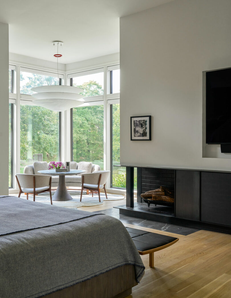
Primary bedroom with seating area and fireplace \\\ Floatation lamp by Ingo Maurer. Vintage angled sofa by Edward Wormley for Dunbar through Sputnik Modern. Vintage Model 83 Nanna Ditzel lounge chairs through Sputnik Modern. Coccoloba rug by Atelier Agahzadeh. Blackened steel FP surround. Blade bench and Buni chat table by Jader Almeida. \\\ Photo: Nathan Schroder
Guided by an artistic ethos, the collaborators formed the tendrils for connection between visitors, art, and architecture. The contemporized style here is stripped back, trading decoration for artwork and sculpture, with a particular focus on dialogue between precious personal belongings and surface treatment. “We wanted these design objects to be an important feature to the overall design, but not completely dominate the spaces they inhabit,” Rice adds. “That’s why the materials in the architecture and surrounding design were deliberately selected to be complementary.“
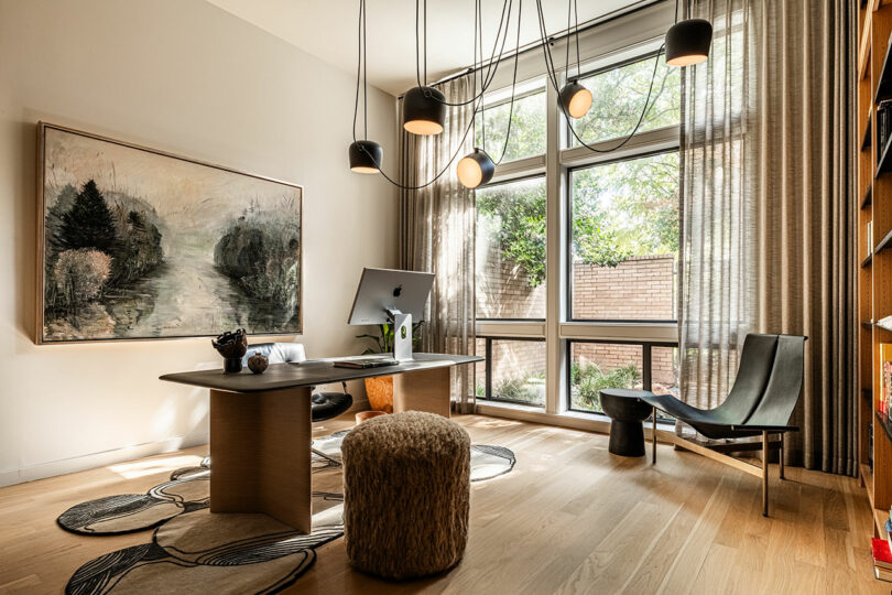
Private office space \\\ Aim lamps by Ronan and Erwan Bouroullec for Flos. Vintage Preben Fabricius and Jørgen Kastholm model FK84 Swivel chair through Sputnik Modern. Desk by Poltrona Frau. Rug by Atelier Agahzadeh. Vintage bronze TG-15 lounge chair by Katavolos, Littell and Kelley through Sputnik Modern. Linen pouf by Pauline Esparonthrough Garde. \\\ Photo: Robert Tsai
To learn more about the key players visit marcmccollom.com, joshuaricedesign.com, and templeshipley.com.
Photography by Nathan Schroder and Robert Tsai as noted; Production by Karine Monie.
from Design MilkInterior Design Ideas for Your Modern Home | Design Milk https://ift.tt/iGFq0or
via Design Milk

No comments